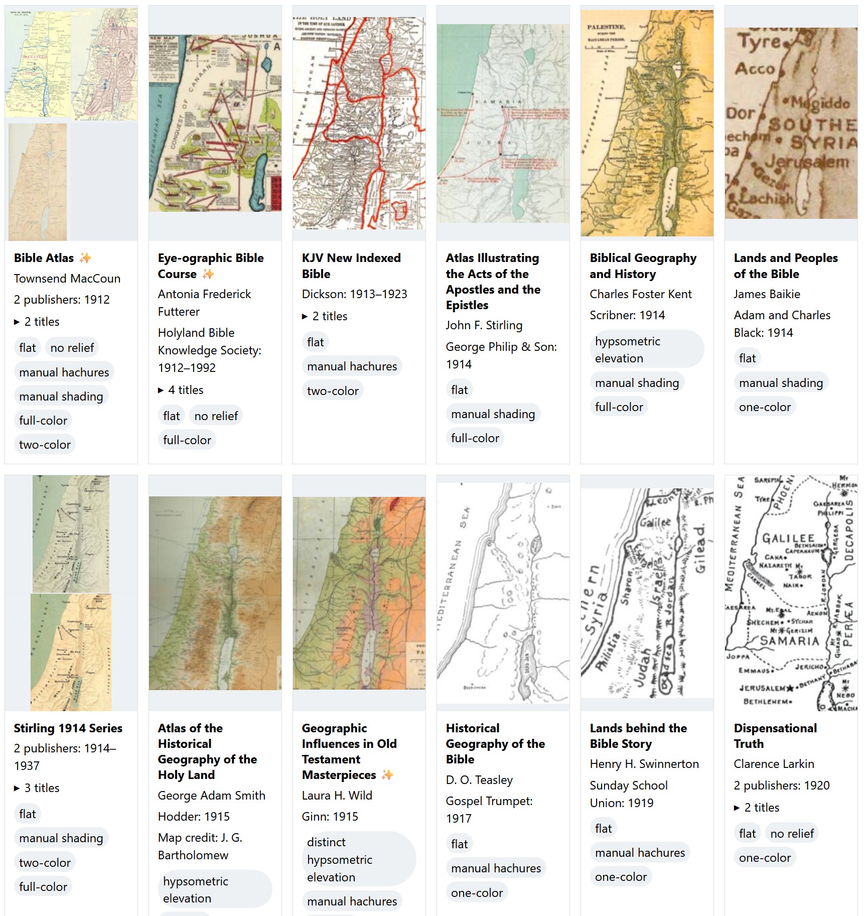
This survey presents over 460 distinct Bible maps from 880 sources published since 1912 and includes a thumbnail of each one to help you identify the source of a printed map you might be looking at. The images are intentionally low-resolution; they’re not designed to substitute for the original but to point you to the original. They’re also cropped from the originals to try to include Gaza in the west, the whole of the Dead Sea in the south, and Damascus in the northeast. The goal is to show you approximately the same view on every thumbnail, though doing so wasn’t possible for every map.
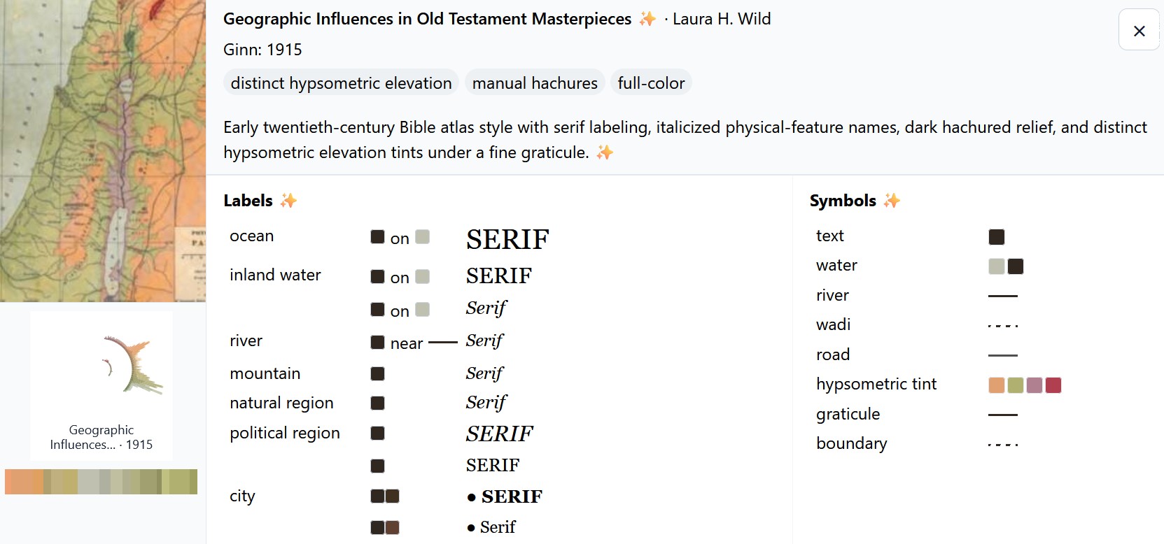
Click an image to show an AI-generated analysis of the colors and symbols used on the map. For example:
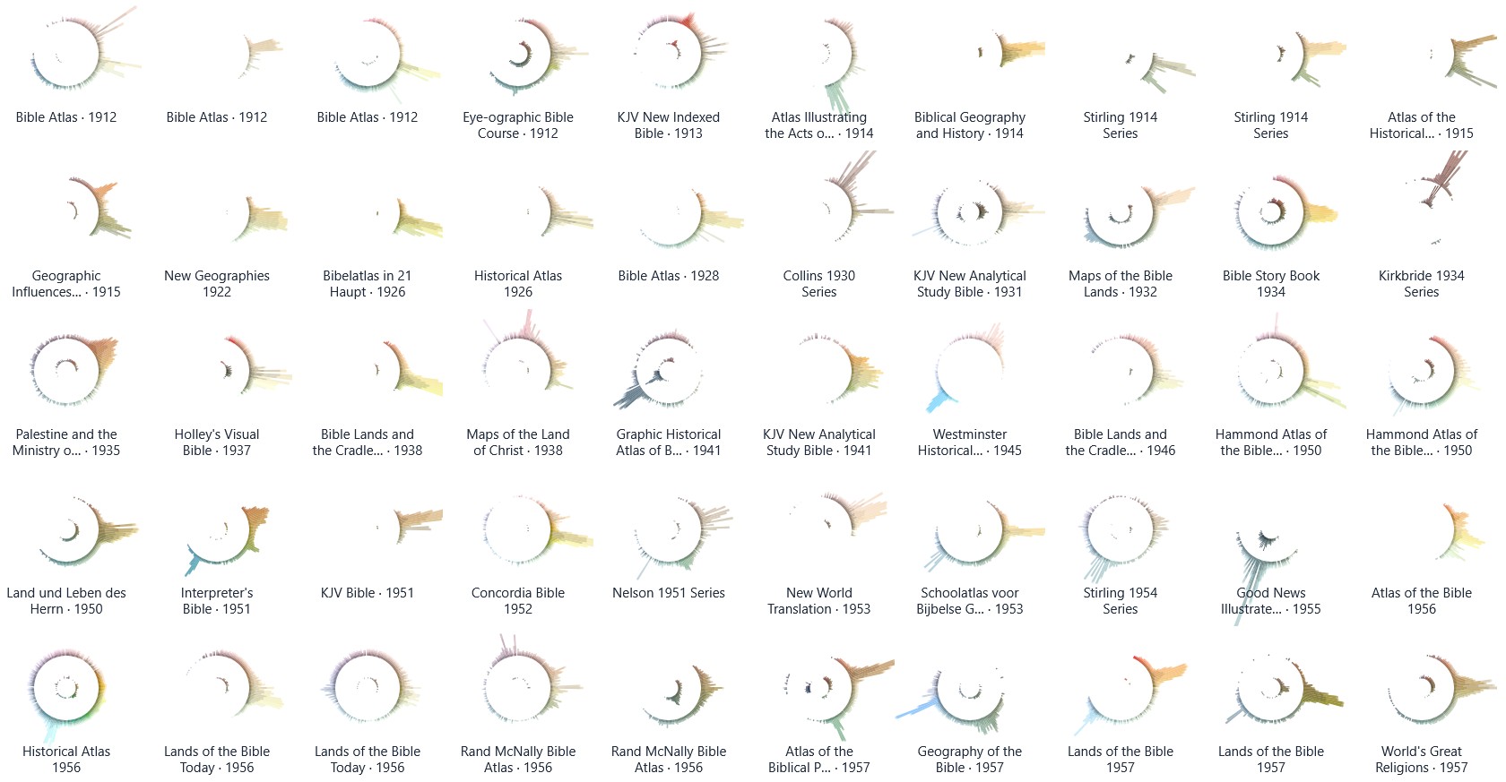
There’s also a palette view that uses radial histograms to let you compare the colors used in these maps. You can use this view to explore trends over time or to identify outliers. Amanda Hinton inspired this approach. (I thought about calling them “eyeball graphs” since the stronger dark colors of an earlier iteration of them made them resemble the pupil of an eyeball. Instead, I turned down the intensity; now they just look like concentric circles.) I also had Claude write a tool to create a circular palette with your own image.
The length of each color bar indicates the amount of that color used in the map. The outer circle shows lighter colors, and the inner circle shows darker colors. Many of the palettes use complementary or triadic color schemes that you probably learned about in school.
In both views, you can search or filter the maps to find what you’re looking for. “Hachures” are little strokes that indicate topography, and “hypsometric elevation” means that colors change depending on the elevation.
To locate potential sources, I used WorldCat to show me all books published in English in the U.S. with the subject headings Bible—Geography—Maps and Bible—Geography. I also went through the list of study Bibles published at Theologue. While I don’t pretend that this survey is exhaustive, I was able to locate images for 95% of the relevant titles listed in WorldCat.
Because maps are relatively expensive to produce, publishers will often reuse the same basic map for decades, which you see reflected in the data. The Hammond 1977 Series, for example, was used for four decades, and the Moody 1986 Series was published in a new book as recently as 2024.
I used AI to reconstruct or enlarge images where the only source I could locate was a low-resolution image. Such images are marked.
Thank you to online Bible reviewers (especially Bible Buying Guide) for creating a historical record of what maps appeared in which Bibles. Even if you just flipped through a Bible in a YouTube video, a glimpse of a map was often enough to identify it.
Finally, if you were to combine the palettes for all these maps into a single visualization, here’s what it would look like. You can see the strong use of oranges and browns to indicate land, smaller blue peaks for water, and a bit of green for vegetation or hypsometric elevation.
