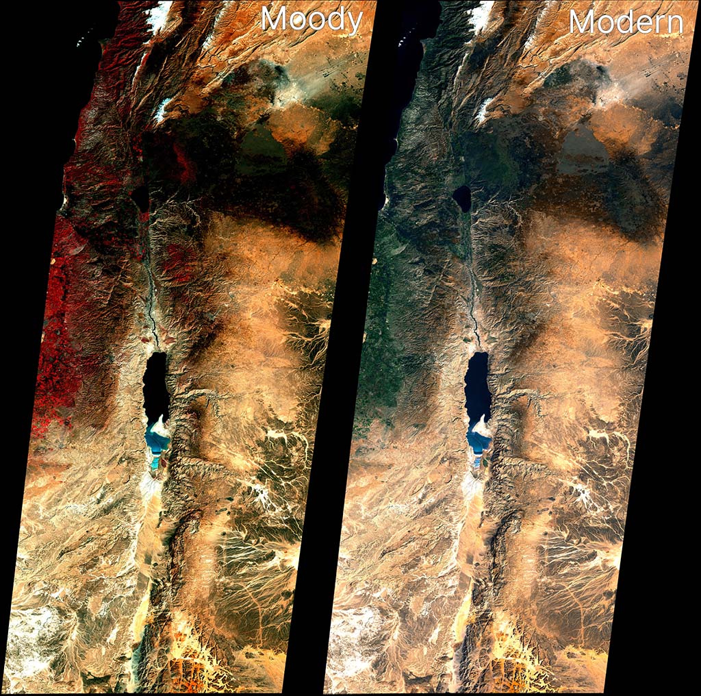
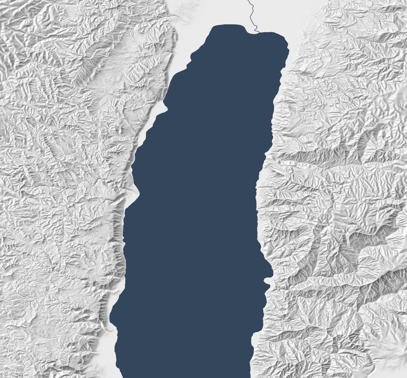
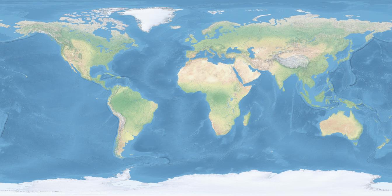
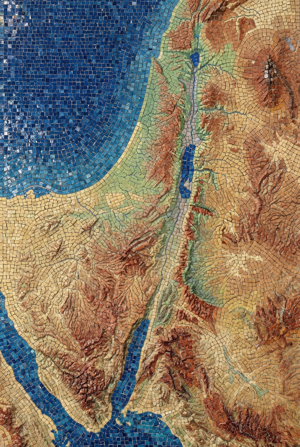
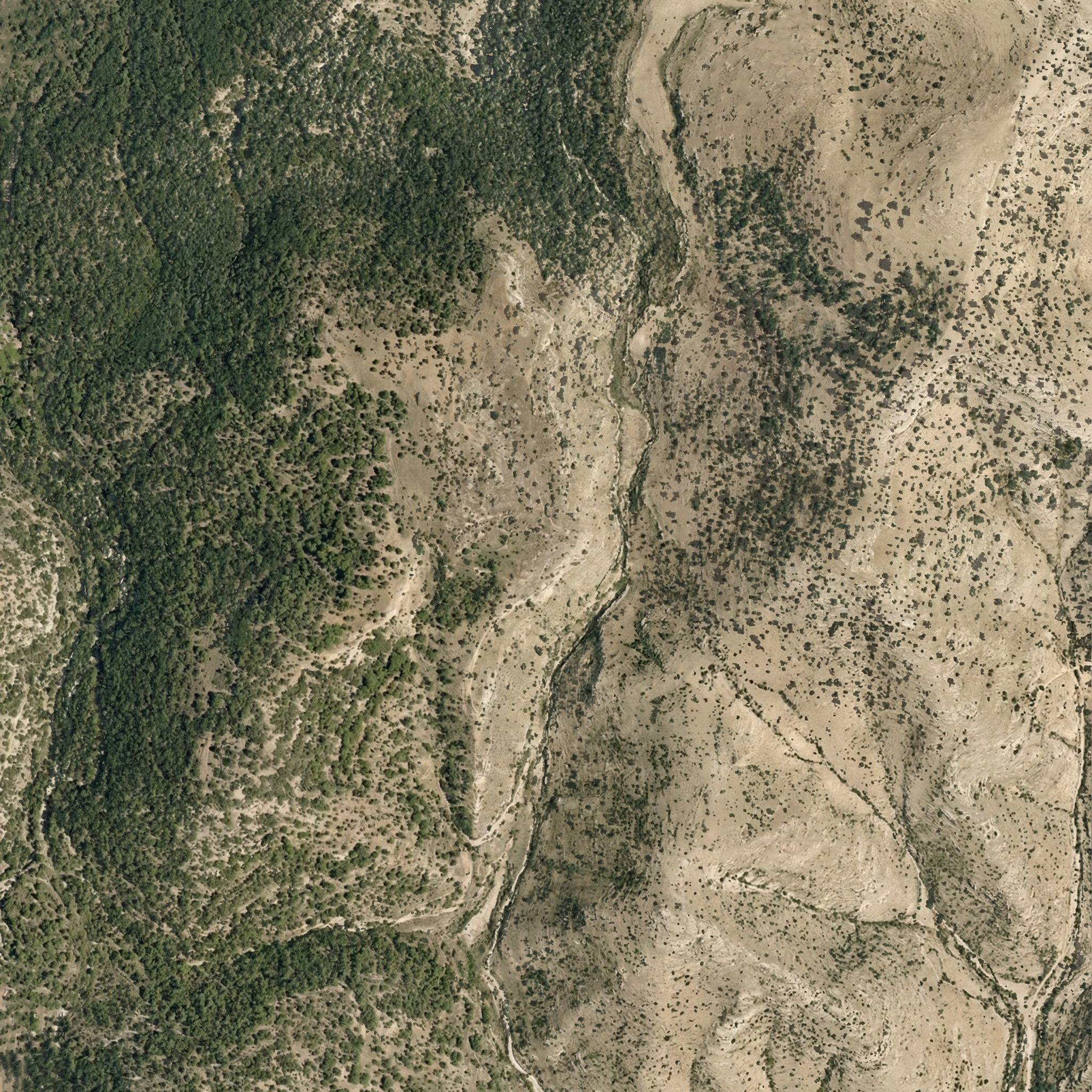
The 1985 Moody Atlas of Bible Lands by Barry J. Beitzel has a section at the end that discusses the history of biblical mapmaking. It concludes by showing a Landsat 1 image from January 1, 1973. Here’s my attempt at recreating the look of that image, alongside a more-modern take on the source data.
The above image rotates the source data by 9 degrees to match the appearance in Moody. You can also download the raw geotiffs for Moody and Modern (about 20 MB each) for use in GIS applications. Resolution is about 60 meters per pixel. Find the raw data at USGS Earth Explorer.
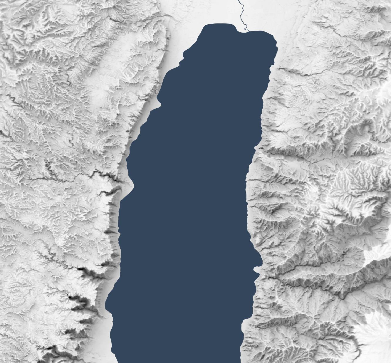
Landsat 1 didn’t include a blue sensor (Landsat satellites wouldn’t get one until Landsat 4 in 1982), which means the blue band for a natural-looking red-green-blue (RGB) output has to be derived from other bands.
Based on the above reconstruction work, I believe Moody used Band 6 (near-infrared) for red, Band 4 (green) for green, and Band 5 (red) for blue. The strong red coloring for vegetation is often a giveaway that the NIR band was used for the red channel. This kind of false-color compositing was fairly common for the era and continues today for specific purposes (like agricultural monitoring). In the print book, the Moody image crops out most of the red vegetation, which I think is a smart move for the audience.
The Moody image is relatively dark, with more contrast than we’d expect today. My recreation here is a bit bluer than the version that appears in print, but it’s the closest I could get. The print version also merges three different scenes with slightly different color processing for each. Here I was able to merge and process the three scenes together, for a more-unified look.
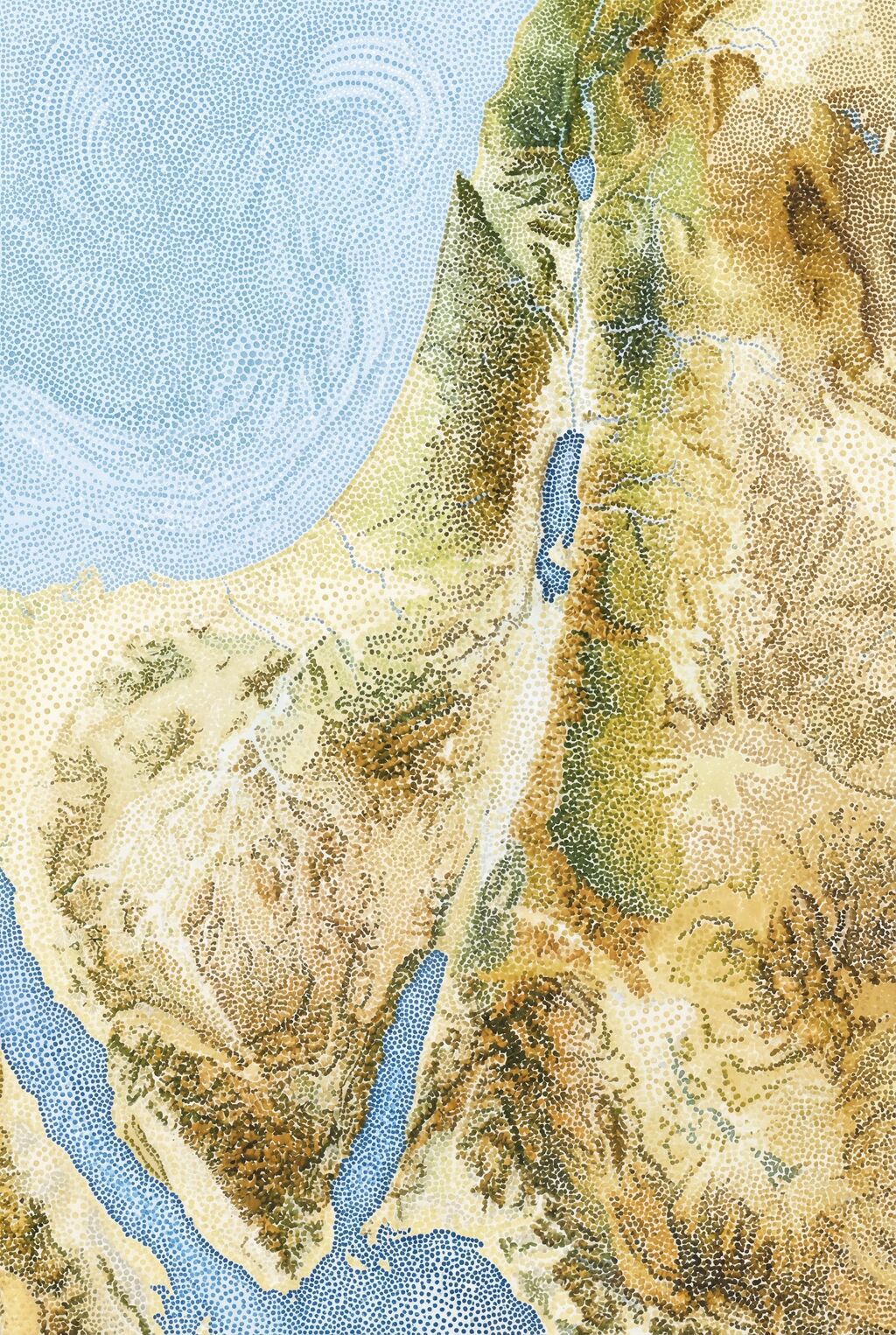
This “vegetation is red” look isn’t how we process satellite imagery today for general consumption, so the second image uses a combination of Bands 4, 5, and 6 to recreate a blue channel and generate a natural-looking scene that matches modern expectations. (Specifically, it does 1.2*B4 - 0.35*B5 + 0.05*B6. OpenAI’s Codex, which did these transformations for me, says, “B4 carries visible-light structure closest to what we need for a blue-like channel. Subtracting B5 suppresses warm soil response that otherwise makes blue muddy. A small B6 term can stabilize tone transitions, but too much NIR in blue quickly produces unnatural color.”) It’s not as perfect as a dedicated blue sensor would be, but it comes close.
In my opinion, the Landsat 5 image from the last post is clearer than either of these images. On the other hand, it has a blue sensor to work with. Moody worked with what they had available to them, and the 1973 image they used presents an especially clear, cloud-free view.
Posted in Geo | Comments Off on Recreating a Satellite View from the 1985 Moody Atlas of Bible Lands
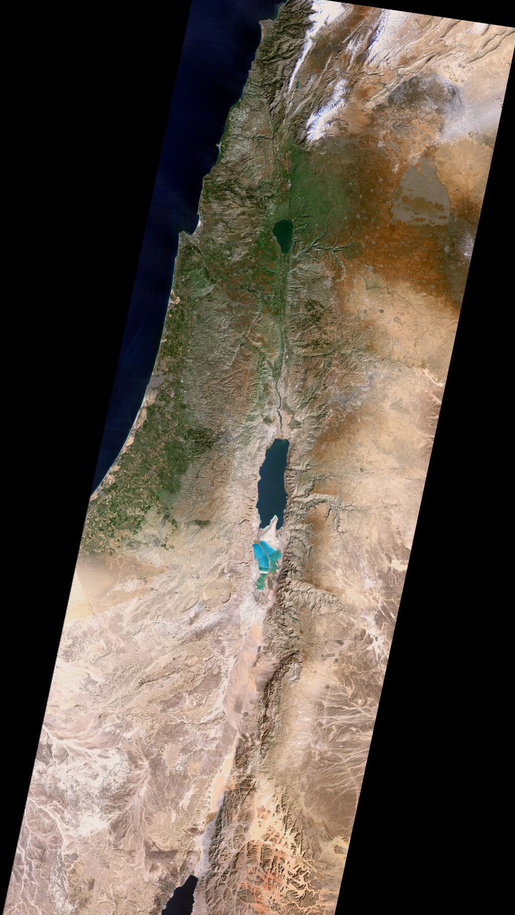
In 1993, Richard Cleave (R. L. W. Cleave) wrote The Holy Land: A Unique Perspective, which to my knowledge (and as the book jacket says) represents the first time satellite imagery was directly used as a base layer for Bible maps. He writes that his source is a Landsat 5 image from January 18, 1987: “a cold, exceptionally clear and almost cloudless morning: the best of all possible mornings for a single contemporary image of the whole area.” He uses this image throughout the book and for his two-part Holy Land Satellite Atlas in 1999, which in turn serves as the basis for the NET Bible Maps (2003).
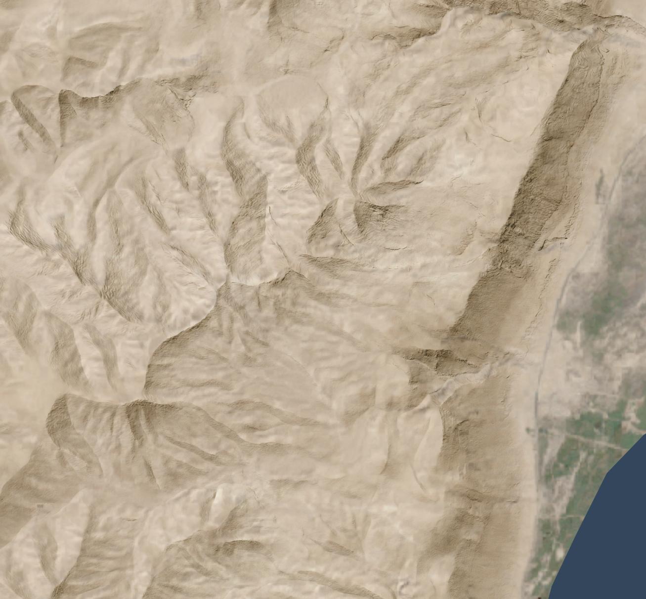
The U.S. government makes decades of Landsat imagery available, so I was curious whether it was possible to approximate Cleave’s classic look using modern methods. The answer is, “Yes, mostly”:
Also available as a Cloud Optimized Geotiff (40 MB) for GIS purposes and a KMZ (80 MB) for Google Earth. Both these larger images include the Sinai peninsula, though I believe Cleave used a different source image and composite method in his books for that region.
If you’ve worked with satellite imagery, you know that the data comes in “bands”—in this case, there are red, green, and blue bands—that you combine to make a final image. The decisions you make when combining these bands dramatically affect the look of the output, and there’s no objectively correct answer. I tried to come close to Cleave’s decisions from the early 1990s, but my water ended up darker and my highlights ended up brighter than his. It has a similar feel, though, down to the purple tones south of the Dead Sea. Making my matching life harder, the print colors of Cleave’s image vary depending on the book, which suggests either printing variations or multiple rendering refinements. So I tried to capture the character of the original, but it’s more of an interpretation than a copycat.
About Richard Cleave
Cleave himself sounds like a fascinating fellow. Robert North in A History of Biblical Map Making describes him in 1979: “Dr. R. L. W. Cleave of the British Navy, after serving hospitals in Jordan and becoming concerned with the lack of aerial survey material of the Holy Land, resigned his commission to accept the offer to prepare a pictorial archive for a Time-Life project. When the 1967 war intervened, he was limited to working inside Israel, and with the guidance of Père Jean Prignaud of the École Biblique he prepared and published 1500 aerial views of all major archeological and geographical features of Cisjordan. To these have already been added some 500 more views of Sinai, Göreme, and some other sites mostly in Turkey” (p. 142).
His photos consistently appeared in Bible reference works from 1967 through the late 2000s and remain high quality even compared to today’s imagery—especially since they capture a world from 60 years ago. His aerial view of the City of David represents, to me, one of the clearest ever captured. Compare a similar perspective from 2014, which shows many more buildings and is harder to parse at a glance.
Cleave worked with James Monson to produce the Student Map Manual in 1979. The ambition described in this book’s preface is astonishing for the time. Cleave’s “Wide Screen Project” describes an entire geographically indexed multimedia learning system: for the audio, cassettes; for the visual, audio-synchronized slides plus maps; for learning, the Student Map Manual, guided tours, and a poster exhibit. This proposed learning system provides a practical use for his library of thousands of photos.
In 1993, he combined 149 of these photos along with the aforementioned satellite view into The Holy Land: A Unique Perspective. The afterword to this book is also ambitious: he describes the now-common (thanks to Google Earth) practice of draping satellite imagery over a digital elevation model to produce a 3D view.
Cleave and his son Adrian worked with “John K. Hall of the Israel Geological Institute, and Gennady Agranov and Craig Gotsman, computer scientists at the Technion, Haifa” to produce these 3D images, which would premiere in National Geographic‘s June 1995 issue (“Satellite Revelations: New Views of the Holy Land“) and later form the core of 1999’s The Holy Land Satellite Atlas as part of RØHR Productions, Ltd. (Nicosia, Cyprus). In this 3D imagery, he uses SPOT panchromatic data to add detail (similar Landsat 7’s panchromatic band).
This work required an international team in 1993; today you can (approximately) recreate it on a home computer. Including satellite imagery in Bible maps has become somewhat more common but remains unusual. Some of Tyndale’s current maps use a subtle satellite background. The Satellite Bible Atlas (2013) relies on satellite imagery for its whole premise. The Casual English Bible maps use 3D satellite images.
But Cleave wasn’t just thinking 3D in 1993; by adding a time dimension, he was thinking 4D:
Rohr Productions is now preparing a 2 1/2 hour videotape of 3D satellite animation, specifically designed for use with this atlas. This will have a 20 minute Introduction and 13 Regional Segments, each of approximately 10 minutes duration…. The spoken commentary in the video will be descriptive, designed to reinforce the regional commentary printed in the book.
Relevant low-level aerial photographs (selected from the book) will be inserted into the “flight path,” providing familiar details of the major Biblical/historical sites and geographical features, each presented in its appropriate regional context.
Therefore all three of the most important elements in the atlas will be fully represented in the videotape: viz. the regional commentary, satellite imagery and low-level aerial photography. The videotape will provide optimal visualization and the book optimal documentation. To be fully effective, both systems are necessary.
This system anticipates multimedia accompaniments to books. He also describes using a CD-ROM to provide interactivity in a way that didn’t become popular until thirteen years later, with Google Earth’s release in 2005. The technology that underlies Google Earth didn’t even exist until 1999, at least six years after he wrote this paragraph:
In the case of the above videotape of simulated flights over the Holy Land, the actual flight paths have been predetermined for use in conjunction with the regional satellite maps in the atlas. Thus the viewer cannot alter these animation sequences in any way. Such personal intervention or “interactivity” is only possible if the 3D satellite data is supplied in digital format (on CD-ROMs), for use on the computer. Such use is already possible, of course, but only on the more powerful graphic work stations. We must still wait for comparable processing power and storage capacity in the PC world to provide this interactive option to a much wider group of Bible students, but it cannot be more than a few years away!
Cleave would ultimately produce this software. You can see somevideos of a later version of it in use on YouTube. The effect is similar to Google Earth’s “tour” feature (which, again, came out more than a decade later). Here’s my recreation of the effect in Google Earth using the above image.
In all these cases—from aerial photos to multimedia education to satellite imagery to 3D views to 4D presentations to interactive explorations—Cleave saw the technological possibilities of the time and explored what they could mean for students of Bible geography.
What happened to the thousands of photos that Cleave took in the 1960s, though? Based on the hundreds he printed in his books and licensed to others, they’re very high quality and are an important historical record. Some of his posters and 3D satellite imagery remain available online (for now) in low-resolution forms, but I couldn’t find a repository of his photos. Maybe they live on as slides in a collection somewhere, waiting to be digitized and made more widely available. Until then, you can buy his books used or browse some of them on the Internet Archive.
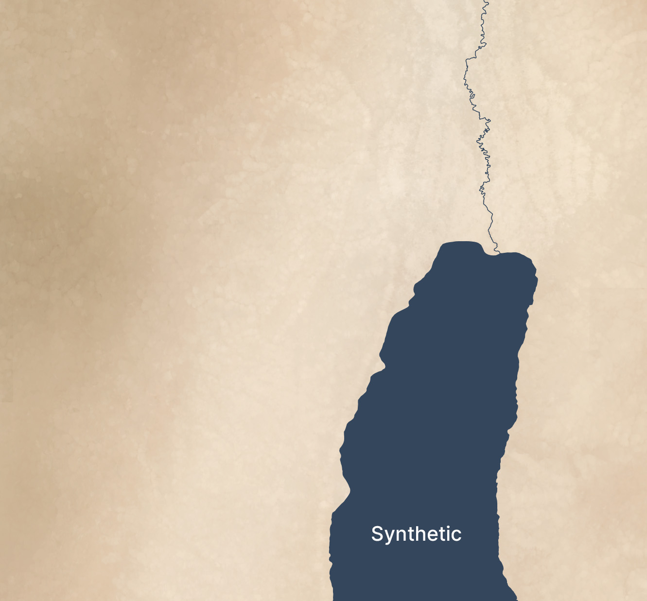
In 2018, I wrote about using terrain-generation software to make historical maps, with synthetic coloring to generate what look like satellite photos with modern features removed (cities, roads, agriculture, etc.).
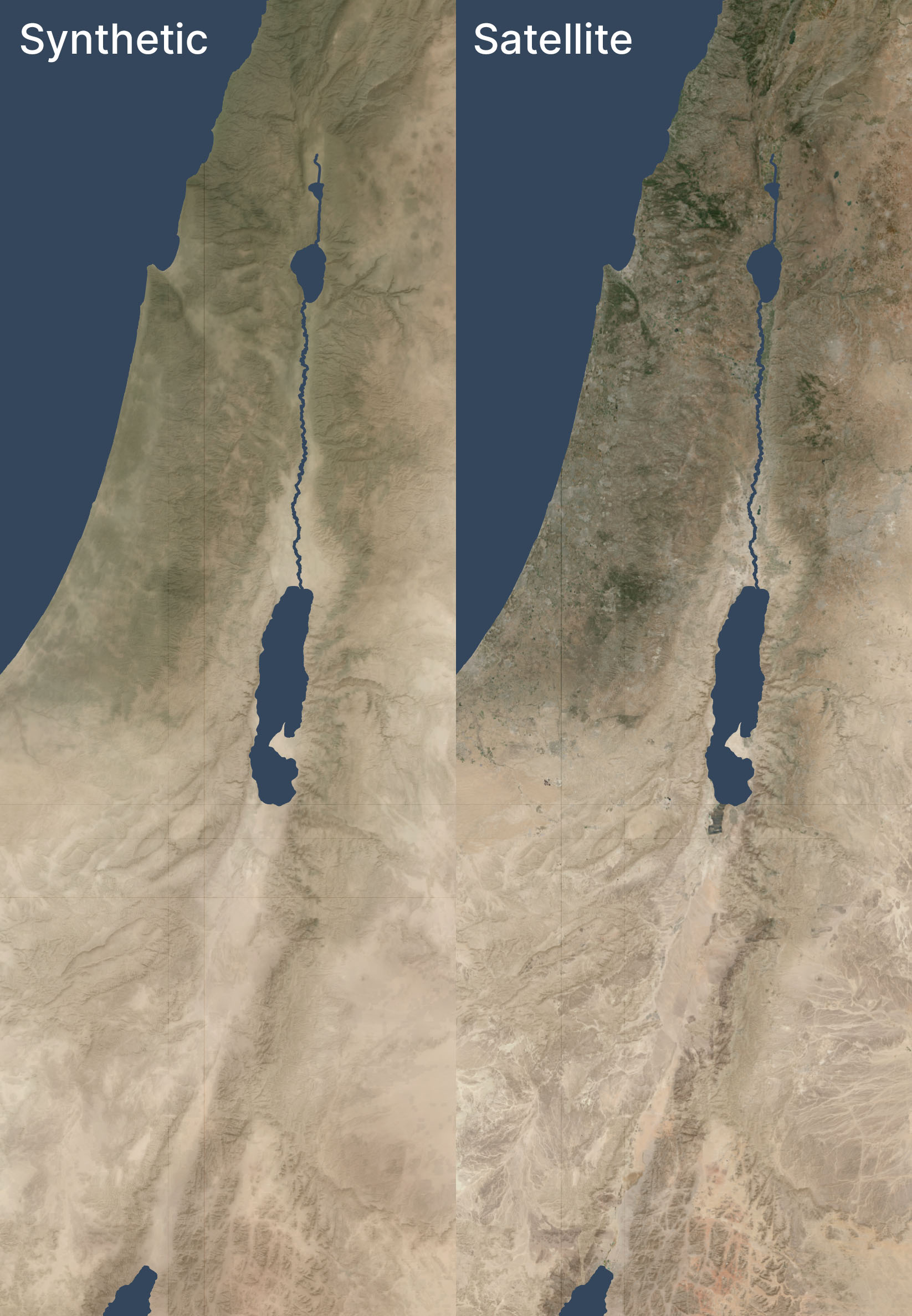
This post expands on the earlier one, creating synthetic satellite coloring at scale. When combined with the hillshading and vegetation techniques I discussed recently, it produces credible synthetic map backgrounds down to scales of about 1:125,000 (30m per pixel). With higher-resolution hillshades and vegetation data, it’s credible to about 10m per pixel.
Here’s an example of this technique used in a zoomed-out view, compared to a satellite view of the same area. Both views have hillshading and vegetation layers added.
I don’t know why there are some random vertical and horizontal lines that look like graticules. They only show up when I export from QGIS.
The synthetic and satellite views look pretty close; the synthetic view depicts a more idealized view of the terrain with fewer drainage lines (note especially the southeastern corner) and less extreme color variations (for example, the orange area in the south, east of the Red Sea, is visible but less intense).
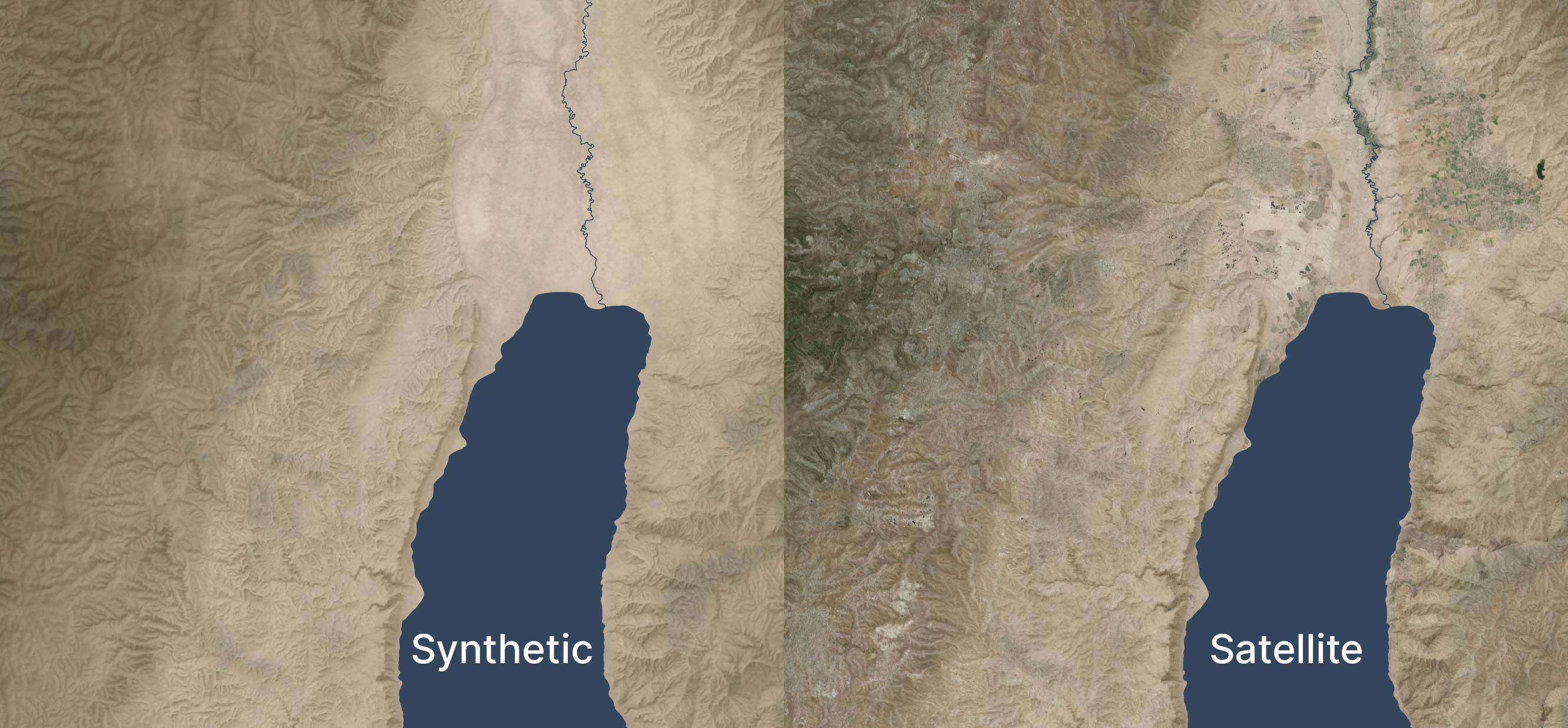
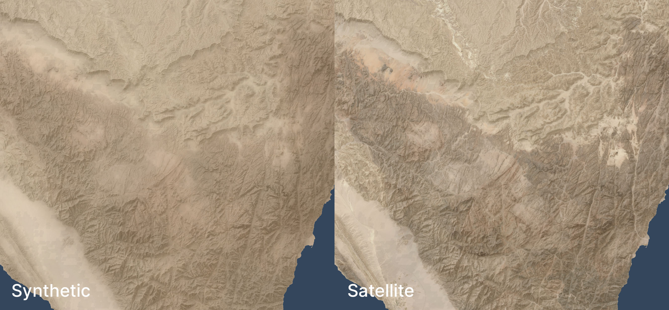
Here’s a zoomed-in area (1:250,000 scale) near the Dead Sea, again overlaid with hillshading and vegetation:
Zoomed in, the colors feel too uniform to me. There’s a decent amount of detailing when you zoom in even further, but it doesn’t read at this scale. I’m OK with it appearing a bit more maplike here because the color variations aren’t necessarily significant; I don’t want to distract viewers with unimportant detail. But I could maybe draw out the highlights a bit more.
See the third and fourth images in this post for an even-more-zoomed-in view.
Methodology
Acquire medium-resolution satellite reflectance data for the area in question. I used 10m Sentinel-2 data I had from 2021’s Bible Atlas project. This data came from from Sentinel Hub, but today I might use an annual or quarterly mosaic from Copernicus. NASA’s 30m Harmonized Landsat-Sentinel data is another potential data source.
Mask any pixels with modern development or forest cover using the Global Land Cover dataset from the University of Maryland (2020).
Create an 8,192×8,192-pixel tile of the desired area.
Blur the tile to fill in missing pixels and prevent any remaining modern pixels from leaking into the image.
Create an elevation tile of the same area (normalizing the elevation values to 0-1). I used GEDTM30.
Pull the colors and elevation into Gaea 2 (a terrain-generation app) and use the Color Erosion tool to create plausible color flows to add detail. This process took about ten minutes per tile on my PC.
Add geodata to Gaea 2’s output.
Move onto the next tile, with a 1,024-pixel overlap to allow smoothing between tiles.
This method automates well; I used it to generate fake satellite data at 10m resolution for 400,000 square kilometers. It’s designed to be overlaid with hillshading and vegetation, not stand on its own.
If you’d like to recreate it, here’s an AI-generated overview of the pipeline and my Gaea 2 file (if you use it, you’ll likely want to adjust the file paths).
Limitations
Tiles with a lot of development and agriculture have a cloudy look thanks to the blurring and the smaller number of valid pixels to work with. The west side of the below image (which excludes hillshading and vegetation), where urban Jerusalem is located, has an indistinct feel to it. The hillshading and vegetation cover up this haziness in the final image, but some of it does leak through.
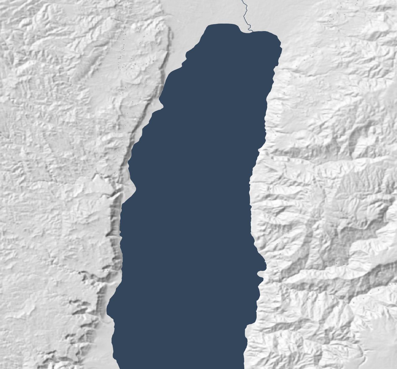
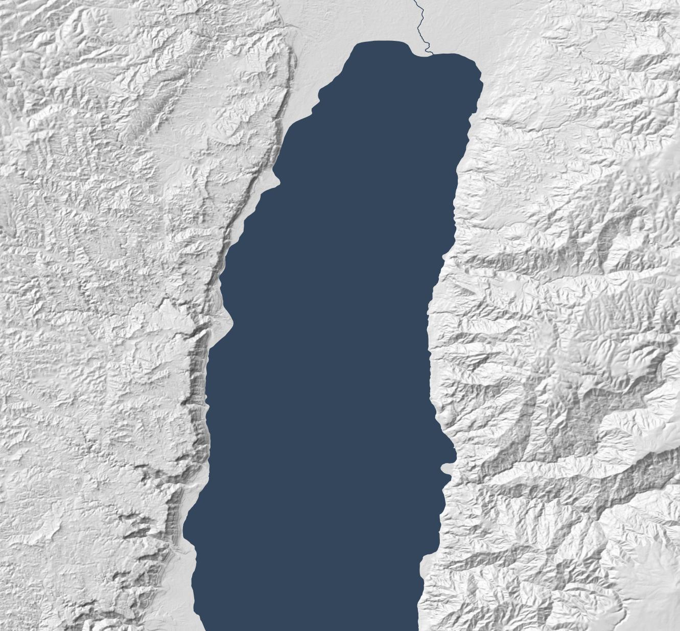
In mountainous areas, not all the color depth is preserved. The below satellite view of part of the Sinai peninsula shows darker tones in the mountains and more contrast in the drainage areas, compared to the synthetic view. The orange area in the northwest also shows up better in the satellite view. When compared side-by-side, the synthetic view feels like a render, lacking some heft.
I didn’t try this technique outside my area of interest, so it may not apply to other, less-arid biomes.
Conclusion
This method is a decently scalable way to generate realistic-looking synthetic satellite views. The result holds up well from scales of 1:1,000,000 (though at that scale, I’d just use Natural Earth II plus vegetation) down to scales of 1:125,000 or so. For historical mapping (such as for Bible maps), it recreates a plausible (but stylized) view of how the terrain might have looked in the past, before modern urban infrastructure. It gives a modern feel to a view of the past.
Posted in Geo | Comments Off on Synthetic Satellite-Based Coloring for Historical Maps using Gaea 2
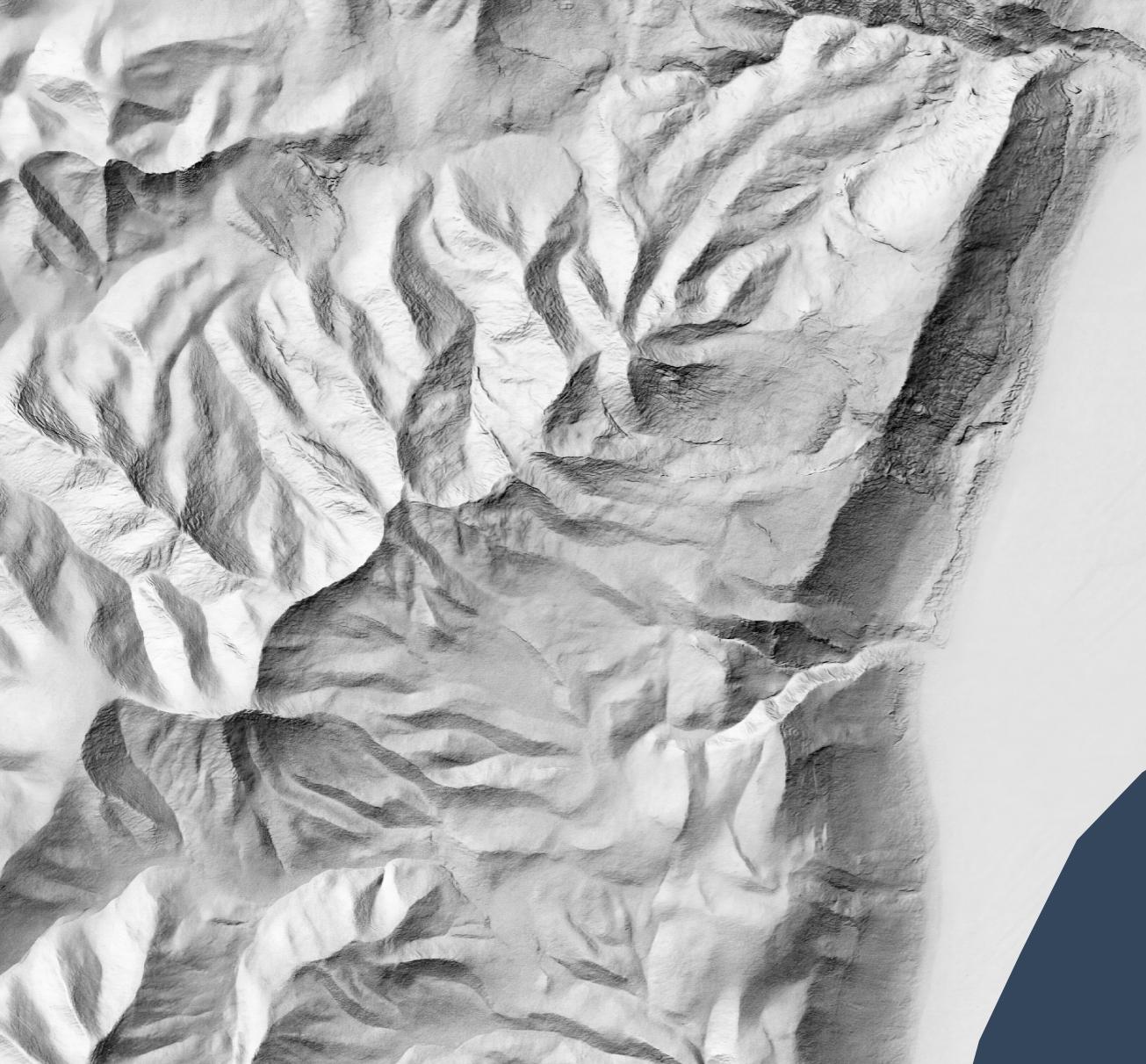
Since 2015, three major hillshading advances have allowed for more attractive but still accurate and efficient-to-create maps than before: advances in data, surfaces, and lighting.
(“Hillshading” means using shadow, light, and sometimes color to turn raw elevation data into something easily understandable by humans.)
Data advances: 30m digital elevation models
From 2003 through August 2015, 90m-per-pixel SRTM data was the best available resolution for the Middle East. Consequently, Bible atlases produced during this time have hillshading that looks something like the following, which is based on this data. (All the maps in this post show an area around the Dead Sea.)
NASA released 30m-per-pixel elevation data in 2015, which means 9x more resolution is available. Everything feels crisper, though the extra detail makes the larger structures harder to discern:
Surface advances: Eduard
The above hillshading style, called “Lambertian,” derives from the 1700s. It’s computationally inexpensive (an algorithm describes it in 1981, and it can run on 1992-era computer hardware) and produces a decent result. This algorithm remains popular today; the standard ArcGIS hillshade function takes essentially the same approach.
Lambertian hillshading appeals to a modern desire for precision and accuracy when compared to older, manual hillshading methods. Since an algorithm is producing the hillshade, the viewer should be able to have confidence that they’re seeing a true depiction of the world. 1992’s Hammond Atlas of the Worldwas the “first all-digital world atlas;” its introduction mentions “producing maps more accurately and more efficiently than ever before.”
In an AI era, however, we no longer have the luxury of believing that an algorithm neutrally presents reality. Algorithms shape us as much as we shape them. Lambertian hillshading presents a view of reality, but it’s not necessarily more “accurate” than manual hillshading; its purpose is to approximate pixel-level lighting, which is reflecting a computationally efficient point of view on what’s important to depict.
More practically, the main problem with Lambertian hillshading is that it “looks sort of like wrinkled tinfoil; full of sharp edges.” It’s busy, creating lots of detail while obscuring larger- and smaller-scale structures. So it’s accurate, but it doesn’t communicate well. By contrast, manual hillshading didn’t necessarily prioritize accuracy but emphasized helping the viewer understand the terrain’s structure. There are ways to make Lambertian hillshading read better (such as resolution bumping), but we now have better algorithms available.
Specifically, we have algorithms that mimic manual hillshading. Eduard (which I’ve mentioned previously) came out in 2022 and is specifically designed to recreate the look of twentieth-century Swiss cartographers, who “were widely regarded as preeminent in the development of printed maps that demonstrated a more naturalistic approach to relief portrayal.”
Eduard models surfaces better by addressing the question, “What form should the viewer see?” Rather than just modeling light (as Lambertian hillshading does), it employs multi-scale smoothing (suppressing noise compared to Lambertian’s pixel independence), a ridge/valley emphasis, and appropriate generalization to emphasize structure.
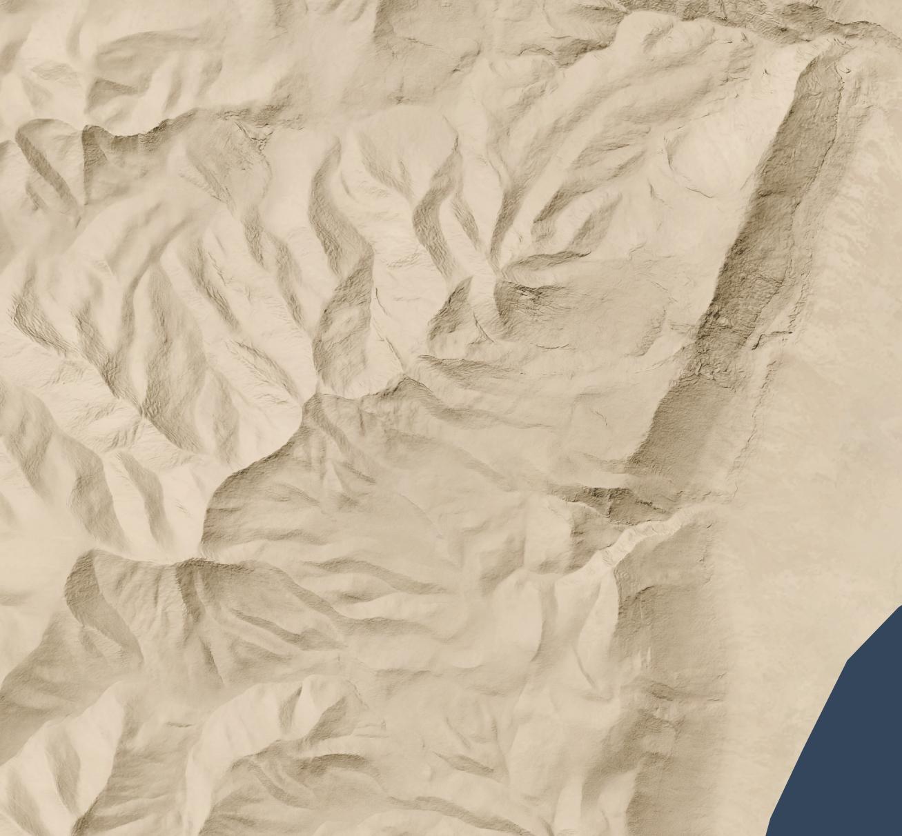
The below map, created with Eduard, uses the same 30m source DEM as the previous map but makes overall geomorphology clearer; small structures coalesce into larger ones, and ridges and valleys are clearer.
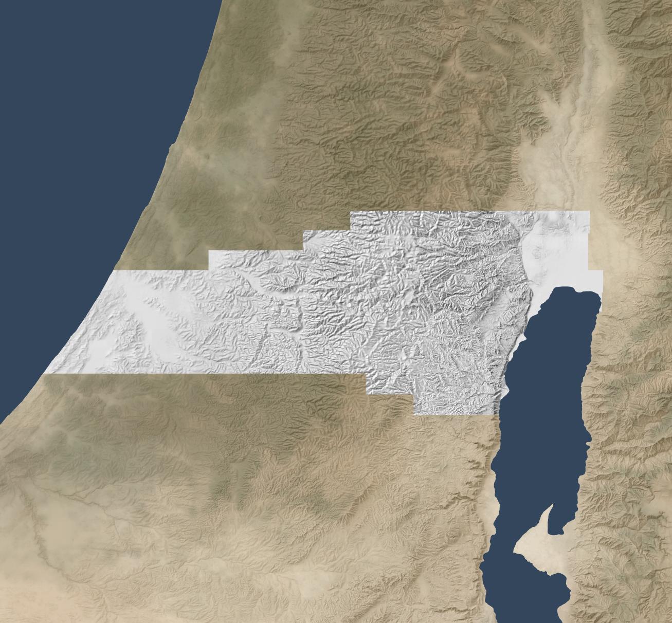
Eduard also generalizes well. The below map makes the overall structure of the Old Testament’s “Promised Land” clear, with coastal plains on the west moving into foothills, then into a central, hilly spine that gives way quickly to a rift valley with the Jordan River. This map preserves the large structures that allow the viewer to focus on the big picture.
Lighting advances: sky models
The final advance since 2015 involves the physics of rendering lighting. Daniel Huffman blogged about using Blender for shaded relief in 2013 and popularized it in a 2017 tutorial. This technique involves using 3D modeling software to produce more-realistic shadows than Lambertian shading does.
(ArcGIS introduced multidirectional hillshades in 2014, which is a refinement to the standard Lambertian approach but still creates an unnatural plastic effect to my eye. They also introduced several more hillshading tools in 2015.)
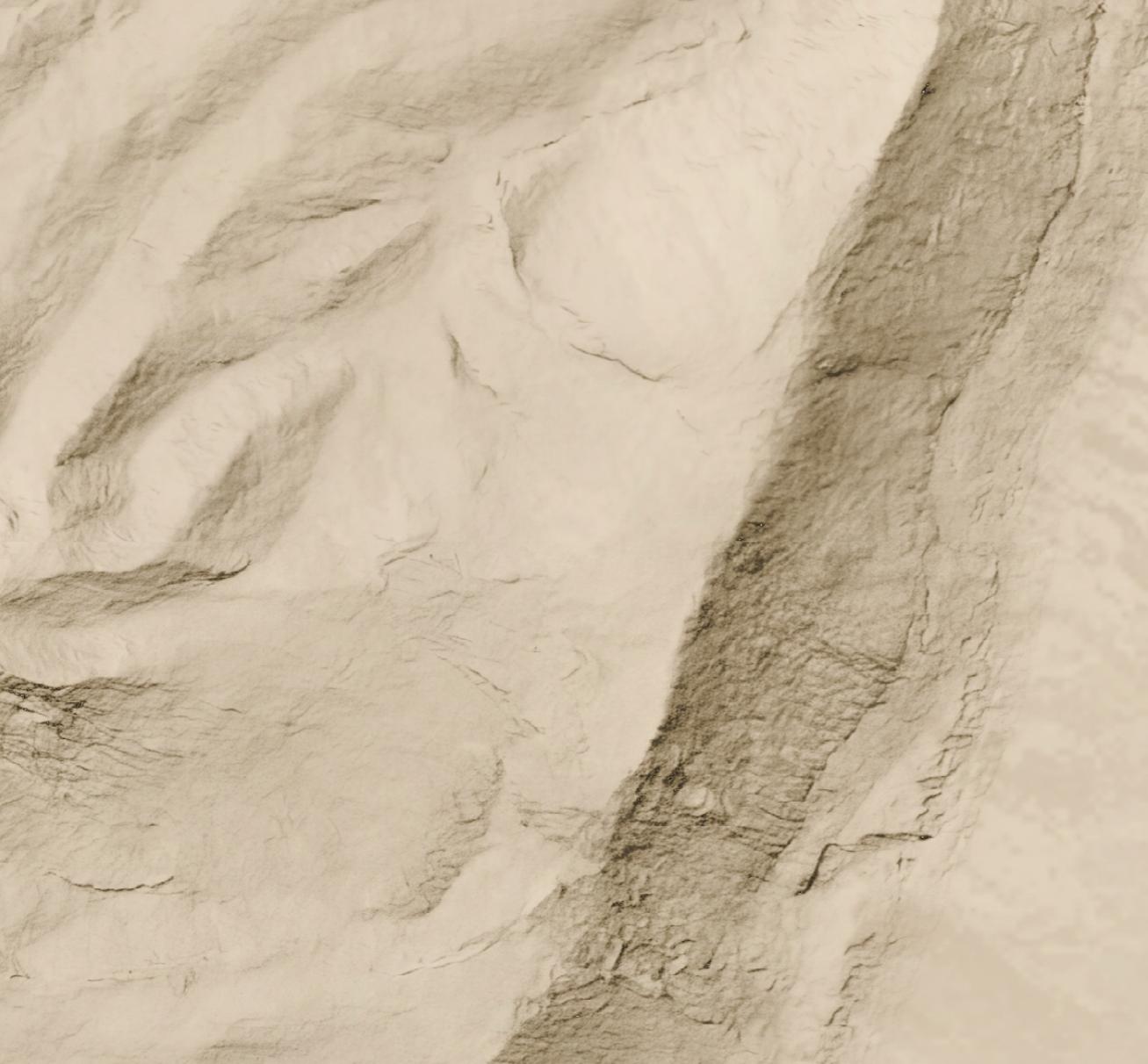
The below map uses the Sky Model in Terrain Shader Toolbox plugin for QGIS to produce a Blender-like effect using just shadows. (Check out this video for more background on this plugin.) The Sky Model creates 200 lighting snapshots from different angles and then combines them to produce a strong and dramatic shadowing effect. The Arnon gorge in the bottom right is clearly visible, as is the El Buqeia valley near the northwestern coast of the Dead Sea. It also captures the drama of gorges along the western coast of the Dead Sea.
Combining Approaches
The sky-model (or skybox) approach does have drawbacks; it compellingly preserves local features but doesn’t generalize them well. The best overall approach, in my opinion, is to combine 30m Eduard shading with the sky model, reducing their opacity so that they don’t overwhelm the landscape. This approach combines the generalizing features from Eduard with the detailed shadows from the sky model to produce an accurate, easy-to-understand hillshade:
Conclusion
Recent advances in data, surfaces, and lighting make hillshading from even ten years ago feel low resolution and computationally sterile. HIllshading from 1990 to 2020 fits into a historical era when “accuracy” and “efficiency” came to the forefront. It was based on the best data and techniques at the time, but new techniques allow us to move beyond Lambertian hillshading.
I expect that future Bible cartography will use these advances to produce attractive and understandable relief maps where the terrain depiction supports the map’s purpose, contributing to the map’s story without being distracting.
Let’s say you want a high-resolution (1.2 meters per pixel) hillshade like this one of cliffs and hills to the west of the Dead Sea:
1:13,000 scale
So that you can layer it over a satellite image (compare the original satellite image without hillshading added):
Or maybe over an idealized landscape with human features removed:
Here’s a full-resolution view (1:5,000 scale) of part of the cliff area.
But all you have is a lower-resolution (30 meters per pixel) hillshade like this:
Nano Banana Pro can help you out, if you’re willing to accept that it’s making up all the details it’s adding to your lower-resolution hillshade and that your high-resolution hillshade looks nice but doesn’t necessarily reflect reality.
Here’s how I made the above hillshade and tiled it to cover about 3,000 square kilometers around Jerusalem.
Process
First, I used Eduard to create a 30m-per-pixel hillshade derived from the recent CC-BY-licensed GEDTM30. I gave the hillshade to Nano Banana Pro along with this prompt, repeating it a few times until I was satisfied with the result. I considered whether to go straight from the DEM to the final hillshade (which does actually work decently), but I wanted to take advantage of Eduard’s hillshading know-how. I also wasn’t confident that I could use the DEM for tiling.
Once I had an initial tile, it was mostly a matter of creating tiles that extended from existing tiles. I ran Nano Banana Pro repeatedly with this prompt, overlapping each tile by 248 pixels for a 2K tile and 496 pixels for a 4K tile (about 25 square kilometers) to ensure that the style and luminosity were consistent between tiles. Here’s an example tile overlap with high-resolution hillshade on the right and bottom sides of the tile.
I did experience some style drift, however; the hillshades got fainter over time.
This process worked great for hilly terrain; I almost never had to regenerate a tile.
For terrain with large flat areas, however, this process fell apart quickly. It often took several tries, plus adjusting the amount of overlap between tiles, to get a usable result. Typically, Nano Banana Pro wouldn’t match the luminosity of the surrounding tiles, or it would add distracting detail to the flat area. It was possible to get a decent result, but it required lots of human attention and tinkering—in other words, it wasn’t an automated process like the hilly terrain was.
If you look hard enough, you can find some tiling artifacts in flat areas (and a few in hilly areas). In practice, these tiling artifacts won’t be visible to map viewers since you’re likely draping the hillshade over some kind of background and reducing the opacity or increasing the gamma to keep the hillshade from overwhelming the viewer.
I didn’t use Photoshop on any of these tiles (though I did sometimes run a histogram match between the source tile and the result tile), but I probably would need to if I were to create more tiles for flat areas.
Results
In all, I created hillshades for about 3,000 square kilometers around Jerusalem, spending US$70 on Nano Banana Pro (2.3 cents per square kilometer, or 6 cents per square mile). That cost includes a lot of experimentation; at scale, with a mix of hilly and flat areas, the all-in cost is about 1.8 cents per square kilometer.
This area represents about 15% of the area of the full extent of ancient Israel (“Dan to Beersheba”), which means it would cost around $500 to create a full set of tiles. I stopped tiling when I exhausted my budget for this project (and my patience for regenerating flat areas).
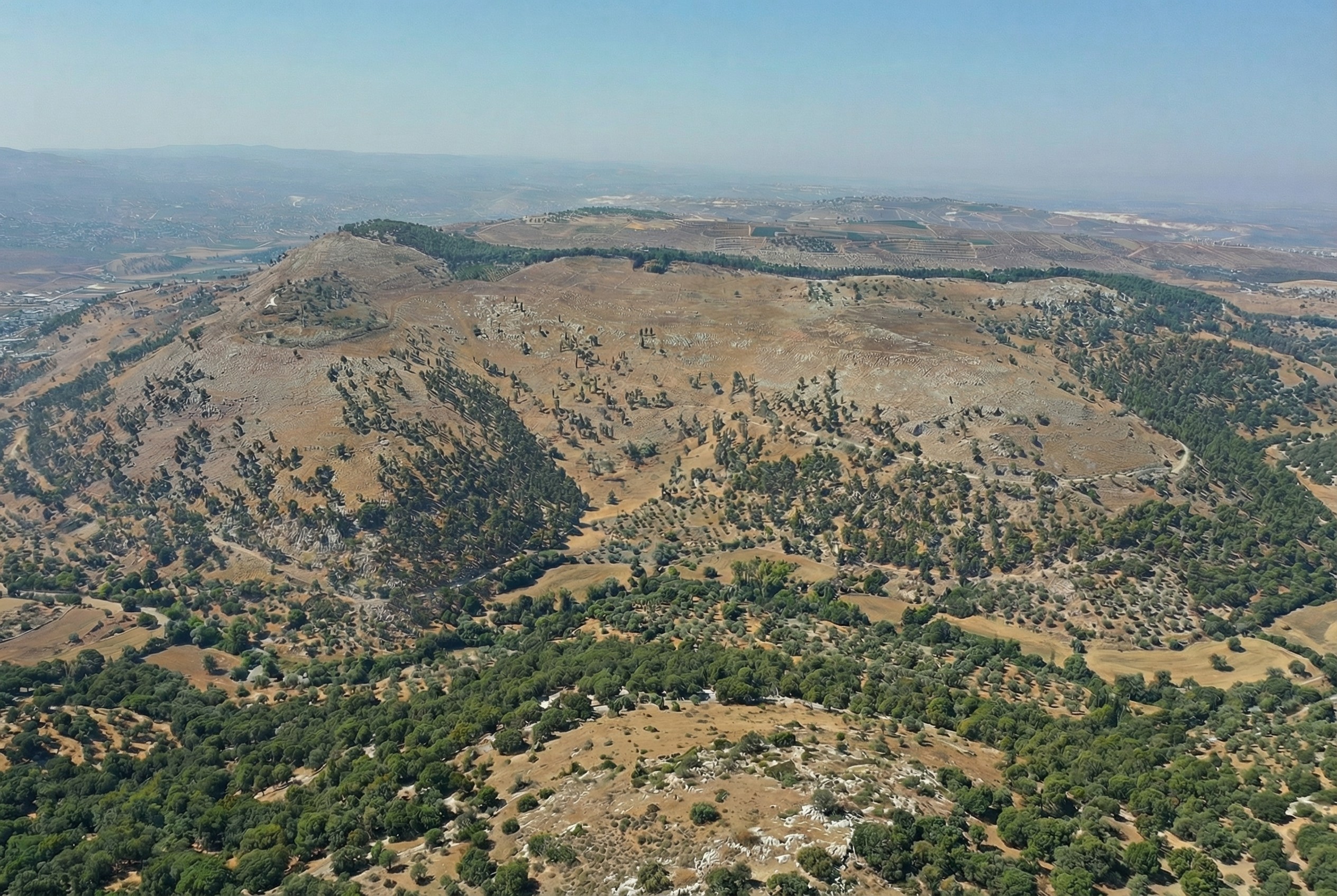
Here’s the coverage area:
Discussion
As noted above, the resulting hillshade is plausible but fake—there’s no way any process can turn a 30m hillshade into a 1.2m hillshade and reflect reality.
Whether you want to use this method depends on your application. If you’re creating a fantasy map, you’re already two steps removed from reality, so this method can add some extra realism to your map. If you’re doing historical mapping, you’re one step removed from reality, as climate, landforms, and landcover have shifted over time.
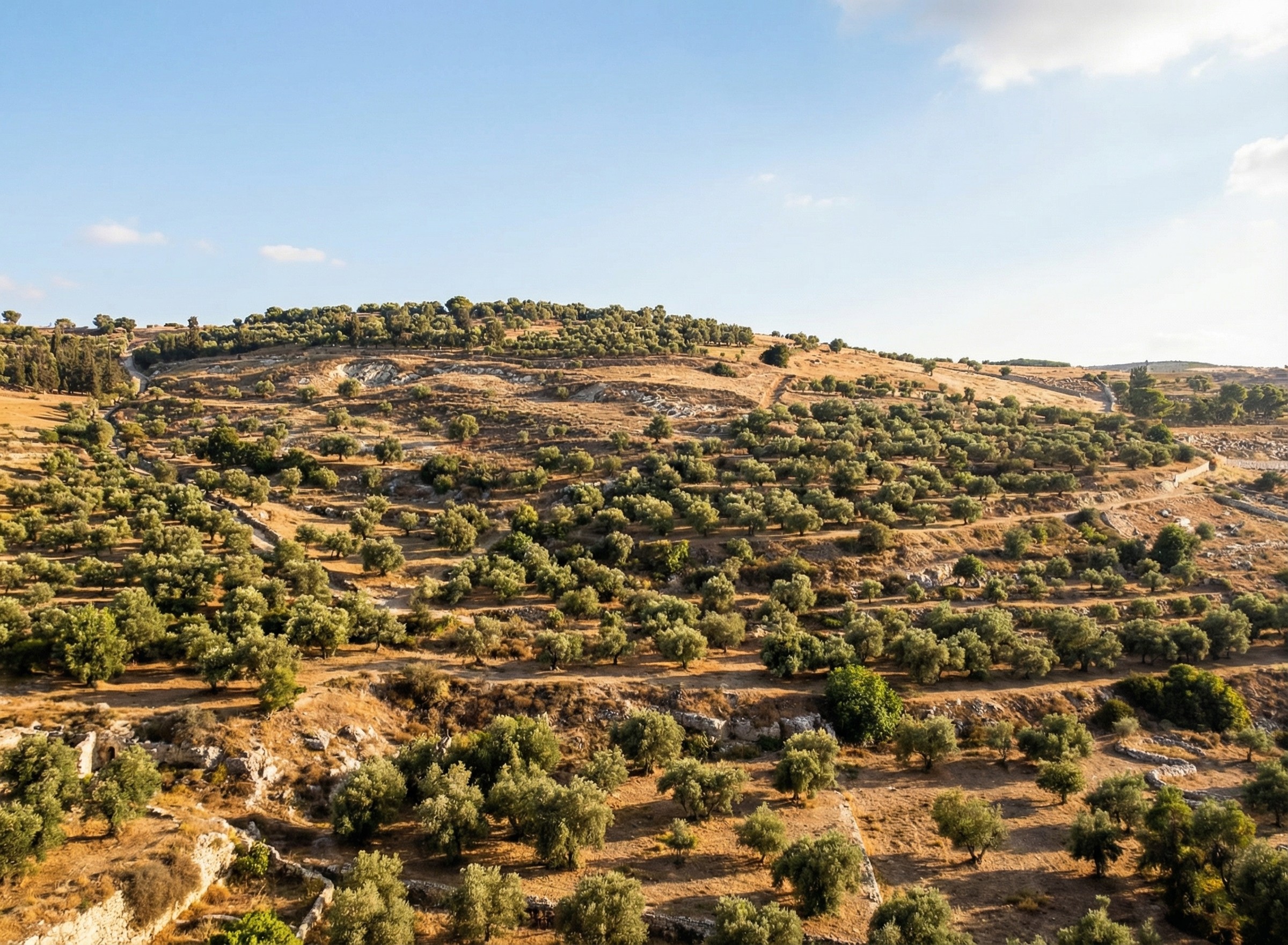
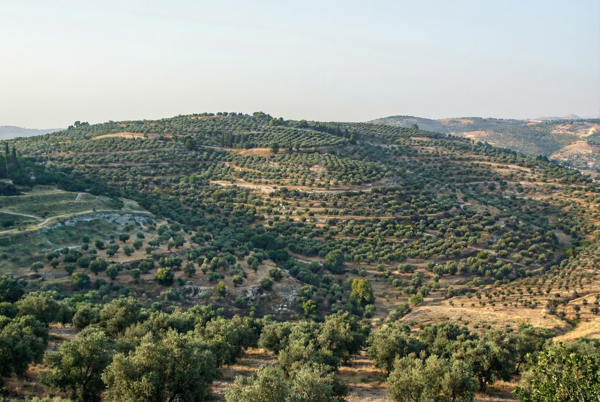
This method shines where you’re pushing past the detail available in the lower-resolution hillshade and want to provide a crisper experience without presenting all the detail that’s available in the higher-resolution hillshade. The Good Samaritan images below show where I think this method works especially well.
The hillshade quality is pretty good. In general, the results are hydrologically consistent (rivers drain in the correct direction). It also captures the traditional hillshade look exceptionally well, in my opinion, and this process scales well in hilly terrain. The limiting factor in hilly terrain is cost, whereas the limiting factor in flat terrain is the time involved to revise tiles. In flat areas, it might make sense to retain the lower-resolution hillshade or to use a different super-resolution method.
In principle, it would be possible to create a model similar to Eduard’s U-Net approach that could go from low-resolution to high-resolution hillshades without involving Nano Banana Pro. I’m skeptical that it would handle drainage properly, but the bigger barrier is that Google’s terms of service preclude creating such a model.
Conclusion
To give you a practical application, here’s a closeup of the road from Jericho (where the two roads intersect on the right) to Jerusalem (which is off-map to the left). This road reflects the setting of the Good Samaritan story. Everything on the high-resolution map feels crisper and clearer thanks to imaginary AI detail.
First the lower-resolution map:
And then the higher-resolution map:
The source 30m hillshade and derived 1.2m hillshade are both available here for your use. You’ll probably want a GIS tool like QGIS to work with them; you won’t be able to just use them as-is in Google Earth.
If you’re using free Natural Earth rasters as a base layer for your historical cartography needs (and why wouldn’t you be?), you might find it helpful to add an extra layer of vegetation to create more consistency with satellite views:
Here’s the original Natural Earth 2, where you can see that vegetated areas are much lighter-toned:
Vegetation also punches up a regional view by adding realistic coloring. Note especially the darker areas along the eastern and northern Mediterranean coast:
Compared to the original:
Even on more-minimalist maps, vegetation can convey information without adding distracting detail. For example, here’s water, hillshading, and vegetation on a neutral background:
Try it yourself
The vegetation data in the above maps is derived from a 2023 article in Nature that plots idealized vegetation coverage.
In the above maps, I converted the data to an 8-bit grayscale and then applied this color ramp to the layer in QGIS.
Why potential vegetation
Instead of showing current vegetation cover, which reflects modern, human-induced changes to the environment (such as deforestation and irrigated agriculture), these maps show what the vegetation coverage might be without humans. While the landscape in biblical times was hardly untouched by humans, such changes were much smaller-scale than they are today. This type of view helps recreate a version of the natural world that’s closer to what biblical writers experienced.
Natural Earth 2 provides a good basemap for historical mapping because it aspires to present a less-developed earth: for “historical maps before the modern era and the explosive growth of human population, [potential natural vegetation maps] more accurately reflect what the landscape actually looked like. The Mediterranean region at the time of the Phoenicians was more verdant than today.”
More-detailed vegetation alters the character of the Natural Earth maps somewhat by elevating vegetation over other biome indicators. It doesn’t preserve as strongly the distinction between the different kinds of forests (tropical, temperate, and northern) that Natural Earth 2 makes. For historical maps, these changes mean that the adjusted maps feel more in line with satellite imagery.
Depending on your map’s purpose, you may find that presenting vegetation this way tells a clearer story to the viewer.
Posted in Geo | Comments Off on Enhancing a Natural Earth Base Layer with Potential Vegetation Data
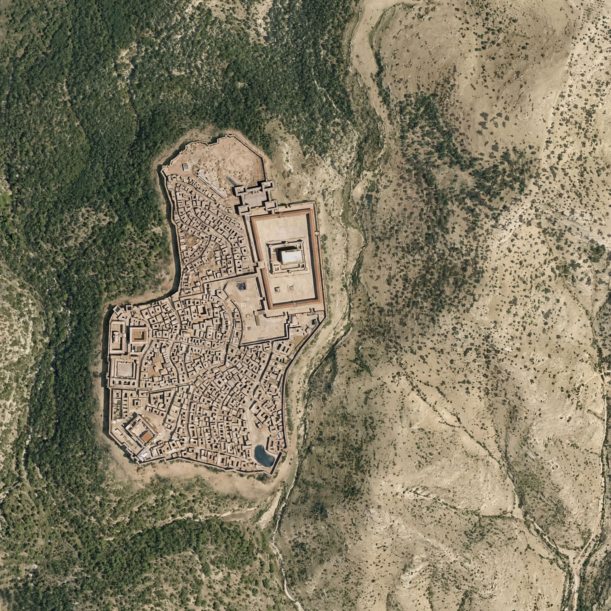
If you’re wondering whether Nano Banana Pro can credibly integrate a view of Roman-era Jerusalem into the rewilded landscape from the last post, the answer is yes. I appreciate how the above image even cleared some of the area around the walls, as you’d expect from history. The structures inside the city walls are mostly too large, however.
Here the rewilded landscape is misleading—during the time of Jesus (which the above image depicts), the area around Jerusalem was less forested than this image suggests. The area included agriculture, roads, pasturelands, and other changes introduced by humans.
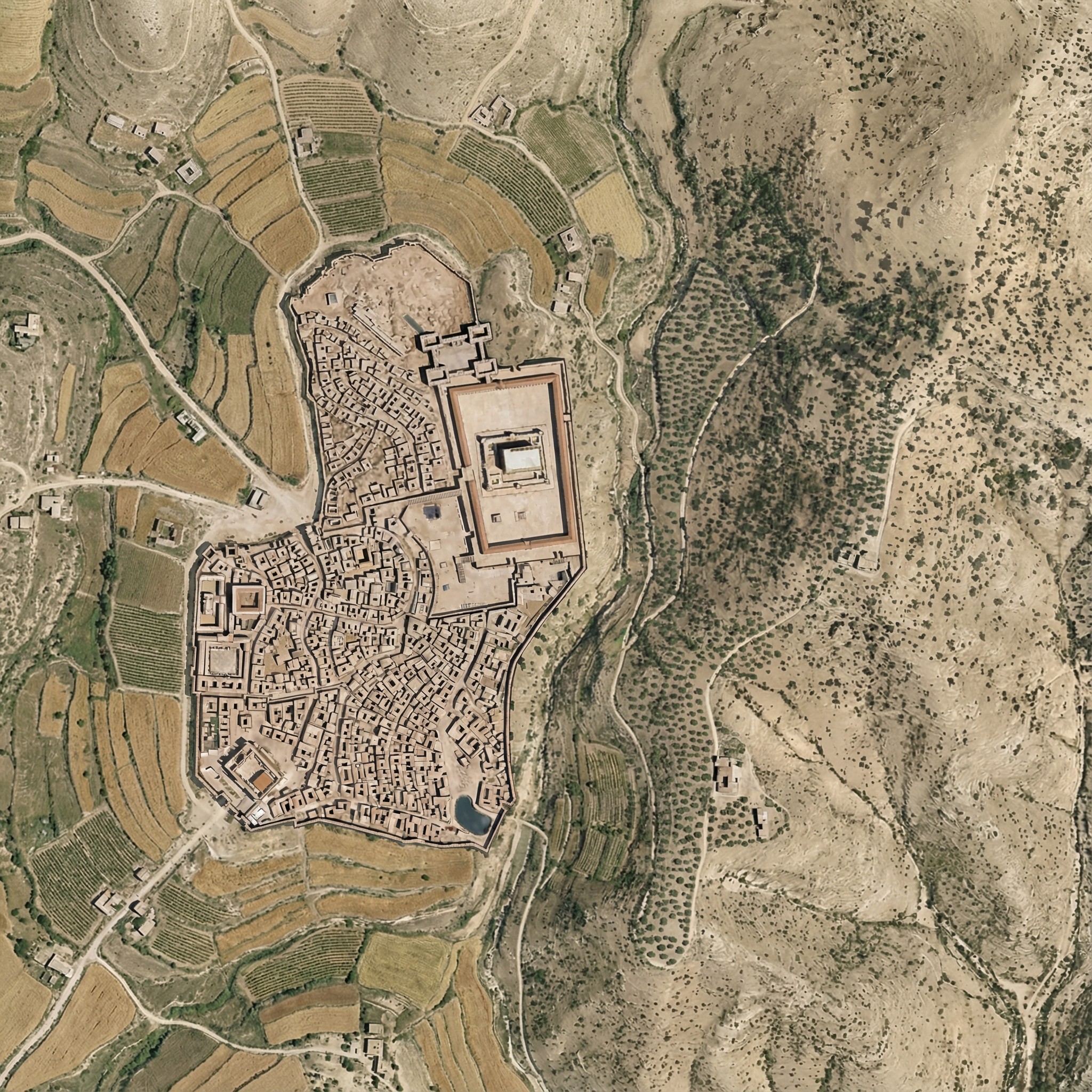
Below is my attempt at using Nano Banana Pro to convey this human activity. It regraded the whole image slightly, and the roads aren’t exactly right. I also don’t think the Hinnom Valley south of the city would have this much agriculture. The terraced agriculture is a nice touch, though, since I spent so much time getting rid of terraces in the original image.
Here was my prompt:
Right now, this Roman-era city of Jerusalem feels pasted on, because it is. Integrate the feel of the city so that it integrates into the rest of the landscape.
Also add ancient roads and small-scale agriculture (think wheat barley, olives, and vineyards), reducing the forested area. Don’t have agriculture immediately outside the city walls. Especially include cultivated olive groves on the Mount of Olives across the gully to the east of the city.
Add a few small structures and villages in the area outside the walls (isolated farmhouses, etc.) that are appropriate for the time.
Make sure there’s a way to get into the city from the west (left) near where the walls make a “J” shape.
Keep the rest of the landscape as-is and don’t adjust the overall lighting or colors of the scene, just of the city.
Posted in AI, Geo | Comments Off on Integrating Roman-era Jerusalem into a Rewilded Landscape
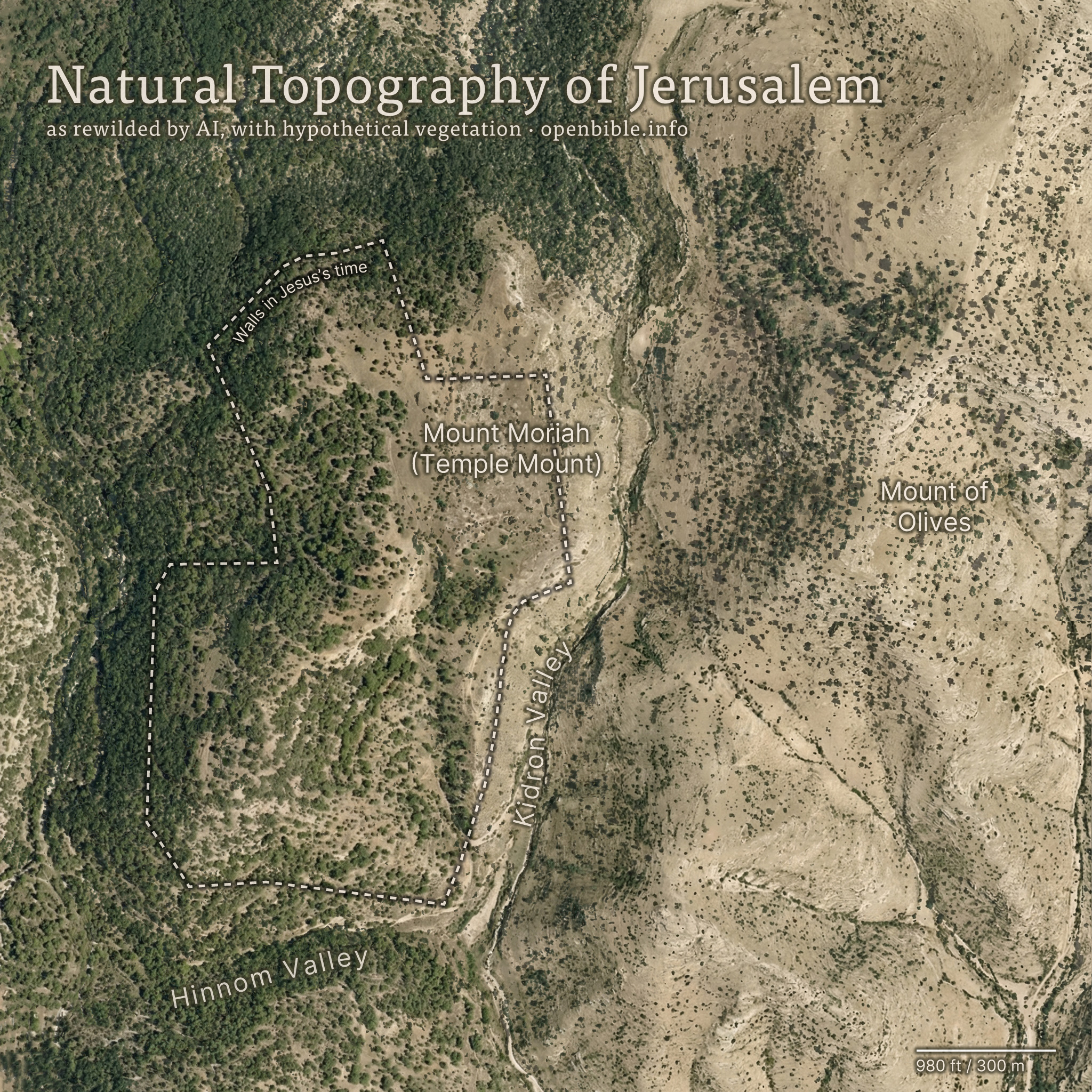
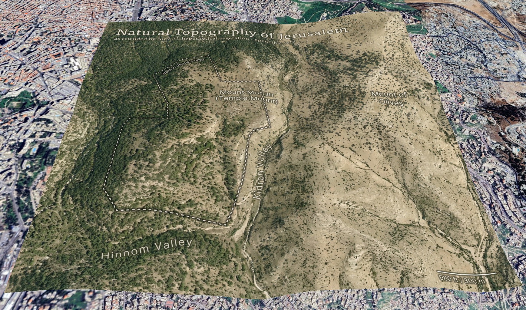
Nano Banana Pro can rewild photos of archaeological sites with AI; it can also create rewilded maps. For example, here’s a fake satellite view of the Jerusalem area with all structures, roads, and anything human-created removed:
And georeferenced in Google Earth:
AI enables creating this kind of map in a few hours, rather than the weeks it would have taken using traditional methods.
The effective resolution of this image is about 1.2m per pixel, equivalent to a high-resolution (and therefore expensive) satellite photo. (A true satellite photo would show mostly urban development here, of course, and wouldn’t be terribly useful for visualizing the underlying landscape.) The topography is mostly accurate; the vegetation coverage is speculative.
Methodology
First, I needed a relatively high-resolution topography for the area around historical Jerusalem: approximately 2.3km by 2.3km (about 2 square miles). The highest-resolution free Digital Elevation Models are 30m per pixel, which at this latitude gives a grid of about 100 x 100 elevation pixels. While that may not sound like a lot, it’s enough to create a final 2,048 x 2,048-pixel image—but the low resolution of the source data also reinforces how much the AI is inventing fine surface detail.
I started with the GEDTM30 global 30m elevation dataset (which, as a DTM, aims to give bare earth elevations, excluding buildings and landcover). Using these instructions, I created 5m contour intervals in QGIS and exported them to a png. I compared these contours with 5m GovMap contours; they differed in some details but were plenty close enough for this purpose.
Here’s where Nano Banana Pro came in. I gave it the contours and the following prompt (the “text” in the prompt refers to the contour elevation labels):
This is a detailed map of the area around Jerusalem. Convert it to an overhead aerial view. Preserve all the topography exactly. Remove all text. Apply landcover (especially trees and scrub) in a naturalistic fashion and show bare dirt, light scrub, and trees where hydrologically appropriate.
Smooth out all the elevation lines—there are only smooth hills, no terraces or cliffs. Use the elevation lines as a reference, not to create terraces. No terraces should be visible at all; just smooth them out.
The idea is to make it look natural, without any human developments.
As you can tell from my pleas in the prompt, Nano Banana Pro really liked making terraces (since the contour intervals look like terraces). I ended up generating twenty-four iterations but used the seventh one because it preserved the topography of the City of David especially well. Each generation had different pluses and minuses—some were better at color, some at vegetation, and some at hydrology. That’s part of the beauty of using AI: it allows rapid iteration and many generations at low cost. This project cost about $5 in total.
I also explored giving it a version of the DTM itself (with the elevations scaled to grayscale values 25 through 244), as well as a hillshaded version. Nano Banana Pro gave me roughly comparable results for each, but I preferred how the contour versions turned out.
With a 2,048 x 2,048-pixel png in hand, it was time for Photoshop. I used the spot healing brush extensively to remove visible terraces. I also went back to Nano Banana Pro to generate trees and scrub for certain areas, brought in parts of other discarded generations, and used Photoshop’s built-in generative features in some places. You can definitely see artifacts from my editing if you look closely at the finished map. I also added an exposed rock (just visible under the “m” in “Temple” in the above map) where the Dome of the Rock now stands.
Then it was off to Illustrator to add the text and the outline of the city walls. ChatGPT gave me a few pointers to refine the look.
Finally, I georeferenced the map in Google Earth and consequently adjusted some of the wall placement in Illustrator to align the wall more precisely with structures that are still visible today.
Discussion
I’ve never used an AI + real data workflow like this one before. It would’ve been prohibitively time-consuming to create this map without AI, which is part of the ethical question around using AI. Did I “steal” the hundreds or thousands of dollars I might otherwise have paid a cartographer-artist to create this map? More realistically, I never would have created it at all.
The map’s high degree of realism could lead people to believe that it reflects reality more than it does; at first glance, you could easily take it for a real satellite photo. The landscape that it depicts never looked exactly like it does in the map. This combination of extreme realism with plausible hallucinations captures the current state of AI in a nutshell: it looks real, but it isn’t.
The map depicts a pre-human landscape (thus the “rewilding”). Biblically, it’s closest to how it might have looked in Abraham’s time, before subsequent urbanization. But even during his time, there still would be settlements, visible footpaths, grazing areas, small-scale agriculture, and potentially less forest.
Nano Banana Pro’s interpretation of the elevation data is reasonable. I feel like it made some of the eastern hills ridgier than they are in reality, however.
It also did a good job with the trees and scrub, though they’re much more speculative than the topography. I chose, artistically, to forest the western half of the map more than the eastern half, since Jerusalem approximately marks where denser vegetation in the west would yield to sparser vegetation in the east. I may have gone too far in either direction—too much forest in the west and too little vegetation in the east.
In addition to reconstructing archaeological sites from photos, Nano Banana Pro can do the opposite: it can rewild them—removing modern features to give a sense of what the natural place might have looked like in ancient times. Where reconstruction involves plausible additions to existing photos, rewilding involves plausible subtractions from them. In both cases, the AI is producing “plausible” output, not a historical reality.
Mount of Olives
For example, the modern Mount of Olives has many human-created developments on it (roads, structures, walls, etc.). My first reaction to seeing it in person was that there were a lot fewer olive trees than I was expecting, and I wondered what it would’ve looked like 2,000 years ago.
Nano Banana Pro can edit images of the Mount of Olives to show how Jesus might have seen it, giving viewers an “artificially authentic” experience. It’s “authentic” by providing a view that removes accreted history, getting closer to how the scene may have appeared thousands of years ago. It’s “artificial” because these AI images depict a reality that never existed, combined with a level of realism that far outshines traditional illustrations. Without proper context, rewilded AI images could potentially mislead viewers into thinking that they’re “objective” photographs rather than subjective interpretations.
Rewilded Mount of Olives
The first image below is derived from a monochrome 1800s drawing of the Mount of Olives, which allowed Nano Banana Pro to add an intensely modern color grading (as though post-processed with a modern phone). The second is derived from a recent photo taken from a different vantage point.
Similarly, here’s Mount Gerizim, minus the modern city of Nablus. Nano Banana Pro didn’t completely remove everything modern, but it got close. If I were turning it into a finished piece, I’d edit the remaining modern features using Photoshop’s AI tools (at least until Google allows Nano Banana Pro to edit partial images).
This process only works if existing illustrations or photos accurately depict a location. If I owned rights to a library of photos of Bible places, I’d explore how AI could enhance some of them (with appropriate labeling), either through reconstruction or rewilding. A before/after slider interface could help viewers understand the difference between the original photos and the AI derivatives, letting them choose the view they want.
Restoration (using original or equivalent materials to restore portions of the original site) is another archaeological approach that AI could contribute to, but the methods there would be radically different.
Nano Banana Pro did its best job at converting the Mount of Olives illustration, in my opinion. I wonder if doing multiple conversions (going from a photo to an illustration and then back to a photo) could yield consistently strong results.
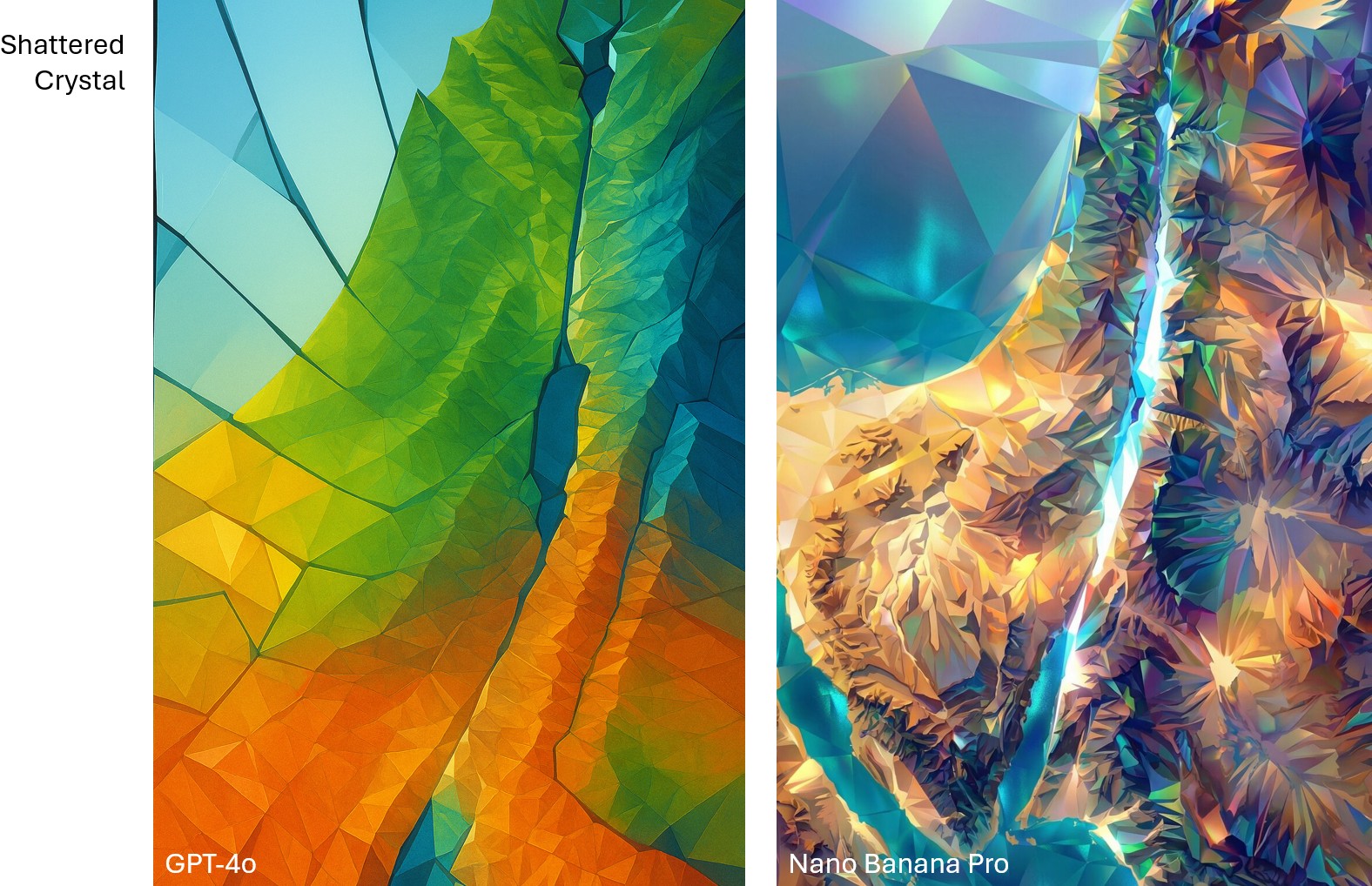
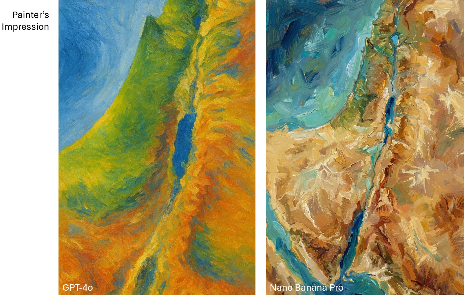
In April, I had GPT-4o create a bunch of maps of the Holy Land based on an existing public-domain map. My chief complaint at the time was that GPT-4o “falls apart on the details”—it gives the right macro features but hallucinates micro features (such as omitting specific hills and valleys and creating nonexistent rivers).
Nano Banana Pro changes that. It preserves features both big and small and doesn’t alter the location of features you give it, which means that you can hand it a map, have it transform the look, and then export it back out of Nano Banana with the correct georeferencing. You can completely change the appearance of a map and just swap it out for your purposes.
This time, I started with the same public-domain map but had Nano Banana Pro extend it so that it would have the same 2:3 aspect ratio as the GPT-4o images. It did a phenomenal job. If you’ve heard of the “jagged frontier” of AI, this work is an example of “sometimes it’s amazing.” There’s no reason why it should be so good at creating a map this accurate. But here we are. (You can download the 4K version of the generated image.)
Then I ran the same prompts on Nano Banana Pro that I used for the earlier GPT-4o images. The results preserve all the details but apply the appropriate style. While the Nano Banana Pro images are more accurate, I feel like the GPT-4o images were, on the whole, more aesthetically pleasing for the same prompt. On the other hand, the NBP images followed the prompts way better. Only a few of the more heavily stylized NBP images inserted the nonexistent river between the Red Sea and the Dead Sea.
Compare the “shattered crystal” look between GPT-4o and Nano Banana Pro. GPT-4o is more conceptual, while Nano Banana Pro is more literal.Compare the “painter’s impression” look between GPT-4o and Nano Banana Pro. To my eye, the GPT-4o one captures Impressionism better.
Below are some of my favorite Nano Banana Pro images. The first two recreate the Shaded Blender look that’s so hot right now. The second two show how NBP can change up the style while preserving details. I especially love how the last one makes the Mediterranean Sea feel vaguely threatening, which captures ancient Israelites’ feelings toward it.

.jpg)