In 2018, I wrote about using terrain-generation software to make historical maps, with synthetic coloring to generate what look like satellite photos with modern features removed (cities, roads, agriculture, etc.).
This post expands on the earlier one, creating synthetic satellite coloring at scale. When combined with the hillshading and vegetation techniques I discussed recently, it produces credible synthetic map backgrounds down to scales of about 1:125,000 (30m per pixel). With higher-resolution hillshades and vegetation data, it’s credible to about 10m per pixel.
Here’s an example of this technique used in a zoomed-out view, compared to a satellite view of the same area. Both views have hillshading and vegetation layers added.
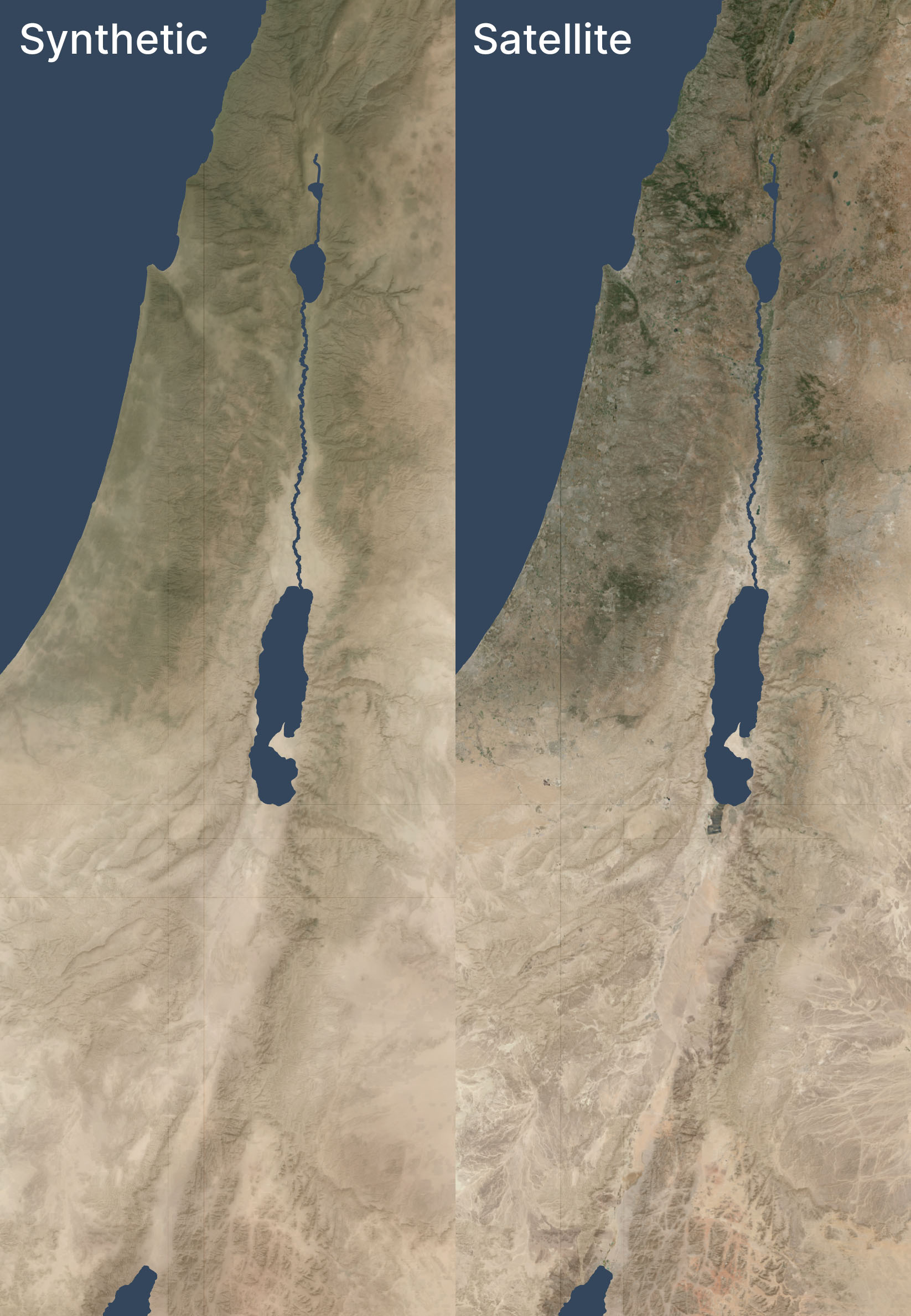
The synthetic and satellite views look pretty close; the synthetic view depicts a more idealized view of the terrain with fewer drainage lines (note especially the southeastern corner) and less extreme color variations (for example, the orange area in the south, east of the Red Sea, is visible but less intense).
Here’s a zoomed-in area (1:250,000 scale) near the Dead Sea, again overlaid with hillshading and vegetation:
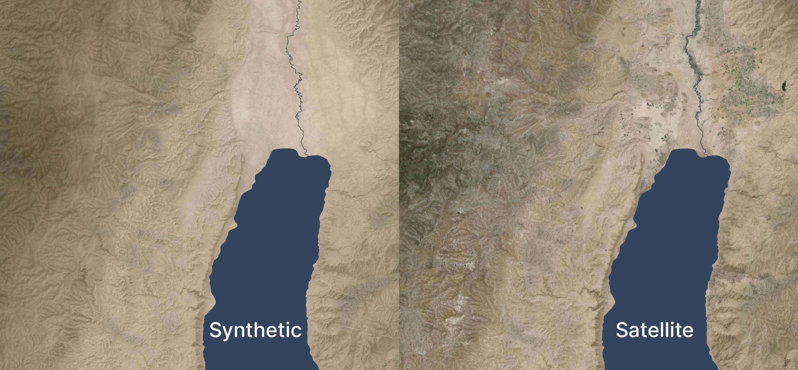
Zoomed in, the colors feel too uniform to me. There’s a decent amount of detailing when you zoom in even further, but it doesn’t read at this scale. I’m OK with it appearing a bit more maplike here because the color variations aren’t necessarily significant; I don’t want to distract viewers with unimportant detail. But I could maybe draw out the highlights a bit more.
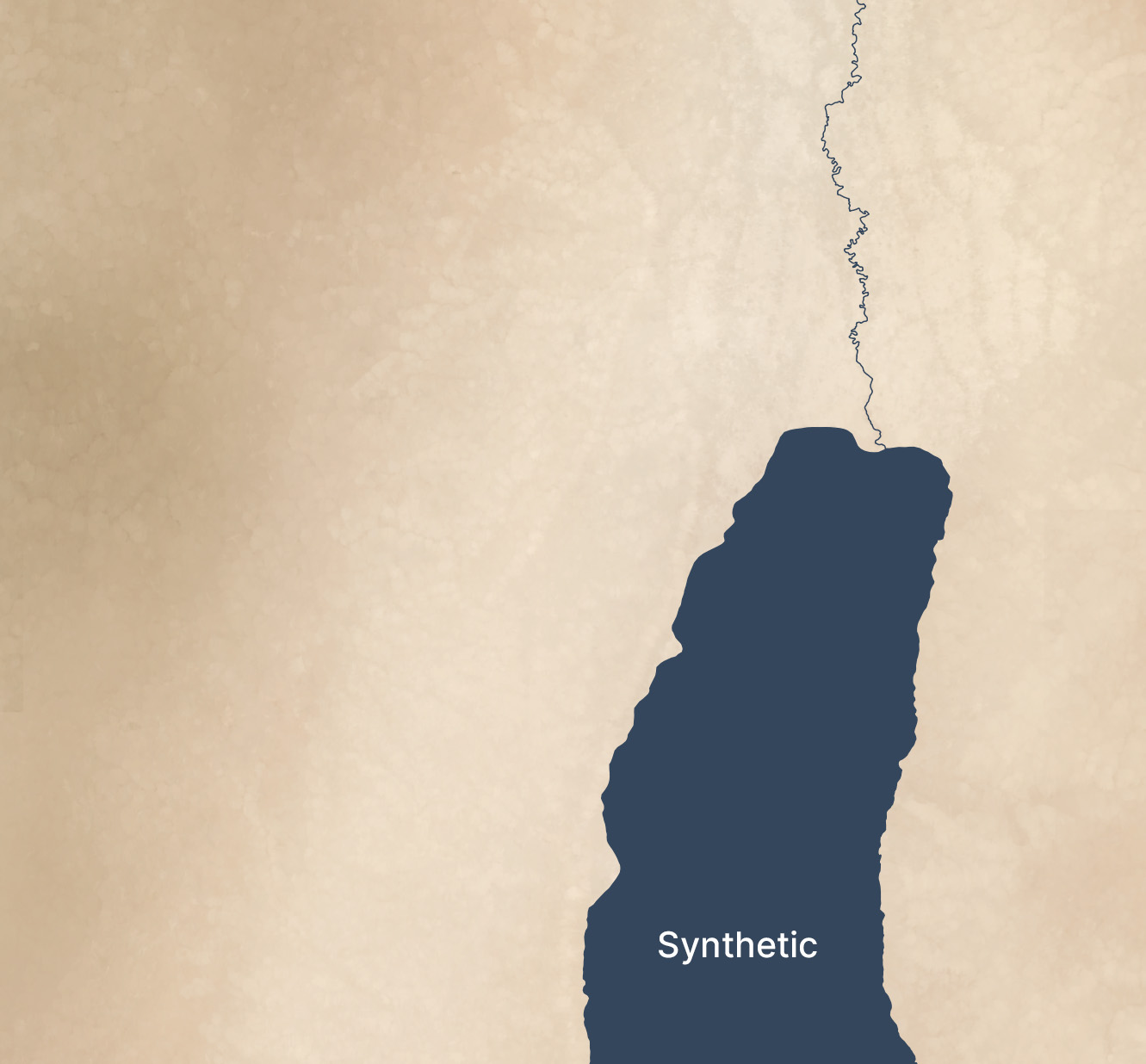
See the third and fourth images in this post for an even-more-zoomed-in view.
Methodology
- Acquire medium-resolution satellite reflectance data for the area in question. I used 10m Sentinel-2 data I had from 2021’s Bible Atlas project. This data came from from Sentinel Hub, but today I might use an annual or quarterly mosaic from Copernicus. NASA’s 30m Harmonized Landsat-Sentinel data is another potential data source.
- Mask any pixels with modern development or forest cover using the Global Land Cover dataset from the University of Maryland (2020).
- Create an 8,192×8,192-pixel tile of the desired area.
- Blur the tile to fill in missing pixels and prevent any remaining modern pixels from leaking into the image.
- Create an elevation tile of the same area (normalizing the elevation values to 0-1). I used GEDTM30.
- Pull the colors and elevation into Gaea 2 (a terrain-generation app) and use the Color Erosion tool to create plausible color flows to add detail. This process took about ten minutes per tile on my PC.
- Add geodata to Gaea 2’s output.
- Move onto the next tile, with a 1,024-pixel overlap to allow smoothing between tiles.
This method automates well; I used it to generate fake satellite data at 10m resolution for 400,000 square kilometers. It’s designed to be overlaid with hillshading and vegetation, not stand on its own.
If you’d like to recreate it, here’s an AI-generated overview of the pipeline and my Gaea 2 file (if you use it, you’ll likely want to adjust the file paths).
Limitations
Tiles with a lot of development and agriculture have a cloudy look thanks to the blurring and the smaller number of valid pixels to work with. The west side of the below image (which excludes hillshading and vegetation), where urban Jerusalem is located, has an indistinct feel to it. The hillshading and vegetation cover up this haziness in the final image, but some of it does leak through.
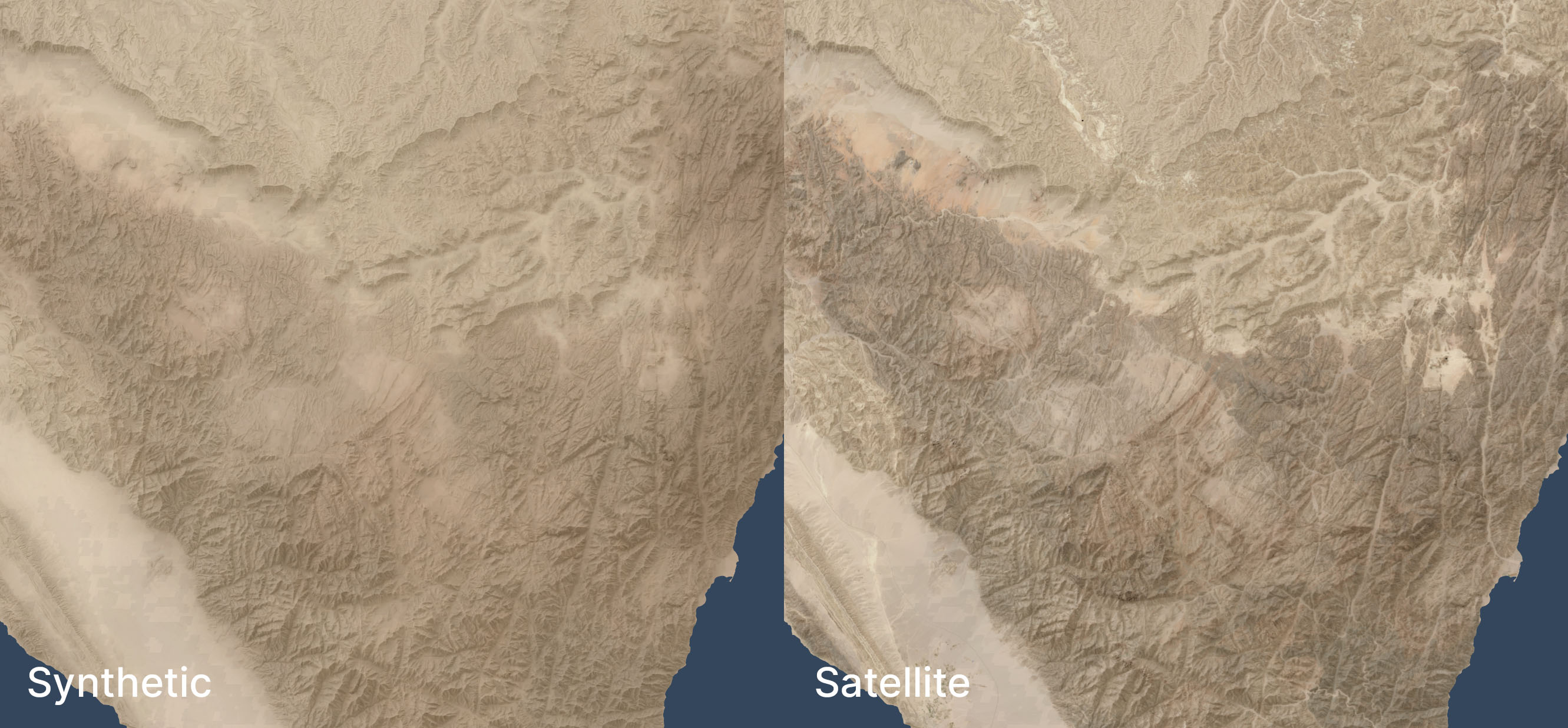
In mountainous areas, not all the color depth is preserved. The below satellite view of part of the Sinai peninsula shows darker tones in the mountains and more contrast in the drainage areas, compared to the synthetic view. The orange area in the northwest also shows up better in the satellite view. When compared side-by-side, the synthetic view feels like a render, lacking some heft.
I didn’t try this technique outside my area of interest, so it may not apply to other, less-arid biomes.
Conclusion
This method is a decently scalable way to generate realistic-looking synthetic satellite views. The result holds up well from scales of 1:1,000,000 (though at that scale, I’d just use Natural Earth II plus vegetation) down to scales of 1:125,000 or so. For historical mapping (such as for Bible maps), it recreates a plausible (but stylized) view of how the terrain might have looked in the past, before modern urban infrastructure. It gives a modern feel to a view of the past.