Browse all 76 Leviticus flowcharts.
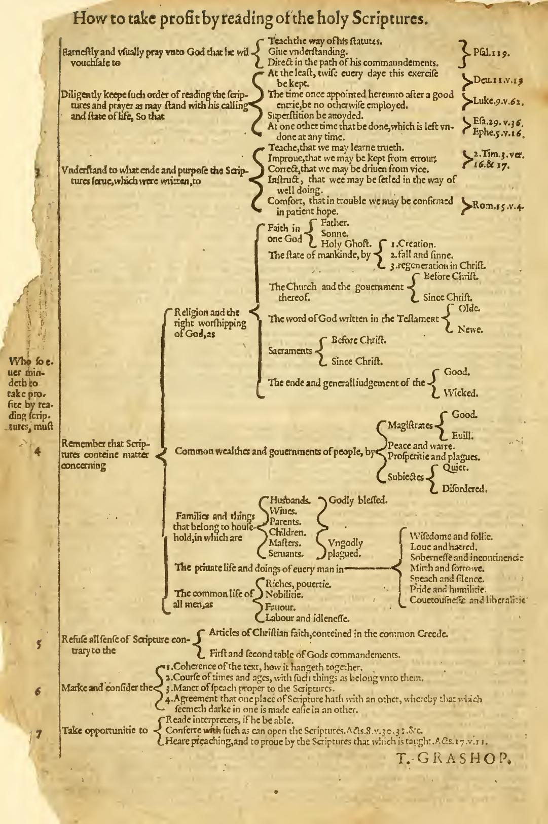
Leviticus probably isn’t your favorite book of the Bible, with its long lists of cleanliness regulations and priestly procedures. But I’ve long thought that the natural format for Leviticus is the flowchart: do this, then this, then this. A flowchart makes the prose much easier to follow. So I spent about thirty minutes a week over the past year turning Leviticus into a series of flowcharts by hand.
However, with Nano Banana Pro, I was able to make more progress in an afternoon than I had in a year—going from raw Bible text to finished flowcharts in four hours. I didn’t even use any of the work I’d done over the past year.
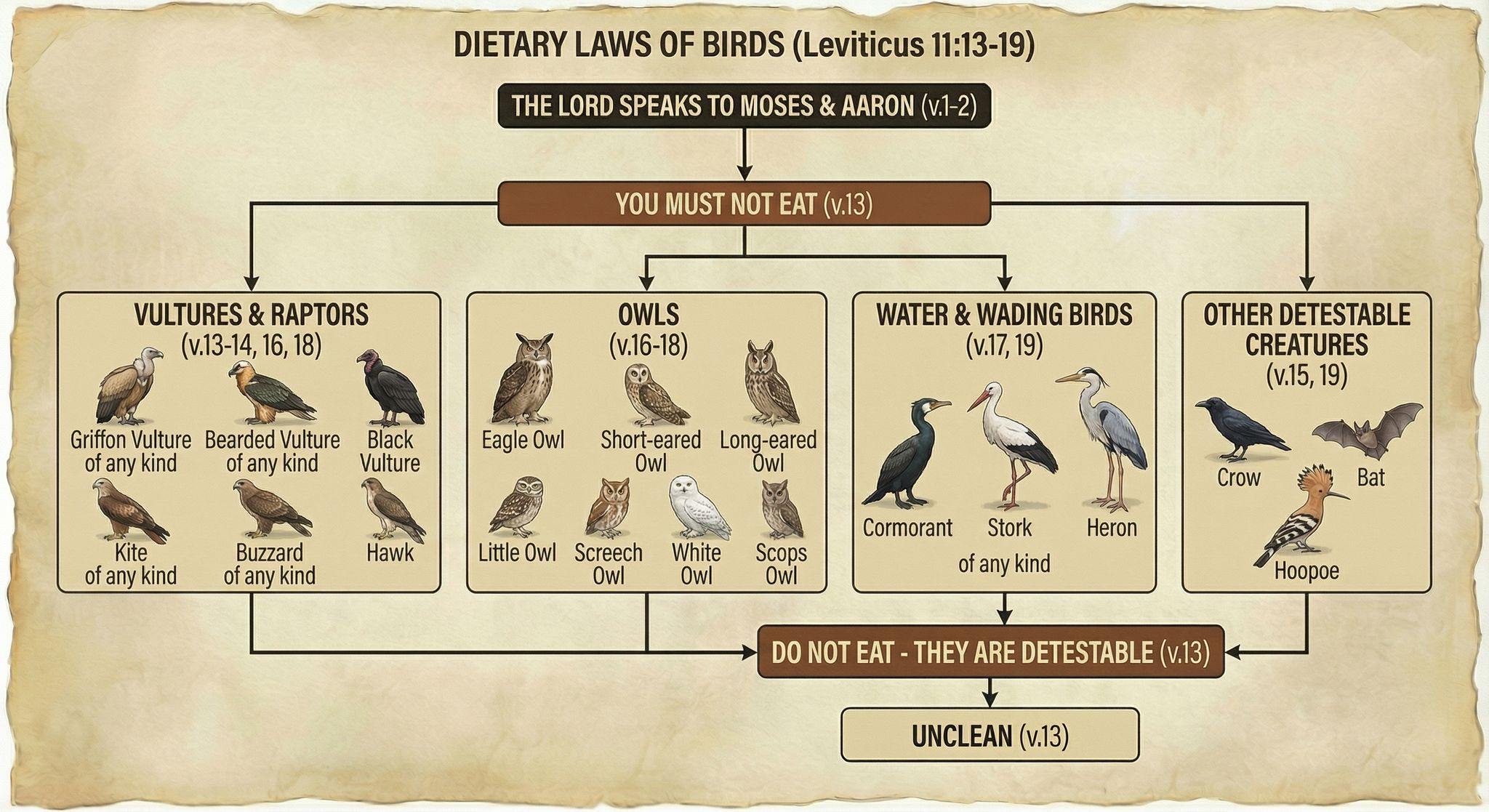
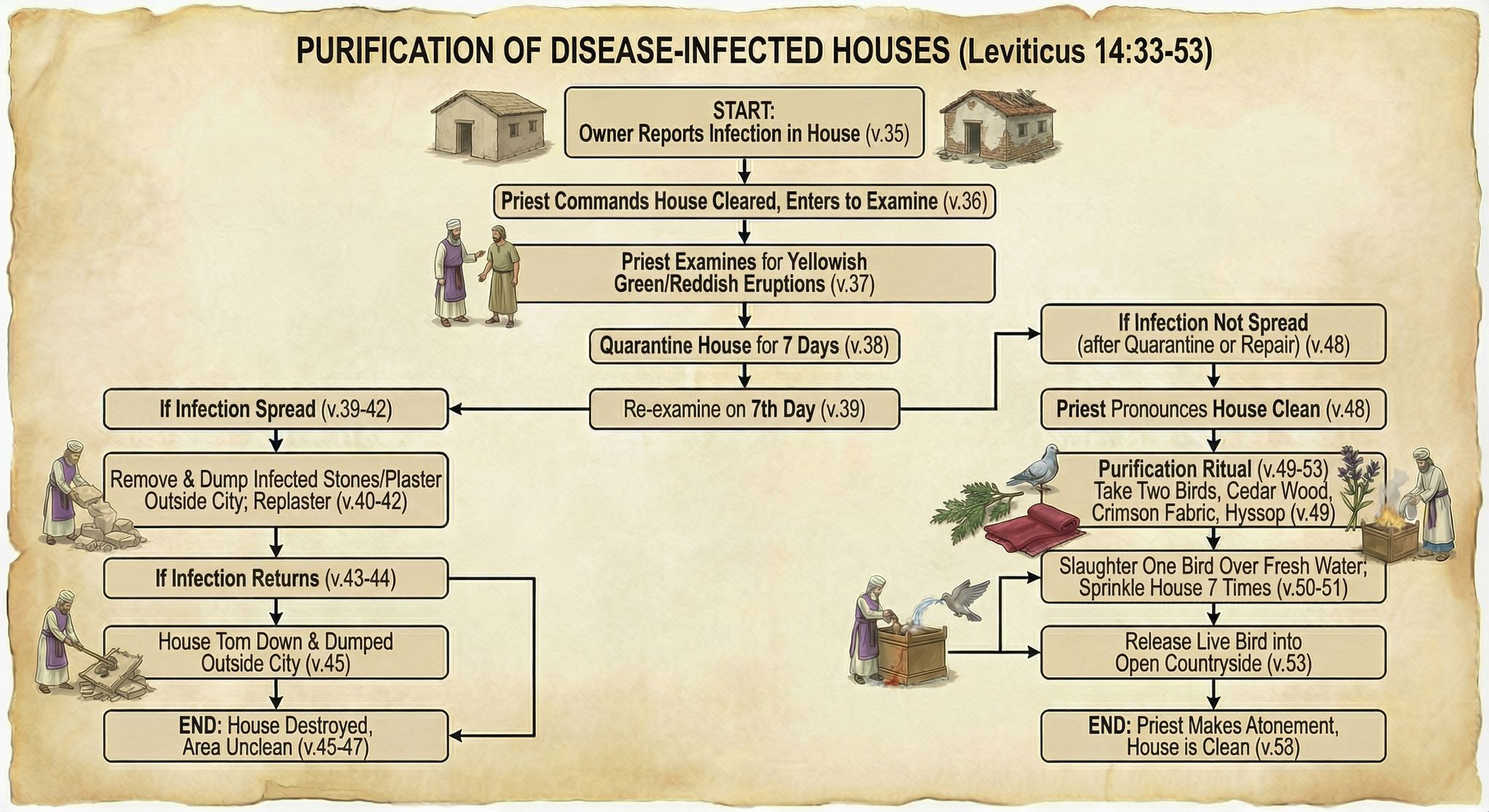
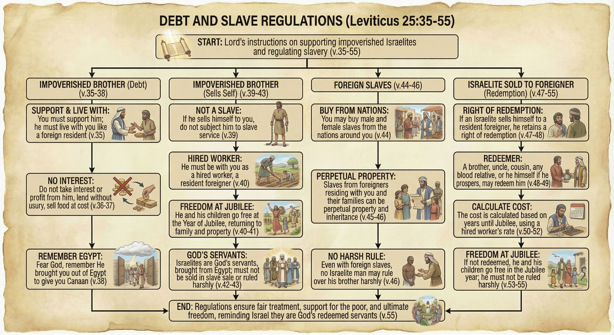
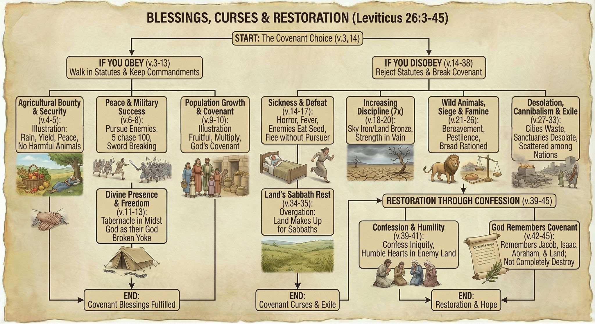
Here are some examples of finished flowcharts:
Methodology
I first generated some test flowcharts to get a visual style I liked. I wasn’t planning on the illustrations being so friendly, but Nano Banana Pro came up with a clear and pleasing style, so I went with it.
My first thought was to display all the Bible text—NBP could actually handle it—but the summary view I ended up with was easier to follow, visually.
From there, it was mostly a matter of choosing logical verse breaks for each flowchart, which ChatGPT helped with. I then used this prompt and gave it a previously generated flowchart as a style reference:
Create an image of a flowchart for Leviticus [chapter number] (below). Use the image as a stylistic model. Match its styles (not content or exact layout), including text, arrow, box, and imagery styles. Structure your flowchart so that it fits the content. Integrate the images into the boxes themselves where appropriate; they’re not just for decoration. Present a summary, not all the text. Indicate relevant verse numbers, and include the specific verse numbers in the title, not just the chapter number. Never depict the Lord as a person.
[Relevant Bible text]
Often it took two or more tries to get the look I wanted, or to ensure that it got all the logic right. I originally wanted to have all the clean/unclean animals on one flowchart, for example, but I couldn’t get the level of detail I was going for. So they’re broken up by animal type into multiple flowcharts.
On the other hand, even when I forgot to adjust the chapter number in my prompt, NBP would still show the correct chapter number in the output—it knew the chapter I meant, not the chapter I said.
All the image resizing and metadata work on my side to prepare the final webpage was vibecoded. It wasn’t hard code, but it was even easier just to explain to ChatGPT what I wanted to do.
Discussion
These flowcharts are better than I could have executed on my own and only took about four hours to create, from start to finish. By contrast, my earlier, manual process involved taking notes in a physical notebook, and I’d only made it to Leviticus 21 after twenty hours of work. Turning those notes into a finished product would’ve taken perhaps another 100 hours. So I got a better product for 1/30 the time investment, at a cost of $24 to generate the images.
Those twenty hours I spent with Leviticus weren’t lost, as ultimately any time spent in the Bible isn’t. In generating these flowcharts, I already had an idea of what the content needed to be and that it worked well in flowchart form.
But still, I didn’t add much value to this process. Anyone with a spare $24 could’ve done what I did. I expect that people will create custom infographics for their personal Bible studies in the future—why wouldn’t they?
The main risk here involves hallucinations. NBP sometimes misinterpreted the text, and the arrows it drew didn’t always make sense. I reviewed all the generated images to cut down on errors, but some could’ve slipped through.
As you can tell from my recent blog posts, I think that Nano Banana Pro represents a step change in AI image-generation capability. It unlocks whole new classes of endeavors that would’ve been too costly to consider in the past.


