Blog RSS Feed

Archive for the ‘Visualizations’ Category

Bible Annotation Modeling and Querying in MySQL and CouchDB

Thursday, September 1st, 2011

If you’re storing people’s Bible annotations (notes, bookmarks, highlights, etc.) digitally, you want to be able to retrieve them later. Let’s look at some strategies for how to store and look up these annotations.

Know What You’re Modeling

First you need to understand the shape of the data. I don’t have access to a large repository of Bible annotations, but the Twitter and Facebook Bible citations from the Realtime Bible Search section of this website provide a good approximation of how people cite the Bible. (Quite a few Facebook posts appear to involve people responding to their daily devotions.) These tweets and posts are public, and private annotations may take on a slightly different form, but the general shape of the data should be similar: nearly all (99%) refer to a chapter or less.

Large dots at the bottom indicate many single-verse references. Chapter references are also fairly prominent. See below for more discussion.

Compare Bible Gateway reading habits, which are much heavier on chapter-level usage, but 98% of accesses still involve a chapter or less.

The Numbers

The data consists of about 35 million total references.

Percent of Total Description Example
73.5 Single verse John 3:16
17.1 Verse range in a single chapter John 3:16-17
8.4 Exactly one chapter John 3
0.7 Two or more chapters (at chapter boundaries) John 3-4
0.1 Verses spanning two chapters (not at chapter boundaries) John 3:16-4:2
0.1 Verses spanning three or more chapters (not at chapter boundaries) John 3:16-5:2

About 92.9% of posts or tweets cited only one verse or verse range; 7.1% mentioned more than one verse range. Of the latter, 77% cited exactly two verse ranges; the highest had 323 independent verse ranges. Of Facebook posts, 9.1% contained multiple verse ranges, compared to 4.2% of tweets. When there were multiple ranges, 43% of the time they referred to verses in different books from the other ranges; 39% referred to verses in the same book (but not in the same chapter); and 18% referred to verses in the same chapter. (This distribution is a unusual—normally close verses stick together.)

The data, oddly, doesn’t contain any references that span multiple books. Less than 0.01% of passage accesses span multiple books on Bible Gateway, which is probably a useful upper bound for this type of data.

Key Points

  1. Nearly all citations involve verses in the same chapter; only 1% involve verses in multiple chapters.
  2. Of the 1% spanning two or more chapters, most refer to exact chapter boundaries.
  3. Multiple-book references are even more unusual (under 0.01%) but have outsize effects: an annotation that references Genesis 1 to Revelation 22 would be relevant for every verse in the Bible.
  4. Around 7% of notes contained multiple independent ranges of verses—the more text you allow for an annotation, the more likely someone is to mention multiple verses.

Download

Download the raw social data (1.4 MB zip) under the usual CC-Attribution license.

Data Modeling

A Bible annotation consists of arbitrary content (a highlight might have one kind of content, while a proper note might have a title, body, attachments, etc., but modeling the content itself isn’t the point of this piece) tied to one or more Bible references:

  1. A single verse (John 3:16).
  2. A single range (John 3:16-17).
  3. Multiple verses or ranges (John 3:16, John 3:18-19)

The Relational Model

One user can have many rows of annotations, and one annotation can have many rows of verses that it refers to. To model a Bible annotation relationally, we set up three tables that look something like this:

users

user_id name
1

annotations

user_id annotation_id content
1 101
1 102
1 103

annotation_verses

The verse references here are integers to allow for easy range searches: 43 = John (the 43rd book in the typical Protestant Bible); 003 = the third chapter; the last three digits = the verse number.

I like using this approach over others (sequential integer or separate columns for book, chapter, and verse) because it limits the need for a lookup table. (You just need to know that 43 = John, and then you can find any verse or range of verses in that book.) It also lets you find all the annotations for a particular chapter without having to know how many verses are in the chapter. (The longest chapter in the Bible has 176 verses, so you know that all the verses in John 3, for example, fall between 43003001 and 43003176.) This main disadvantage is that you don’t necessarily know how many verses you’re selecting until after you’ve selected them. And using individual columns, unlike here, does allow you to run group by queries to get easy counts.

annotation_id start_verse end_verse
101 43003016 43003016
102 43003016 43003017
103 43003016 43003016
103 43003019 43003020

Querying

In a Bible application, the usual mode of accessing annotations is by passage: if you’re looking at John 3:16-18, you want to see all your annotations that apply to that passage.

Querying MySQL

In SQL terms:

select distinct(annotations.annotation_id)
from annotations, annotation_verses
where annotation_verses.start_verse <= 43003018 and
annotation_verses.end_verse >= 43003016 and
annotations.user_id = 1 and
annotations.annotation_id = annotation_verses.annotation_id
order by annotation_verses.start_verse asc, annotation_verses.end_verse desc

The quirkiest part of the SQL is the first part of the “where” clause, which at first glance looks backward: why is the last verse in the start_verse field and the first verse in the end_verse field? Because the start_verse and end_verse can span any range of verses, you need to make sure that you get any range that overlaps the verses you’re looking for: in other words, the start_verse is before the end of the range, and the end_verse is after the start.

Visually, you can think of each start_verse and end_verse pair as a line: if the line overlaps the shaded area you’re looking for, then it’s a relevant annotation. If not, it’s not relevant. There are six cases:

Start before, end before: John 3:15 / Start before, end inside: John 3:15-17 / Start before, end after: John 3:15-19 / Start inside, end inside: John 3:16-18 / Start inside, end after: John 3:17-19 / Start after, end after: John 3:19

The other trick in the SQL is the sort order: you generally want to see annotations in canonical order, starting with the longest range first. In other words, you start with an annotation about John 3, then to a section inside John 3, then to individual verses. In this way, you move from the broadest annotations to the narrowest annotations. You may want to switch up this order, but it makes a good default.

The relational approach works pretty well. If you worry about the performance implications of the SQL join, you can always put the user_id in annotation_verses or use a view or something.

Querying CouchDB

CouchDB is one of the oldest entrants in the NoSQL space and distinguishes itself by being both a key-value store and queryable using map-reduce: the usual way to access more than one document in a single query is to write Javascript to output the data you want. It lets you create complex keys to query by, so you might think that you can generate a key like [start_verse,end_verse] and query it like this: ?startkey=[0,43003016]&endkey=[43003018,99999999]

But no. Views are one-dimensional, meaning that CouchDB doesn’t even look at the second element in the key if the first one matches the query. For example, an annotation with both a start and end verse of 19001001 matches the above query, which isn’t useful for this purpose.

I can think of two ways to get around this limitation, both of which have drawbacks.

GeoCouch

CouchDB has a plugin called GeoCouch that lets you query geographic data, which actually maps well to this data model. (I didn’t come up with this approach on my own: see Efficient Time-based Range Queries in CouchDB using GeoCouch for the background.)

The basic idea is to treat each start_verse,end_verse pair as a point on a two-dimensional grid. Here’s the above social data plotted this way:

A diagonal line starts in the bottom left corner and continues to the top right. Large dots indicate popular verses, and book outlines are visible.

The line bisects the grid diagonally since an end_verse never precedes a start_verse: the diagonal line where start_verse = end_verse indicates the lower bound of any reference. Here are some points indicating where ranges fall on the plot:

This chart looks the same as the previous one but has points marked to illustrate that longer ranges are farther away from the bisecting line.

To find all the annotations relevant to John 3:16-18, we draw a region starting in the upper left and continuing to the point 43003018,43003016:

This chart looks the same as the previous one but has a box from the top left ending just above and past the beginning of John near the upper right of the chart.

GeoCouch allows exactly this kind of bounding-box query: ?bbox=0,43003016,43003018,99999999

You can even support multiple users in this scheme: just give everyone their own, independent box. I might occupy 1×1 (with an annotation at 1.43003016,1.43003016), while you might occupy 2×2 (with an annotation at 2.43003016,2.43003016); queries for our annotations would never overlap. Each whole number to the left of the decimal acts as a namespace.

The drawbacks:

  1. The results aren’t sorted in a useful way. You’ll need to do sorting on the client side or in a show function.
  2. You don’t get pagination.

Repetition at Intervals

Given the shape of the data, which is overwhelmingly chapter-bound (and lookups, which at least on Bible Gateway are chapter-based), you could simply repeat chapter-spanning annotations at the beginning of every chapter. In the worst case annotation (Genesis 1-Revelation 22), you end up with about 1200 repetitions.

For example, in the Genesis-Revelation case, for John 3 you might create a key like [43000000.01001001,66022021] so that it sorts at the beginning of the chapter—and if you have multiple annotations with different start verses, they stay sorted properly.

To get annotations for John 3:16-18, you’d query for ?startkey=[43003000]&endkey=[43003018,{}]

The drawbacks:

  1. You have to filter out all the irrelevant annotations: if you have a lot of annotations about John 3:14, you have to skip through them all before you get to the ones about John 3:16.
  2. You have to filter out duplicates when the range you’re querying for spans multiple chapters.
  3. You’re repeating yourself, though given how rarely a multi-chapter span (let alone a multi-book span) happens in the wild, it might not matter that much.

Other CouchDB Approaches

Both these approaches assume that you want to make only one query to retrieve the data. If you’re willing to make multiple queries, you could create different list functions and query them in parallel: for example, you could have one for single-chapter annotations and one for multi-chapter annotations. See interval trees and geohashes for additional ideas. You could also introduce a separate query layer, such as elasticsearch, to sit on top of CouchDB.

Holy Week Timeline: Behind the Music

Saturday, April 16th, 2011

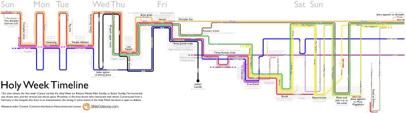
It’s always fun for me to learn the process people use to create visualizations, and especially why they made the decisions they did. So please forgive me if you find this post self-indulgent; I’m going to talk about the new Holy Week Timeline that’s on the Bible Gateway blog:

Holy Week timeline

The idea for this visualization started in November 2009 when xkcd published its movie narrative charts comic, which bubbled up through the Internet and shortly thereafter became a meme. Although the charts are really just setting up a joke for the last two panels in the comic, they’re also a fantastic way of visualizing narratives, providing a quick way to see what’s going on in a story at any point in time. The format also forces you to consider what’s happening offstage—it’s not like the other characters cease to exist just because you’re not seeing them and hearing about them.

My first thought was to plot the book of Acts this way, but Acts presented too broad a scope to manage in a reasonable timeframe. Holy Week then came to mind—it involves a limited amount of time and space, it doesn’t feature too many characters, and the Gospels recount it in a good bit of detail: one Gospel often fills in gaps in another’s account.

Now I needed data. (Data is always the holdup in creating visualizations.) Fortunately, Gospel harmonies are prevalent, even free ones online. The version of Logos I have includes A. T. Robertson’s Harmony of the Gospels, so I started transcribing verse references from the pericopes listed there into a spreadsheet, identifying who’s in each one and when and where it takes place. I plowed halfway through, but then other priorities arose, and I had to abandon hopes of completing it in time for Holy Week 2010.

It lay dormant for a year (there’s not a lot of reason to publish something on Holy Week unless Holy Week is nigh). A few weeks ago, I finished itemizing the people, places, and times in Robertson. Justin Taylor last year published a harmony of Holy Week based on the ESV Study Bible, which had a slightly different take on the timeline (one that made more sense to me in certain areas), so I moved a few things around on my spreadsheet. I also consulted a couple of other study Bibles and books I had readily available to me.

With data in hand, it was time to put pencil to paper.

Version 1: Paper

Hand-drawn prototype

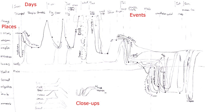
I wanted to make four basic changes to the xkcd comic: use the vertical axis consistently to show spatial progression, provide close-ups for complex narrative sequences, include every character and event, and add the days of the week to orient the viewer in time. Only the last of these changes wound up in the final product, however.

The vertical axis in this version proceeded from Bethany at the top, through the Mount of Olives and various places in Jerusalem, and ended at Emmaus. On a map of Holy Week events, this axis approximates a line running from east (Bethany) to west (Emmaus). Using the vertical axis this way encodes more information into the chart, allowing you to see everything that happened in a single location simply by following an imaginary horizontal line across the chart. Unfortunately, it also leads to a lopsided chart that progresses down and to the right, creating huge amounts of whitespace on a rectangular canvas. I didn’t see that problem yet, however.

I did see that the right half of the chart (Friday to Sunday) was much denser than the left half—I’d need to space that out better when creating a digital version.

Version 2: Drawing Freehand in Illustrator

Mouse-drawn prototype

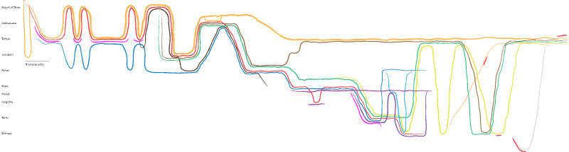
I have a confession: I’d never used Adobe Illustrator before this project. Most of my image work uses pixels; Photoshop is my constant companion. But this project would have to use vectors to allow for the constant fiddling necessary to produce a decent result at multiple sizes. So, Illustrator it was.

My first goal was to reproduce the pencil drawing with reasonable fidelity. I used my mouse to draw deliberately wobbly lines that mimicked the xkcd comic. Now, if I’d had more experience with Illustrator, the hand-drawn effect may have worked. But making changes was incredibly annoying; I had to delete sections, redraw them, and then join them to the existing lines. It took forever to make minor tweaks; what would I do when I needed to move whole lines around (as frequently happened later in the process)? After all, if you look closely, you’ll see entire swaths of the chart misplaced. (Why are the disciples hanging out in the Temple after Jesus’ arrest?) No, this hand-drawn approach was impractical for someone of my limited Illustrator experience. I needed straight lines and a grid.

Version 3: The Grid

Grooving with a 1970s grid style

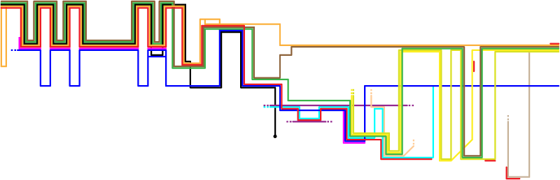
My wife says that this version reminds her of 1970s-style album covers. She’s right. Nevertheless, it formed the foundation of the final product.

So, what are the problems here? First, the lines weigh too much. Having given up a pure freehand approach, I wanted a more transit-style map (used for subways / the Underground) with straight lines and restricted angles. I’m most familiar with Chicago’s CTA map and thought I’d emulate their style of thick lines that almost touch. This approach leads to lots of heavy lines that don’t convey additional information—it’s also tricky to round the corners of such thick lines without unsightly gaps appearing (again, for someone of my limited Illustrator experience).

The second problem is the extreme weight in the upper left of the chart, far out of proportion to the gravity of events there. The green, brown, and black lines represent Peter, James, and Judas, who don’t play prominent roles until later in the story. They’re adding lots of “ink” to the chart and not conveying useful information. They had to go.

Why not simply lighten the colors–after all, why is Judas’s line black? Simple: black often represents evil. Similarly, Jesus’ line is red to represent his blood. The Jewish leaders are blue because it contrasts well with red, and most of the chart involves conflict between Jesus and the Jewish leaders (with the pink crowd usually acting as a buffer to prevent Jesus’ arrest). Pilate and Herod are imperial purple. Orange is similar in hue to Jesus’ red, so the disciples are orange. I tried not to get too heavy-handed with the symbolism, but there it is.

Most of the other colors are arbitrary (i.e., available in Illustrator’s default palette and of roughly the same saturation as the symbolic colors). John would be sharing a lot of space on the chart with Mary Magdalene and the other women, so I tried to give them colors (green, olive, yellow) that worked well together. The only future change from the color scheme in this version involves the guards, who change from cyan (too bright) to a light purple.

Version 4: Less Technicolor

Lighter lines open up the image considerably

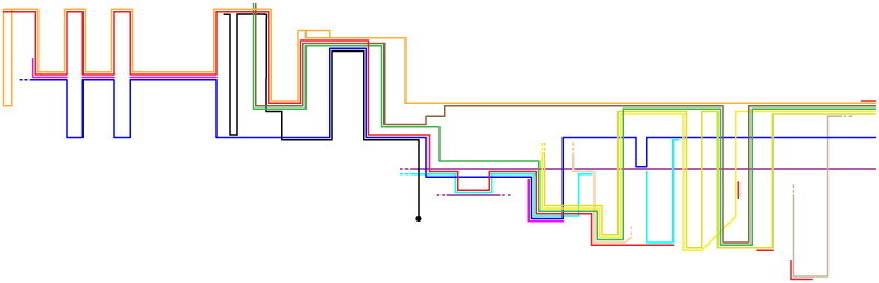
This version reduced the line weight and introduced Peter, John, and Judas only when they needed to appear as independent entities in the story. It works better, but there are still two problems with it.

First, look at the giant areas of whitespace in the bottom left and top right (especially the top right). Using the vertical axis to indicate absolute travel through space is a nice idea, but I couldn’t figure out how to do it without creating these huge gaps. In the next version, I abandoned the vertical-axis-as-space idea—it now indicated travel between places, but you could no longer follow a horizontal line to see everything that happened in a single place.

Second, I realized that I wouldn’t be able to incorporate every event and person, as they added clutter. I could have added close-ups to illustrate these details—obviously there was enough space for them. However, I felt that including them would distract from the main point: to show Holy Week at a glance. I’m still a bit torn over omitting them, but I think it was a better decision to reduce the total space used by the chart.

I also abandoned the idea that Jesus went to the Temple on Wednesday. Some commentators think he did; others disagree. From a story-structure standpoint, I like the idea that Judas slipped away from the other disciples to bargain for his thirty pieces of silver while Jesus was teaching in the Temple. However, the text is ambiguous on when exactly Judas agreed to betray Jesus and what Jesus was doing on Wednesday.

Version 5: Text

Final version with text

This is the final version. It condenses a lot of vertical and horizontal space; moves some lines around so they overlap less; and, most importantly, adds text: titles for major events; shading and place names for major locations; verse references; line labels; and a short explanation.

The xkcd chart is brilliant in that it doesn’t need a key: following recent trends in UI design, all the labels are inline. I definitely wanted to keep that approach, which meant making lots of labels and placing them on the lines. Again, my lack of experience with Illustrator showed up: I couldn’t get the text to center on the lines automatically, and I had trouble creating an outer glow on the text to provide some contrast with the background and make sure that the text was legible. (Black text on a bright blue background is an unpleasant combination.) But the glow always ate into the letters. Thus, I ended up creating lots of pixel-perfect, partially transparent rectangles as backgrounds for the labels. Some of the person lines had somehow slipped out of alignment with the grid, so I had to do a lot of clicking to get things back into order. In retrospect, it was good that I had to make the rectangles; I might not otherwise have noticed that the lines weren’t all where they were supposed to be.

The shaded boxes to indicate places are straight-up rounded rectangles (though I’m not sure why the corner radius is a global application preference in Illustrator). These boxes, borrowed from xkcd, replace the vertical-axis idea I earlier toyed with.

Finally, I added event titles and verse references. Here I tried to be comprehensive, including references even when I didn’t have a title to put with them. For example, there are two fig tree stories in the Gospels, but I only titled one of them. The references are available to you if you want to read both, though.

Conclusion

This project was fun, if time-consuming. In total, it took somewhere between forty and sixty hours (much of it spent climbing Illustrator’s learning curve). The chart ended up looking less like the xkcd comic and more like a transit map than I was expecting at the outset, but that’s OK. I’m now a whole lot more familiar with the Holy Week timeline, and I hope that others find the chart useful, too. If it helps improve Bible literacy even a little bit, then I consider it a success.

Quantifying Traditional vs. Contemporary Language in English Bibles Using Google NGram Data

Monday, December 27th, 2010

Using data from Google’s new ngram corpus, here’s how English Bible translations compare in their use of traditional vs. contemporary vocabulary:

Relative Traditional vs. Contemporary Language in English Bible Translations
* Partial Bible (New Testament except for The Voice, which only has the Gospel of John). The colors represent somewhat arbitrary groups.

Here’s similar data with the most recent publication year (since 1970) as the x-axis:

Relative Traditional vs. Contemporary Language in English Bible Translations by Publication Year

Discussion

The result accords well with my expectations of translations. It generally follows the “word for word/thought for thought” continuum often used to categorize translations, suggesting that word-for-word, functionally equivalent translations tend toward traditional language, while thought-for-thought, dynamic-equivalent translations sometimes find replacements for traditional words. For reference, here’s how Bible publisher Zondervan categorizes translations along that continuum:

A word-for-word to thought-for-thought continuum lists about twenty English translations, from an interlinear to The Message.

I’m not sure what to make of the curious NLT grouping in the first chart above: the five translations are more similar than any others. In particular, I’d expect the new Common English Bible to be more contemporary–perhaps it will become so once the Old Testament is available and it’s more comparable to other translations.

In the chart with publication years, notice how no one tries to occupy the same space as the NIV for twenty years until the HCSB comes along.

The World English Bible appears where it does largely because it uses “Yahweh” instead of “LORD.” If you ignore that word, the WEB shows up between the Amplified and the NASB. (The word Yahweh has become more popular recently.) Similarly, the New Jerusalem Bible would appear between the HCSB and the NET for the same reason.

The more contemporary versions often use contractions (e.g., you’ll), which pulls their score considerably toward the contemporary side.

Religious words (“God,” “Jesus”) pull translations to the traditional side, since a greater percentage of books in the past dealt with religious subjects. A religious text such as the Bible therefore naturally tends toward older language.

If you’re looking for translations largely free from copyright restrictions, most of the KJV-grouped translations are public domain. The Lexham English Bible and the World English Bible are available in the ESV/NASB group. The NET Bible is available in the NIV group. Interestingly, all the more contemporary-style translations are under standard copyright; I don’t know of a project to produce an open thought-for-thought translation–maybe because there’s more room for disagreement in such a project?

Not included in the above chart is the LOLCat Bible, a non-academic attempt to translate the Bible into LOLspeak. If charted, it appears well to the contemporary side of The Message:

The KJV is on the far left, The Message is in the middle, and the LOLCat Bible is on the far right.

Methodology

I downloaded the English 1-gram corpus from Google, normalized the words (stripping combining characters and making them case insensitive), and inserted the five million or so unique words into a database table. I combined individual years into decades to lower the row count. Next, I ran a percentage-wise comparison (similar to what Google’s ngram viewer does) for each word to determine when they were most popular.

Then, I created word counts for a variety of translations, dropped stopwords, and multiplied the counts by the above ngram percentages to arrive at a median year for each translation.

The year scale (x-axis on the first chart, y-axis on the second) runs from 1838 to 1878, largely, as mentioned before, because Bibles use religious language. Even the LOLCat Bible dates to 1921 because it uses words (e.g., “ceiling cat”) that don’t particularly tie it to the present.

Caveats

The data doesn’t present a complete picture of a translation’s suitability for a particular audience or overall readability. For example, it doesn’t take into account word order (“fear not” vs. “do not fear”). (I wanted to use Google’s two- or three-gram data to see what differences they make, but as of this writing, Google hasn’t finished uploading them.)

I work for Zondervan, which publishes the NIV family of Bibles, but the work here is my own and I don’t speak for them.

Venn Diagram of Google Bible Searches

Monday, October 25th, 2010

Technomancy.org just released a Google Suggest Venn Diagram Generator, where you enter a phrase and three ways to finish it: for example, “(Bible, New Testament, Old Testament) verses on….” It then creates a Venn diagram showing you how Google autocompletes the phrase and where the suggestions overlap.

The below diagram shows the result for “(Bible, New Testament, Old Testament) verses on….” The overlapping words–faith, hope, love, forgiveness, prayer–present a decent (though incomplete) summary of Christianity.

A Venn diagram shows completions for (X Verses on...): Bible (courage, death, friendship, patience), New Testament (divorce, homosexuality, justice, tithing), Old Testament (Jesus), NT + Bible (hope, strength), OT + Bible (faith), OT + NT (marriage), and all three (forgiveness, love, prayer).

Visualizing Pericope Similarity in the New Testament

Monday, September 13th, 2010

This diagram plots the similarity of pericopes (sections) in the New Testament based on their linguistic similarity in Greek:

Blue = Gospels, Purple = Acts, Green = Paul’s Epistles, Red = General Epistles, Gray = Revelation

If you don’t have Silverlight installed (or are reading this post via RSS–I suggest you click through to the original post), here’s a thumbnail:

Pericope similarity in the New Testament (thumbnail).

Download the full-size PDF (300KB) or PNG (22 MB, 12,000 pixels wide).

Do we actually learn anything from this kind of diagram? The most interesting part to me is how the gospels on the right flow primarily through the Gospel of John to the epistles on the left. I wonder why that is.

Methodology

I calculated the cosine similarity between the full text of the pericopes using the Greek lemmas (after removing about forty stopwords). The pericope titles come from the ESV. I produced the diagram with Cytoscape. The widget at the top of the post comes from zoom.it, Microsoft’s Deep-Zoom-as-a-Service.

Bill Mounce’s excellent free New Testament Greek dictionary served as the source of the lemmas.

Bible Cross References Visualization

Friday, April 16th, 2010

Here’s a visualization of 340,000 Bible cross references:

Visualization of Bible cross references.
Larger version (2,000 x 1,600 pixels).

Does anything strike you as intriguing? A few trends jump out at me:

  1. The frequency of dense New Testament streaks in the Old Testament, especially in Leviticus and Deuteronomy; I didn’t expect to see them there.
  2. The loops in Samuel / Kings / Chronicles and in the Gospels indicating parallel stories.
  3. The sudden increased density of New Testament references in Psalms through Isaiah.
  4. The eschatological references in Isaiah and Daniel.
  5. The density of references from the Minor Prophets back to both the Major Prophets and earlier in the Old Testament.
  6. The surprising density of cross references in Hebrew-Jude.
  7. The asymmetry. If verse A cites verse B, verse B doesn’t necessarily cite verse A. I wonder if I should make the data symmetrical.

You can also download the full-size image (10,000 x 8,000 pixels, 75 MB PNG). It’s a very large image that could crash your browser. If you want it, I strongly recommend that you save it to your computer rather than trying to open it in your browser.

This visualization uses data from the Bible Cross References project. I used PHP’s GD library to create the graphic.

Inspired by Chris Harrison and Christian Swinehart’s wonderful Choose Your Own Adventure work.

Presentation on Tweeting the Bible

Friday, March 26th, 2010

Here’s a presentation I just gave at the BibleTech 2010 conference about how people tweet the Bible:

Also: PowerPoint, PDF.

I distributed the following handout at the presentation, showing the popularity of Bible chapters and verses cited on Twitter. It displays a lot of data: darker chapters are more popular, the number in the middle of each box is the most popular verse in the chapter, and sparklines in each box show the distribution of the popularity in each chapter. (Genesis 1:1 is by far the most popular verse in Genesis 1, while Genesis 3:15 is only a little more popular than other verses in the chapter.)

The grid shows the popularity of chapters and verses in the Bible as cited on Twitter.

Delving into Lent Data

Sunday, March 7th, 2010

Let’s look a little more at some of the data on what Twitterers are giving up for Lent.

Categories of Things Given up by Location

As I only track in English what people are giving up, there are concentrations in English-speaking countries.

Categories by Country
Size indicates the relative number of Twitterers in each country giving up something for Lent.

Categories by Location

Categories of Things Given up by State

These visualizations show the differences (or lack thereof) in what people are giving up among U.S. states.

Categories by State
Size indicates the relative number of Twitterers in each state giving up something for Lent. Sorry, Alaska and Hawaii.

Categories by State (%)
The composition of each state’s categories of tweets shows mostly minor variations among states. Some states (like Wyoming on the far right) have small numbers of tweets. I would have liked to use opacity or width to indicate this disparity but couldn’t figure out how to do it.

Comparison between 2009 and 2010

This treemap shows how the data changed between 2009 and 2010. The size of the box shows the number of people giving up each category and thing, while color indicates the percentage change from last year: dark blue indicates the steepest drop; dark orange indicates the steepest rise. The second chart shows the same data more conventionally expressed.

Categories and Terms: Term Changes: 2009-2010

Categories and Terms: Term Changes: 2009-2010

About the Visualizations

I created these charts mostly to explore how the new data-analysis software Tableau Public works. One of its claims to fame is that you can publish interactive visualizations to the web, a feature I didn’t take advantage of here. Tableau doesn’t do treemaps, so I used Many Eyes to create the treemap; the closest Tableau equivalent appears below the treemap.

Interview with Yingyan Huang

Wednesday, August 26th, 2009

Yingyan Huang, who created the two visualizations on the unity of Scripture from the last post, graciously agreed to answer a few questions for me about her work:

Where did you get the inspiration for your pieces? What was your motivation to create them?

Initially I had started with ideas of creating an information visualizations on Paul’s journeys and the spread of Christianity. As I explored the topic further, I realized that the focus, as a Christian, should not be on Paul but really on Christ Himself. Since the objective of Paul’s journeys and ministry was Christ. So I began exploring the Gospels and the role of Christ in the Bible. Ultimately my motivation is to visually demonstrate, given the Bible as a historical relic and literature, Christ’s centrality in the Bible and His reality because of the sheer number of references to Him found in the OT even before His birth.

What was the process you used to create them? Where did you get the data? What tools did you use?

My data was obtained through many reading and primarily comes from the Tyndale Life Application Study Bible, ESV Study Bible, and The Christ of the Covenants by O. Palmer Robertson. I cross referenced the passages from ESV’s history of salvation and Palmer’s book against the 250 events in the life of Christ from the Tyndale study bible. Some computer programs I used include Adobe Illustrator, Acrobat, and Microsoft Excel.

With infographics, there’s often a tension between making something attractive and clearly portraying the information you want to communicate. As a designer, how did you resolve that tension with these pieces?

As mentioned above, I basically cross-referenced the bible verses/passages to create data points. I did not create my own data, merely synthesized available data that have been around for centuries to create the data sets.

Why do graphic designers create infographics about the Bible?

Perhaps the Bible remains a choice subject matter because it is rich with intricacies and complexities that come together so harmoniously.

What are you up to these days?

I am currently interning/working at a magazine as a art/photo assistant and assisting in teaching an information design class at Parsons. I am also cooking and baking to test and create recipes. Additionally I am involved in starting a new college ministry (City Campus Ministry) and a teaching assistant for the Children’s Ministry at my church, Redeemer Presbyterian Church in NYC.

Two Bible Visualizations on the Unity of Scripture

Sunday, August 2nd, 2009

Yingyan Huang, a graphic designer, recently created two Bible visualizations that emphasize the unity of Scripture.

Harmony of the Gospels. The first visualization, “The Harmony of the Gospels—250 Events in the Life of Christ,” identifies 250 events recorded in the Gospels, arranges them chronologically, and plots them to reveal which events occurred in which Gospels. In effect, it’s a visualization of the Composite Gospel Index, though the visualization is apparently using a different data set.

A Single Story. The second visualization, “A Single Story—The Bible through the Lens of 250 Events,” starts with the same 250 events but extends references to them into the Old Testament and the remainder of the New Testament. This visualization shows the centrality of Christ in the Bible.

Both visualizations convey useful information. I wish they were available in larger sizes, but even the low-resolution versions give you a sense of the message behind the images.