The 2023 Daily Cross Reference Bible Reading Plan (also an RSS feed) walks you through the 303 verses in the book of Hebrews one day at a time, six days a week, with a review every Saturday. It includes up to twelve of the most-popular cross references for each verse, as well as an AI-generated summary of how each cross reference relates to the main verse. Each day also contains an AI-written introduction and a concluding prayer that tie together the themes between the main verse and its cross references.
For example, one of the explanations for January 1 connects Hebrews 1:1 and Genesis 3:15 like this:
Both passages refer to God’s plan of salvation. Hebrews 1:1 refers to God’s promise of redemption through the prophets, while Genesis 3:15 refers to the promise of a Redeemer who would come to defeat Satan and restore humanity.
The quality of the content generated by the AI (GPT-3) feels generally comparable to the typical evangelical devotional; I review the generated content by hand before posting it.
In 2016, I proposed a digital-first Bible reading plan that goes through the Gospels in a year, including all the cross references for each verse. This reading plan is an implementation of this idea with an AI twist and exposes you to 2,295 different verses, or around 7% of the whole Bible.
If you’re looking for a full-year, brisk reading plan for 2023 that you haven’t done before, you might give the Daily Cross Reference Bible Reading Plan a try. You can bookmark that page, which will update itself every day, or subscribe to the RSS feed. To get a sense of what the content is like before committing, between now and January 1, the reading plan features some seasonally appropriate verses chosen by ChatGPT.
AI-Assisted Bible Study is a new project that explores one way to apply an AI to personal Bible study, with AI-generated questions and prayers that apply to each chapter of the Bible. It helps you explore questions you might not otherwise ask, like “How have I let my livestock get in the way of my relationship with God?”
What This Project Does
This project presents AI-generated content for each chapter of the Bible in eight categories: headings, summaries, prayers, journal prompts, and application, exegetical, observational, and discussion questions.
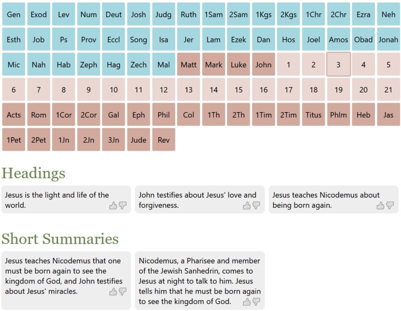
For example, here’s sample AI-generated content for John 3:
Heading: Jesus is the light and life of the world.
Summary: Nicodemus, a Pharisee and member of the Jewish Sanhedrin, comes to Jesus at night to talk to him. Jesus tells him that he must be born again to see the kingdom of God.
Prayer: Father, we pray that we would have hearts like Nicodemus, that we would be willing to learn from Jesus.
Journal prompt: What do you think it means that Jesus said we must be born again?
Application question: What does it mean that “whoever does not believe stands condemned already” in John 3:18?
Exegetical question: What did Nicodemus misunderstand about being born again?
Observation question: What did Jesus tell Nicodemus he must do in order to see the kingdom of God in John 3:3?
Group discussion question: What did Jesus mean when He said that He must be “lifted up”? (John 3:14)
You can vote on content you find helpful or unhelpful. (I’m particularly proud of the CSS that handles the voting, which uses emojis as interface elements and doesn’t require any images. I’m also proud of the navigation, providing fast and compact access to any chapter in the Bible.)
How It Works
I prompted GPT-3 to generate text for each chapter in the Bible in each category. For example, the prompt to generate a prayer was:
Write 5 prayers inspired by John 3 in the Bible. Remember that the events described here are in the past. First include a short observation or lesson for each prayer, and then write a personal prayer related to the lesson.
I reviewed the generated text to avoid (or at least minimize) unhelpful or heretical content. I accepted about 90% of GPT-3’s suggestions on its first pass and regenerated the rest until it gave me something useful. It cost about $150 over six weeks to generate this content, which consists of 71,062 generations and 1.1 million words.
How It Doesn’t Work
Much of the content is useful—about the level you’d find in a typical group Bible study, with interesting insights mixed with odd and irrelevant content. When the content fails, it fails in four main ways:
Heretical. This is the most severe category, which I tried most to eliminate. For example: “Help me to be like Judas and have the courage to betray Jesus when the time comes” or “What would it be like to be worshipped as a god?”
Wrong. This is the hardest category to edit at scale. It includes factual errors (“David is forgiven, and Bathsheba’s son is healed,” “After Paul makes his defense, Agrippa finds him not guilty, but the Jews disagree and appeal to Caesar”) but also harder-to-discern, subtler errors like “What can we learn from Nahum 2:15-16 about God’s wrath?” (Nahum 2 only has 13 verses). Since I didn’t validate every reference, I expect that this category represents the bulk of unhelpful content. The project’s voting mechanism hopefully allows the helpful content to rise to the top over time.
Confusing or very specific: “David rescues his family from Soup,” “How can I identify when someone is trying to lead a rebellion against me?” or the aforementioned “How have I let my livestock get in the way of my relationship with God?” It also likes to generate prayers for historical events as though they’re ongoing: “God, we pray for our leaders, that they would have wisdom to know what to do with the Book of the Law once it is found.”
Vague: “What does Amos 3 reveal to us about God’s character?” or “What are the main points of Amos 5?” This content isn’t bad; it just doesn’t apply specifically to the passage.
Future
In theory, GPT-3 could also generate on-demand answers to the questions it asks about each passage. Doing so would require giving visitors access to the AI, however, which (per OpenAI’s requirements) requires that I create a login system—not something I’m excited to do.
It could also create content at a smaller unit than a chapter (such as a verse or section). In my tests, the content it generated often proved superior to full-chapter content, but going smaller would’ve ballooned the costs of this project.
Background
In my last post about AI-generated Bible art, I mused how the text- and image-generating AIs were doing most of the creative work, and I was just copy-pasting between them. That’s true, but in a larger sense, the AIs are allowing me to explore a possibility space faster and further than I would be able to on my own. As David Holz, the founder of Midjourney (another AI-powered text-to-image generator), says:
“It’s important that we don’t think of this as an AI ‘artist.’ We think of it more like using AI to augment our imagination. It’s not necessarily about art but about imagining. We are asking, ‘what if.’ The AI sort of increases the power of our imagination.”
Thinking of AI as an “imagination augmenter” captures that it’s not “creating” in the strictest sense but rather augmenting humans, allowing them to create at a speed and scale that wouldn’t otherwise be possible individually.
Therefore, this project tries to augment your imagination in your own Bible study.
OpenAI recently released DALL·E 2, an AI that takes written text and turns it into an image. A project I’ve been working on takes stories from Genesis and Luke, feeds them to the AI, and creates images out of the text. For example:
“No sign will be given this generation except the sign of Jonah” (Luke 11:29–32). This image doesn’t literally reflect Jesus’ words here (he doesn’t mean a giant whale), but in my opinion it captures the intent of his saying, that that signs that he’s the Messiah are as obvious to anyone willing to hear as a whale landing on a city.
See all 828 AI-generated Bible images in this project. Below is a selection of my favorites, followed by a longer description of my methodology. Hover over any of the images to see the prompt that generated it.
Noah getting drunk in his vineyard (Gen 9:20–21). You don’t see this story illustrated often.Descendants of Noah (Gen 10). A Chihuly-inspired glass sculpture of a family tree.Melchizedek presents bread and wine to Abram (Gen 14:18–24). Pointilism in the style of Seurat.Destruction of Sodom and Gomorrah (Gen 19:24–25). In the style of Hieronymous Bosch.Jacob and Esau wrestle in the womb (Gen 25:19–26). Another part of the story you don’t often see illustrated.Rachel and Leah arguing over mandrakes (Gen 30:14–15). Don’t remember this story? I didn’t either. But the tiny sculpture conveys the bitterness and pettiness of Rachel and Leah.Jacob and the spotted lambs (Gen 30:25–43). I imagine that this image is of Laban, who looks down to realize that all the sheep are spotted. The pointilistic style reinforces that theme.Jacob and Laban build stone pillars (Gen 31:45–54). This image depicts Jacob and Laban after they’ve built two stone pillars of friendship. I think it’s funny how it looks like one of them is pushing the other off, reflecting that maybe erecting these pillars hasn’t resolved everything between them.The descendants of Esau (Gen 36). Another family tree, this one supposedly in the style of Rothko but is much more representational than his work usually is. The AI does a surprisingly great job at artistic family trees.Joseph’s brothers sell him (Gen 37:28). This photorealistic image reflects the rare time when the AI gave me exactly what I wanted. Here I imagine that Reuben is holding the fragments of Joseph’s robe while he watches the merchants carry Joseph away.People come to Egypt for food (Gen 41:56–57). A Great Depression-style breadline in Egypt because of the famine in Joseph’s time.The silver cup (Gen 44:12). Joseph hides his silver cup in the grain sack of one of his brothers.The plague of frogs (Exod 8:1–15). In the style of a 1990s Saturday-morning cartoon, this image doesn’t exactly convey the story, but it sure is fun.The death of Jezebel (2Kgs 9:30–33). The man wearing the high heel in the background, as though he stole it from Jezebel, sells this image for me.Birth of Christ (Luke 2:6–7). In the style of a 16-bit video game.“The ax is at the root of the tree” (Luke 3:9). A huge sculpture that captures the message.The people of Nazareth pursue Jesus to a cliff (Luke 4:28–30). I’m not sure why there’s a sheep–possibly because the prompt asks for an image in the style of Beatrix Potter.Jesus calls his first disciples (Luke 5:1–11). A 3D render from the perspective of the fish.“First take the plank out of your eye” (Luke 6:41–42). Or, in this case, “First take the eye out of your plank.”“For the mouth speaks what the heart is full of” (Luke 6:45)The house built on the sand (Luke 6:49)A lamp on a stand (Luke 8:16). I could never persuade the AI to create a light under a bowl, only shining on it in various ways.Jesus calms the storm (Luke 8:22–25)The Transfiguration (Luke 9:26–36). I feel like this photo captures how someone might create a hilltop installation to reflect Jesus’ transfiguration.“Foxes have dens and birds have nests, but the Son of Man has no place to lay his head” (Luke 9:58). This fox looks adorably resentful.“The harvest is plentiful, but the workers are few” (Luke 10:2). If the workers are few, the American solution is to industrialize the process.“Which of you fathers, if your son asks for a fish, will give him a snake instead?” (Luke 11:11). In the style of Grandma Moses.“The eye is the lamp of the body” (Luke 11:33–36)“Do not worry about how you will defend yourselves” (Luke 12:11–12)The fall of the tower of Siloam (Luke 13:4). Jesus briefly alludes to this event, and this memorial, in the style of Maya Lin, captures the feeling of a contemporary memorial. Each line represents a victim of the collapse (though the AI only generated 14 lines, not 18).“It is like a mustard seed, which a man took and planted in his garden. It grew and became a tree, and the birds perched in its branches” (Luke 13:19). Here we have tiny birds nesting in a mustard plant.“Whoever has ears to hear, let them hear” (Luke 14:35). This work captures the urgency of the statement, in my opinion.The parable of the lost sheep (Luke 15:4–7). A sculpture in the style of Picasso.“You cannot serve both God and money” (Luke 16:13). Here the money becomes personified as a false god.“If you have faith as small as a mustard seed, you can say to this mulberry tree, ‘Be uprooted and planted in the sea,’ and it will obey you” (Luke 17:6)“A camel through the eye of a needle” (Luke 18:25). The camel is eyeing the needle and deciding that it can’t fit through.Jesus drives out the moneychangers (Luke 19:45–46). I feel like one of the moneychangers is dressed like a luchador for some reason.“God is not the God of the dead, but of the living” (Luke 20:38). This image conveys more the sentiment than the content of the passage.The widow’s mite (Luke 21:1–4). This piece, in the style of Georgia O’Keeffe, offers an interpretation of the widow that captures her emotions as she’s donating (possibly her last) two coins to the Temple treasury.Judas agrees to betray Jesus (Luke 22:1–6). I like that he’s dressed in silver coins.The Garden of Gethsemane (Luke 22:39–46). Here Jesus is having a vision of what he’s about to endure.Jesus’ crucifixion (Luke 23:26–43)The road to Emmaus (Luke 24:13–35)Opening of the abyss (Rev 9:1–2)
Background
DALL·E 2 is a text-to-image generator that takes a text prompt (“Realistic oil painting of a cat”) and generates a set of four images that it thinks matches that prompt. DALL·E doesn’t render human faces well, and sometimes it goes completely off-track in its suggestions, but its quality often astonished me.
OpenAI has another AI, GPT-3, that I used to generate many of the ideas for DALL·E prompts. I wanted to explore DALL·E using a wide variety of styles and artists, and I have limitations and biases when it comes to my knowledge of art history. GPT-3 cast a wider net of styles and artists than I would’ve come up with on my own (although GPT-3 loves Rembrandt and Banksy and mentioned them in many completions). Each GPT-3 completion costs around half a cent, and each text prompt to DALL·E generated an average of 1.3 usable images, bringing the all-in cost per image to around $0.12, or around $99 total for this project. (I generated most of these images during DALL·E’s free preview, however.)
The GPT-3 prompts I used evolved over time, but this one is emblematic:
Suggest 5 unique concept ideas for a work of visual art inspired by Luke 14:7-11 (do not pick the place of honor) in the Bible. Include art direction and a specific medium and artist to emulate. Include artists from a variety of eras, styles, and media. Try for an unusual perspective. Title, year, medium. Description.
And here’s what GPT-3 suggests:
“Turning the Tables,” a sculptural installation in which upside-down tables are suspended from the ceiling, representing how Jesus turned the power dynamic upside-down when he said that the last shall be first and the first shall be last. Inspired by Mexican artist Diego Rivera.
“Remember the Poor,” a series of paintings or drawings depicting the poor and needy from around the world, as a reminder that Jesus said we should always remember the poor. Inspired by the work of 19th century French painter Jean-Francois Millet.
“The Banquet,” a painting or series of paintings depicting a large banquet table spread with food, similar to the one described in the story of the great banquet in Luke 14, to emphasize the importance of hospitality. Inspired by Dutch painter Pieter Bruegel the Elder.
“The Place of Honor,” a painting or sculpture that shows a solitary figure in the place of honor at a banquet table, to represent how Jesus said that the one who takes the place of honor will be the last. Inspired by Chinese painter Zhang Daqian.
“The Outcast,” a painting or sculpture of a figure who is excluded from the banquet, to represent how Jesus said that those who are last will be first. Inspired by Nigerian-born British artist Yinka Shonibare.
I thought #1 was especially interesting as a concept, though I couldn’t persuade DALL·E to produce something good with it. Diego Rivera, further, is a painter rather than a sculptor, so the suggestion wouldn’t work as-is. These ideas often served as a starting place for the prompt I ultimately entered into DALL·E.
I appreciate the irony that I, as a human, am the least-creative part of this whole process; I’m largely copy-pasting content between AIs and then selecting the best output while the AI does most of the lateral thinking.
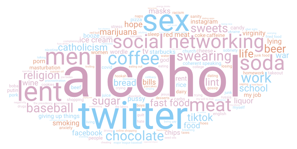
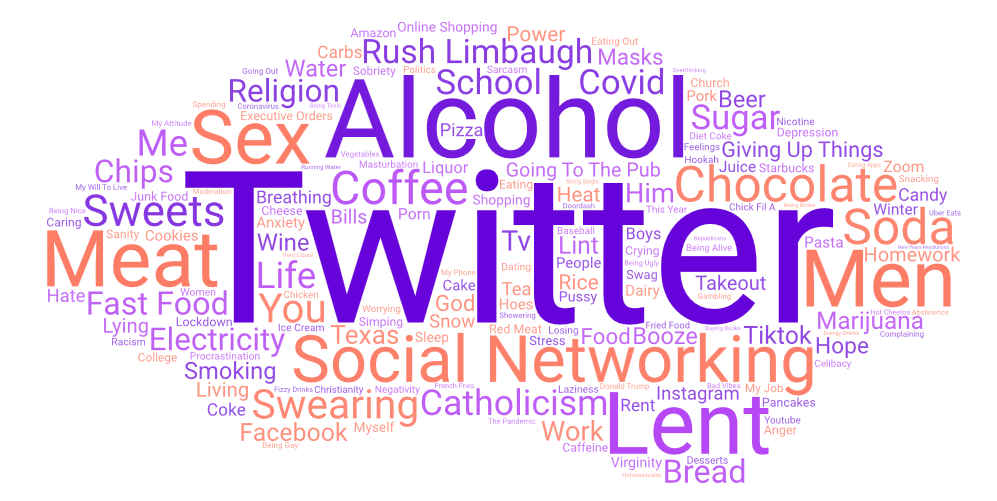
This year, the usual trio of alcohol, Twitter, and social networking led the list, though alcohol easily outpaced Twitter this year–unlike last year, when alcohol fell behind Twitter. If you combine “baseball” and “Major League Baseball,” the combination would have ended up at #5, a reference to this year’s cancellation of the regular start of the baseball season in the U.S. As usual, there were several U.S. political issues, with “coherent speaking,” “ice cream” (up 35 places), and “the presidency” referring to Joe Biden, who landed at #97 this year. “War” came in at #52, referring to the ongoing conflict in Ukraine, with “Putin,” “Russia,” “Ukraine,” and “Russian oil” also appearing near the bottom of the list. New this year is “Wordle,” a currently popular online game owned by the New York Times.
This year’s list draws from 19,411 tweets out of 389,796 total tweets mentioning Lent.
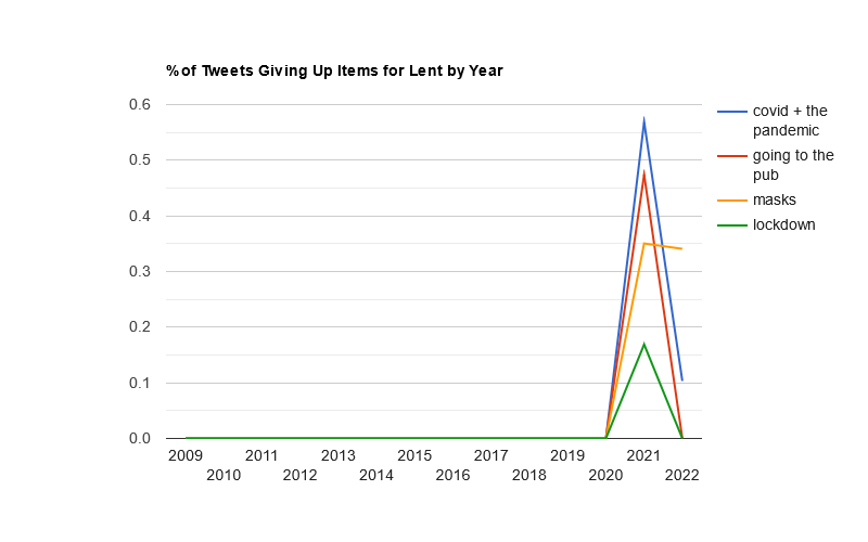
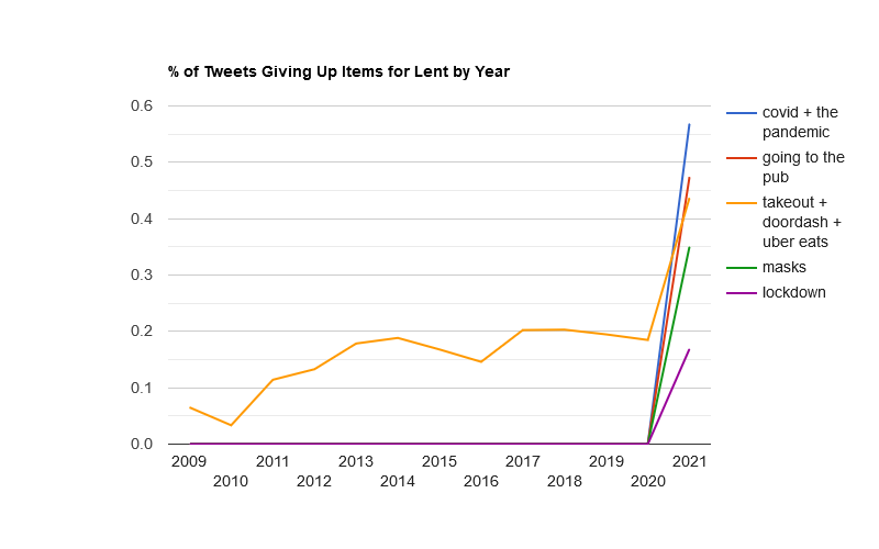
COVID-19
Most COVID-related terms declined substantially this year, aside from “masks,” which stayed relatively constant.
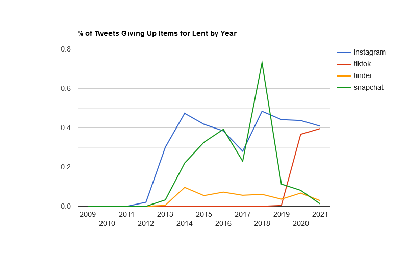
Social Media
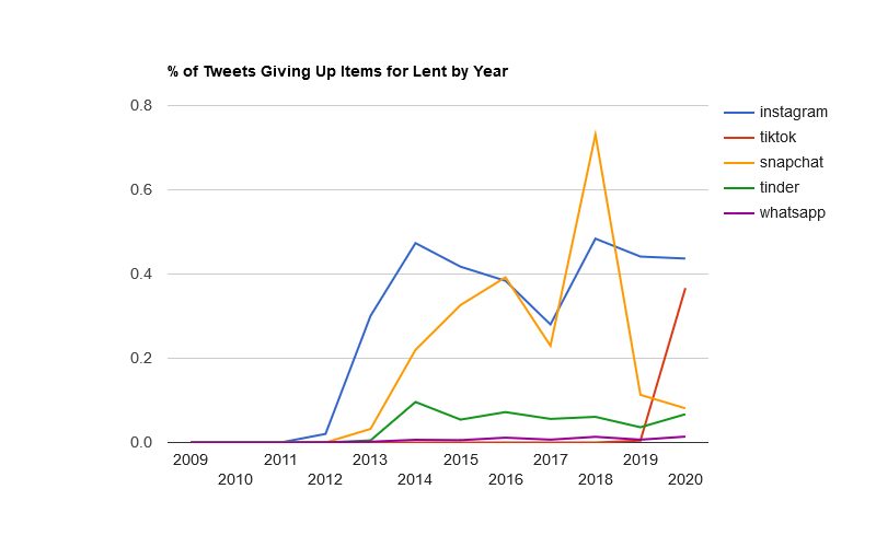
TikTok finally overtook Instagram. Facebook, not on this chart, is also behind Instagram.
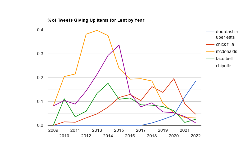
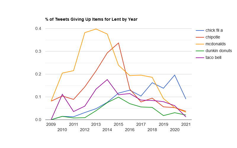
Restaurants
Food-delivery services like DoorDash overtook traditional fast-food restaurants this year.
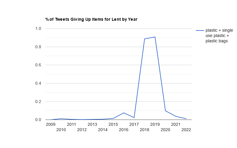
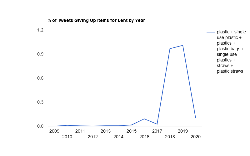
Plastic
Plastic was fashionable to give up in 2018-2019, but no longer.
Top 100 Things Twitterers Gave Up for Lent in 2022
As I write this post, with about 530 tweets analyzed, perennial favorites “twitter,” “alcohol,” and “social networking” lead the list, with “masks” ranking right now at #4 (related to some countries dropping mask requirements for the COVID-19 pandemic).
Look for the usual post-mortem on March 5, 2022.
Posted in Lent | Comments Off on Track in Real Time What People Are Giving Up for Lent in 2022
When I think about the story of David and Goliath, I like to picture David as having an extra leg instead of a left arm, ready to throw a whole torso at Goliath, who’s standing behind him amorphously in Sauron-style armor. And thanks to the power of AI, now my imagination has become reality:
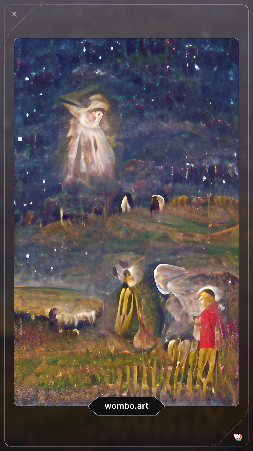
Not really. I gave an AI the text prompt: “David fighting Goliath by a river,” and then it created the image by itself. The AI in question is WOMBO Dream, a new app that generates a trading-card style image based on text you give it. While this image was the most horrifying of all the images it generated for me, it did a decent job on many Bible-related prompts. Below is a gallery of my favorites.
The AI did best with prompts relating to the angel announcing the birth of Jesus to the shepherds:
prompt: Angel Gabriel appears to shepherds and sheep in a field at night prompt: Angel Gabriel appears to shepherds and sheep in a field at night
The star in the last image shows up again in this rendition of the adoration of the magi:
prompt: adoration of the magi
Gethsemane captures the essence of the scene, with a somewhat abstract robed figure collapsed while others pray:
prompt: Gethsemane
The creation of the world shows the waters above and the waters below:
prompt: In the beginning, God created the heavens and the earth
Perennially favorite Bible verse Jeremiah 29:11 gets a literal rendering with a giant eye in the sky:
prompt: I know the thoughts that I think toward you saith the Lord thoughts of peace and not of evil
Here the rainbow in the Noah story becomes an instrument of vengeance:
prompt: Noah ark flood rainbow
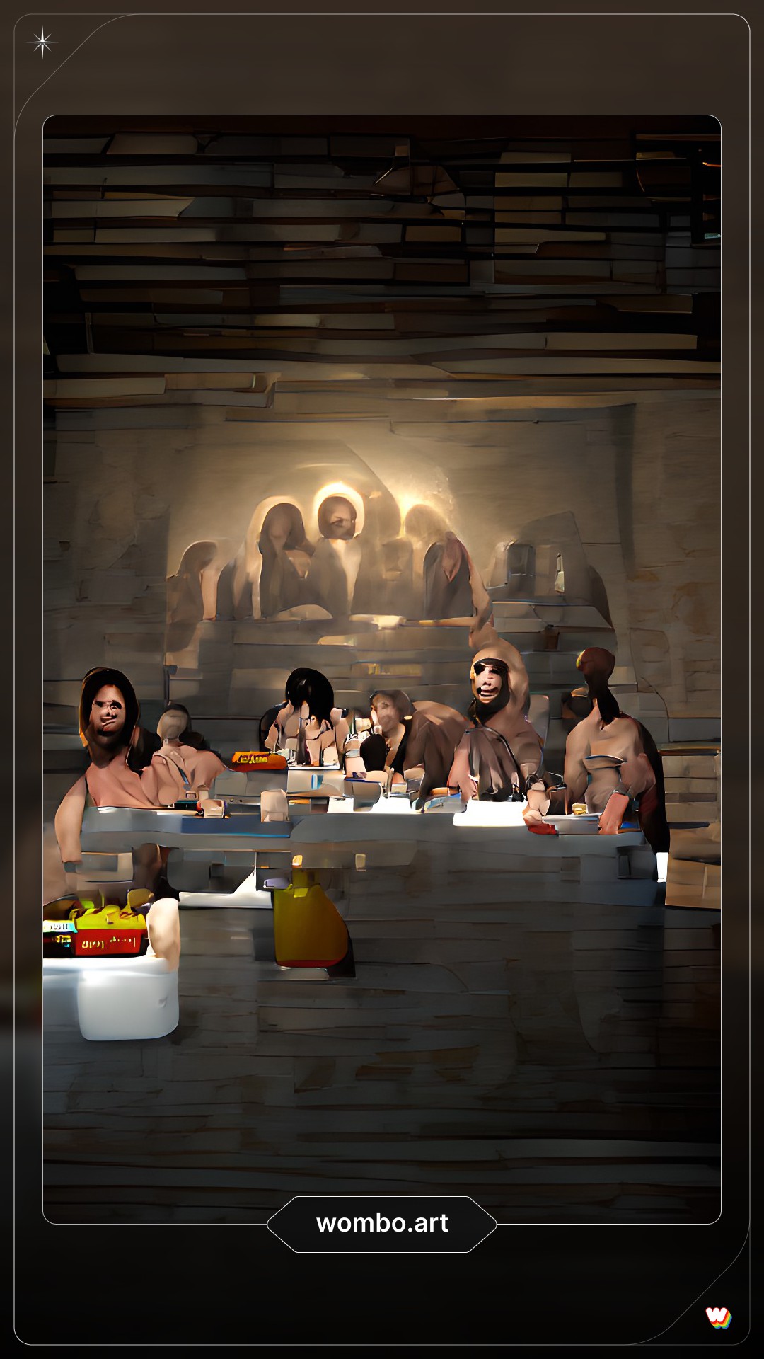
I call this one “The Kiddie Table at The Last Supper” (are those French fries?):
prompt: The Last Supper Jesus
What it’s really doing here is representing the related scenes multiple times in the same image, which is actually quite common in historical artistic depictions of biblical stories. That’s how I interpret what’s going on in this scene of Elijah being fed by ravens, where I think he appears both in the foreground and in the background:
prompt: prophet Elijah being fed by ravens
Finally, here are two images where the AI came up with a conceptually interesting (to me) idea that a human artist could polish and make something thought-provoking. First, here’s a representation of Jesus’ temptation in the wilderness about turning stones to bread. Here there are stones that look like bread to heighten the temptation:
prompt: Jesus temptation in the wilderness turn these stones to bread
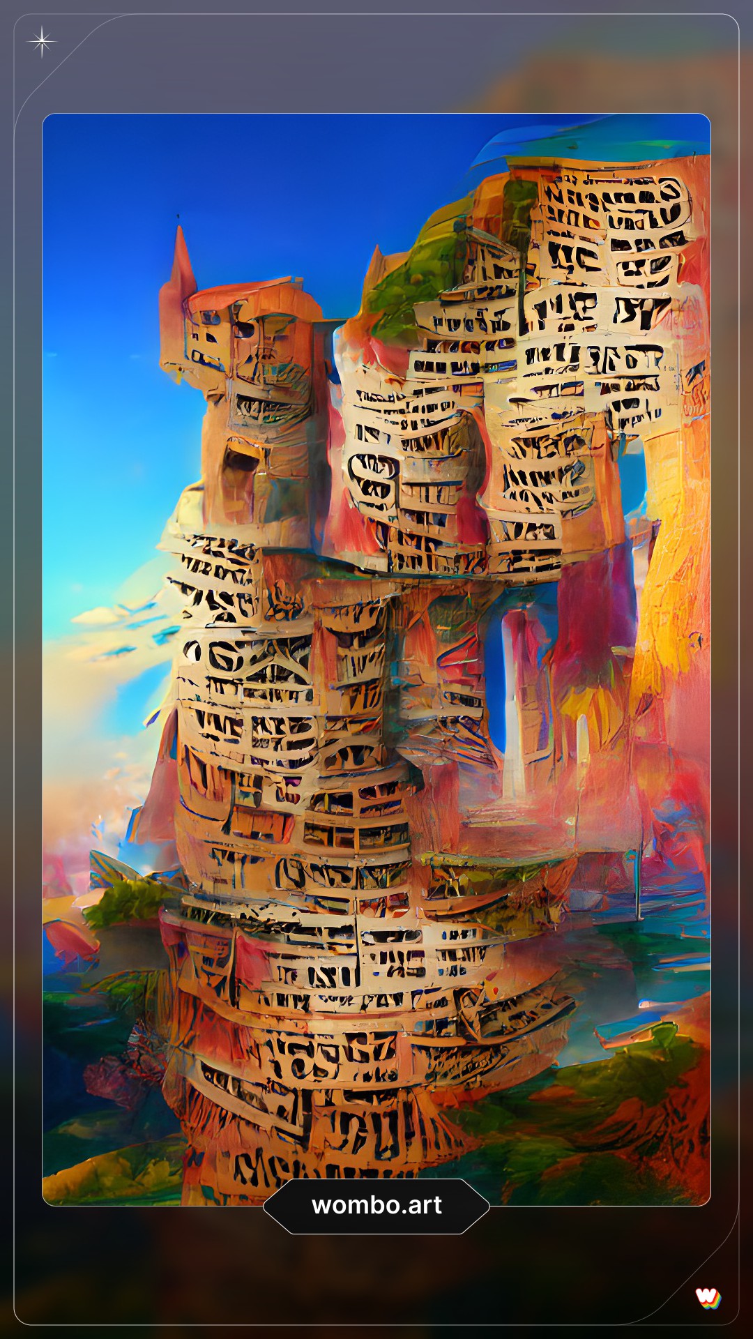
And finally, the Tower of Babel made out of words. That’s just clever:
prompt: tower of Babel confusion of languages
Posted in AI | Comments Off on Terrify Children with These AI-Generated Bible Story Trading Cards
When Bob Pritchett asked me at the BibleTech 2019 conference what I was working on at the time, I answered that I’d returned to the idea that originally launched this site: Bible geography. When I told him that, I’d intended to present the results of this effort at a presumptive BibleTech 2021 conference. Since the global pandemic has put in-person conferences and travel on hold, however, here are 4,800 words about it instead of a presentation.
This project is a Bible atlas (technically, a gazetteer) that (1) comprehensively identifies the possible modern locations of every place mentioned in the Bible as precisely as possible, (2) expresses a data-backed confidence level in each identification, and (3) links to open data to fit into a broader data ecosystem. The goal is to provide a baseline for future Bible geography projects to use.
In my original design document for this project, I have the following guiding principles; I’ll discuss their implementation below:
Comprehensively reflect current scholarship.
Use linked data.
Be accurate and precise.
Quantify uncertainty.
Handle non-point data.
Include media.
Open the data.
Background
I started this site in 2007 with the idea of creating a place that embraced Google Earth as a way of exploring places mentioned in the Bible. I relied on freely available and older public-domain sources to disambiguate and identify modern locations of biblical places, and then I picked the location that looked likeliest to me. The 1899 Morrish Bible Dictionary proved especially helpful because it included latitude and longitude coordinates for many of its entries. Of course, it also reflects a late-nineteenth-century view of biblical and archaeological scholarship.
Over time, I became frustrated with the limited nature of the dataset; I wanted to incorporate modern scholarship, which meant one thing: I needed a budget.
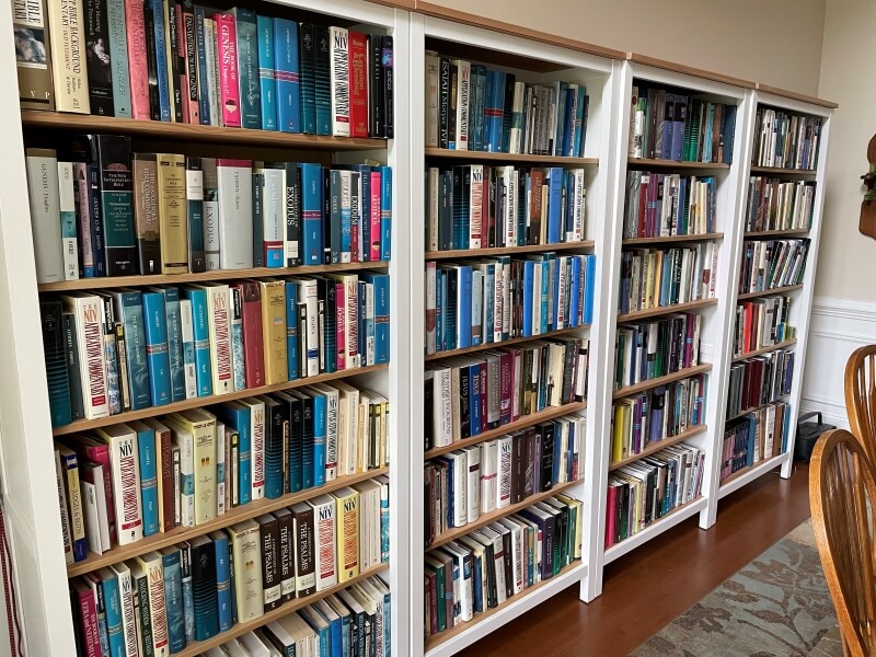
Used Bible atlases are surprisingly cheap; you can find most of them on Amazon for around $10 each. Bible dictionaries and encyclopedias are surprisingly expensive: even digitally, they run $100 or more. Commentaries also add up because there are so many of them. Fortunately, I know people with commentary libraries that I could use, helping keep the cost down:
Look at all those commentaries.
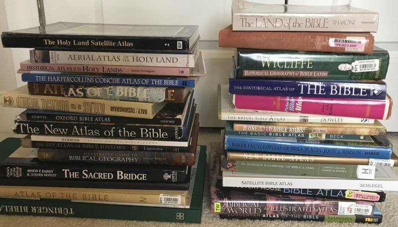
In the end, my content budget for this project ran about $1,000, and I consulted what I believe to be every significant Bible atlas, dictionary, and encyclopedia published since 1980 (and several before then).
These are just the print atlases, excluding the ten-pound one I’m using to prop up my laptop. (Having now owned both print and digital atlases, I recommend print. Atlases on Kindle are the worst, especially when they have a non-hyperlinked index.)
Goal 1: Comprehensively reflect current scholarship
With this variety of sources—over seventy in all—it becomes possible to paint a full(ish) picture of where modern scholars believe biblical places may have been.
My basic method was simple:
Start with a place mentioned in the Bible.
Consult a dictionary/encyclopedia article, atlas/gazetteer entry, commentary note, or other reference work related to that place.
Record every suggestion of possible locations for the place, including the confidence of the suggestion.
Research coordinates for any modern locations mentioned.
Repeat steps 2-4 across 70 or so sources.
Repeat steps 1-5 across all 1,300 places mentioned in the Bible.
In this way, you end up with a set of “votes” from authors that, in principle, reflects the current consensus on where a place was. This approach also removes me from the position of deciding which identifications are more valid than others.
A typical Bible atlas makes around 500 identifications; a large dictionary or encyclopedia might suggest around 1,000. This project records over 3,200 identifications, tallying 23,000 votes across 1,340 ancient places tied to nearly 1,600 possible modern locations.
I use the word “identification” because a source might say that a particular place is another name for a different ancient place, or maybe not even a place at all, so not every vote is for a modern location. The ratio of modern-to-ancient suggestions generally runs around 2:1—in other words, there are usually around twice as many modern suggestions (identifying a specific modern location) as ancient suggestions (identifying a biblical place with another ancient place).
For the purposes of this project, authors have nineteen ways to propose an identification. I particularly want to highlight the different rhetorical strategies of “confidence” vs. “authority.” About 82% of the time, authors will express their own opinion that a certain identification is likely or unlikely. The rest of the time, they’ll appeal to the prevailing consensus, use the passive voice to avoid expressing their own view, or note that someone else has made an identification.
Here’s the schema I used to model this rhetoric.
Category
Keyword
Common words used
Confidence
Yes
is, undoubtedly, no doubt, confirmed, is to be identified with, convincingly identified, surely, corresponds to, has been fixed to, no good reason to question, almost universal agreement, is represented by, should be connected with
Likely
probably, likely, gazetteer entry without qualification, plausibly identified, evidently, fairly certain, quite possibly, popular, attractive, strongly suggest, suits well, serious candidate, seems to fit, presumably, may well be, strong evidence
Most likely
most likely, most probable, best fit, most suitable, strongest candidate, best current suggestion, least objectionable, best identified, best explained
Map
(coordinates unambiguously match on a map)
Possible
possibly, may, (gazetteer entry with qualification, e.g., “?”), tentatively, preliminarily, provisionally, some scholars, apparently, sought at
Unlikely
unlikely, much less likely, doubtful, tenuous, dubious, problematic
No
not, reject, little to commend it, rule out, abandon, unacceptable, out of the question, impossible, unthinkable
Identified
Is identified
is identified, is believed, is associated with, now identified, is identifiable
Has been identified
has been identified, has been inferred, has been linked with
Identified (as an adjective)
identified, suggest, associated with
Authority
Old
formerly, previously
Parallel
parallel passage
Preserved
name has been preserved, name is preserved, name survives
Scholar
(another scholar is cited by name)
Traditional
traditionally, historically, (if the tradition predates the nineteenth century)
Usually
generally, usually, most scholars, many scholars, most often, most, customarily, commonly, consensus, gained favor, is thought to be, prevailing identification
Variant
certain translations read
Unknown
Unknown
Unknown
Uncertain
Uncertain
The resulting KML file has about 7,100 placemarks in Google Earth.
Goal 2: Use Linked Data
A modern Bible atlas doesn’t exist in a data desert; it participates in a network of scholarship both focused on the Bible and also on general history. Linked Data is a way to map data between different datasets—a way to participate computationally in this network of scholarship. This project contains 6,536 Linked Data connections for the ancient places mentioned in the Bible (though, to be fair 1,228 of them are to the 2007 version of this dataset).
About half of the places mentioned in the Bible have a Wikidata entry; I also bring in other ontologies —notably the Bible-oriented Logos Factbook and TIPNR—and Pleiades, the broadly historically focused “community-built gazetteer and graph of ancient places.”
But linking ancient places reflects only half the story: modern locations also have identifiers, and usually coordinates associated with an identifier. Here again I draw on Wikidata but also on modern gazetteers like GeoNames and OpenStreetMap.
In all, 6,473 Linked Data connections support the coordinates for modern locations.
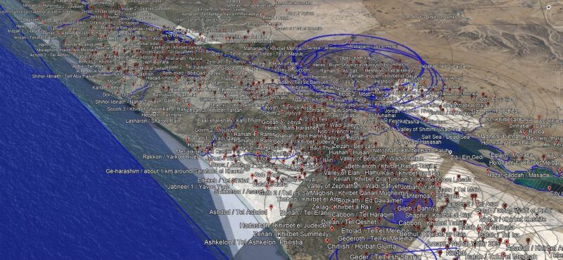
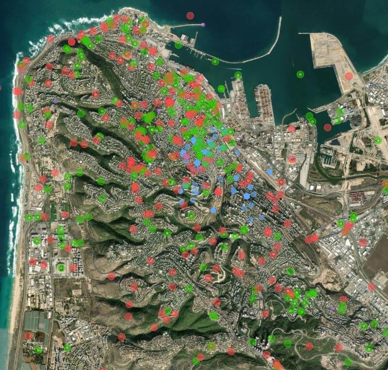
The WikiShootMe tool was especially helpful for this project. Here’s what it looks like around Mount Carmel. The green dots represent Wikidata items with photos, the red dots are Wikidata items without photos, the blue dots are photos without Wikidata items, the yellow dots are Wikipedia articles, and the purple dots are links to other datasets.
Goal 3: Be accurate and precise
Most reference works, when they provide coordinates at all, use a 1 km (0.6 mile) resolution—in other words, they get you within 1 km of the actual coordinates of what you’re looking for. Often they just say that a modern location is “near” another one or provide a rough distance and (if you’re lucky) a direction from a larger city. Sometimes, if they’re drawing from nineteenth-century travelogues, a source might say that a location is a certain number of hours (by foot or horse) along a road between two other cities, or they just provide a name with no indication of where it is. The point is that they’re usually (but not always!) accurate—they provide a general sense of where a location is. Unfortunately, they’re not usually precise—telling you exactly where it is.
Fortunately, with modern, public data and gazetteers powered in part by local knowledge, we can do better. Digital sources often provide precise coordinates for ruins visible on the ground. In this dataset, 17% of locations have coordinates with 10 m, 57% within 100 m, 87% within 250 m (matching a modern settlement), and 97% within 1 km. All locations are as precise as I can find support for; some places in Jerusalem (e.g., the Millo) potentially have specific archaeological remains inside the city with exact coordinates.
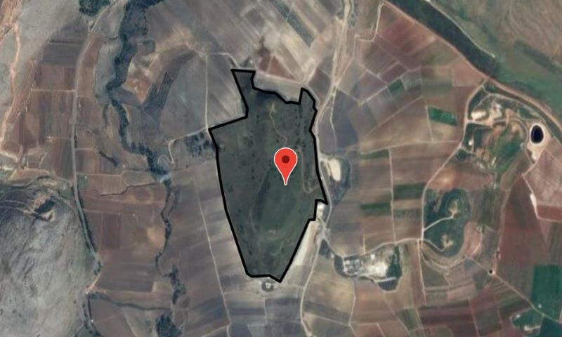
About 190 modern locations, such as Tel Abel Beth Maacah above, even have geometry (provided by OpenStreetMap) that outlines the extent of ruins, illustrating both point and polygon precision.
Additionally, I’ve provided over 1,200 comments on how I came to decide on the coordinates for certain locations (the hard ones to find, or ones with seemingly contradictory sources) so that you have a starting point to validate my decisions beyond the Linked Data. Finding coordinates for modern locations represents the bulk of the time I spent on this project; many of these locations took hours of research to locate, and I cite over 400 different sources.
Goal 4: Quantify uncertainty
Even after this research, however, it wasn’t always possible to find exact coordinates for modern locations. Therefore, I also provide my estimate of how close the coordinates in this dataset are to the actual coordinates. Sometimes the best-available coordinates aren’t exactly where they should be because archaeological datasets predate GPS, or the datasets just don’t try to be more precise.
On the other hand, while modern locations have positional uncertainty, ancient places come with their own set of uncertainties.
About 150 ancient identifications are described as “near” somewhere else, which I attempt to quantify based on context (in some cases, “near” might mean 1 km, and in others it might mean 10 km or more).
But more significantly, scholars just aren’t sure where many biblical places are. Since a goal of this project is to document all the possibilities, the question then becomes how to decide which identifications are most likely. My solution, which has substantial room for improvement, involves looking at the change in confidence over time.
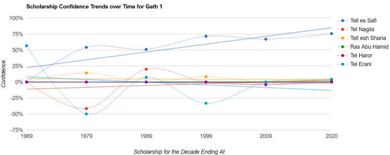
I assign a numerical score for each confidence level (e.g., a “Yes” vote from a source counts for 30 points, while a “Likely” vote counts for 24), sum the scores from each source, normalize the scores (where 1,000 represents near-certainty), and then group them together into decades. In theory, the resulting composite score reflects the confidence of scholarship for a particular identification during that decade. Then, if you draw a best-fit (linear regression) line across the decades, you can see where the scholarship is trending. The number I use for determining confidence levels reflects the value of this best-fit line in 2020.
When we look at a chart expressing the data for Gath of the Philistines below, for example, the trendlines largely reflect what you’d expect if you’re familiar with the controversies over its identification: around the 1950s, it was identified with Tel Erani, but later archaeological discoveries have shifted the identification definitively away from there and likely to Tell es-Safi. Other good examples of shifting confidences are Ai and Anaharath.
The main problem with this approach is that a line doesn’t necessarily model the data well, 77% of the time, the r-squared value is less than 0.5, meaning that confidence doesn’t get consistently higher or lower with time but rather jumps around. See Abel-keramim, for example.
There are other options for generating confidence. For example, I could sum the overall confidences over time so that the lines move higher as time goes on. However, because the number of sources varies by decade, the lines jump in ways that don’t necessarily reflect the underlying confidence levels. I decided that using line charts was the least-misleading way to approach the data, imperfect though it may be.
Goal 5: Handle non-point data
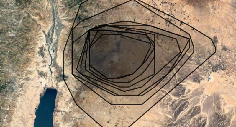
This vote-based approach to modeling uncertainty also extends to regional geographic data. Regions in the past didn’t necessarily have the sharp political boundaries we think of today, and they varied over time as their territory waxed and waned. Thus, while it’s nice to present tidy historical boundaries on a map, reality was messier. We can still try to quantify the messiness, however.
I chose to approach the problem of regions not from a historical or political perspective but from a cartographic one. Instead of answering the question, “What are the boundaries of this region?” I instead answer the question, “Where should I put a label for this region on the map?” And it turns out that this latter question is answerable using a methodology like the one I used for place identifications.
I took about 70 different Bible atlases and other reference works and recorded polygons roughly where the region labels or boundaries appeared. (This approach involved a lot of interpretive looseness on my part: I wanted to emphasize the commonalities among the different sources.) Here’s what the labels for the region of Ammon look like, for example:
Then I combined the polygons from the different sources to create a confidence heatmap: for example, “four sources suggest this point was in the region, but only three sources support this point over here.” The resulting concave-hull isobands (with each line indicating the number of sources supporting the position of the region, so inner isobands reflect a higher confidence) yields useful information about not only where to put a label but also the rough—very rough—extent of a region. The following isobands for Ammon, for example, draw from sixteen sources and show its core territory around Rabbah, as you’d expect. The outermost isoband reflects confidence levels from two sources, while the inner reflects confidence from ten or more. Thus, if you were looking to place a label on this map for “Ammon,” your best bet would be in the innermost polygon, but anywhere inside the isobands would reflect a consensus placement.
Ultimately, I created 3,545 polygons to generate 77 isobands files. Not every ancient region is controversial enough to justify isobands; this dataset contains 238 region files in total.
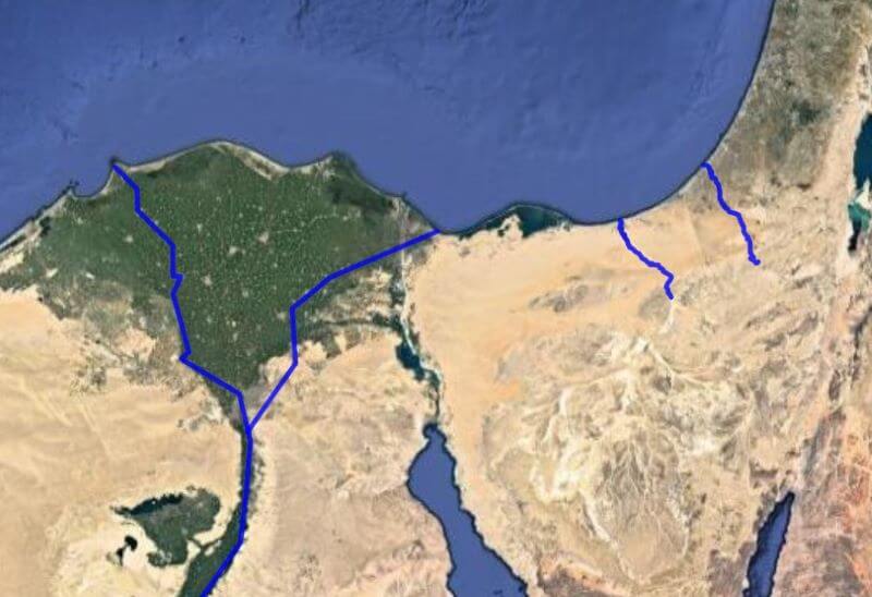
In addition to regions, there’s also path data, especially for rivers and wadis. The previous version of this dataset treated them as points, but OpenStreetMap already had paths for many of the relevant rivers, and when the OSM data didn’t already exist, I created it there. In total, about 120 paths have geometry in this dataset; I made 91 edits to OSM as part of this project.
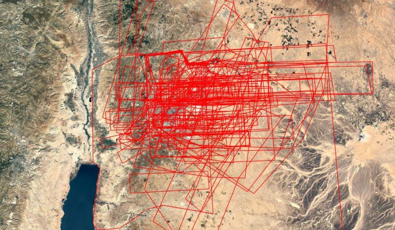
For example, here are the paths of possible identifications for the Brook of Egypt (for display, I reduce all paths to around 100 segments, but the dataset also contains the full geometry from OSM):
Goal 6: Include media
The final major component of this dataset is the inclusion of an image to represent every modern location: there are about 1,650 512×512-pixel “thumbnail” images that are freely available to use. Just over 1,000 of them are drawn from Wikimedia Commons, while the remaining have a satellite image (with a resolution of 10 meters per pixel) illustrating the area surrounding the location. Honestly, Wikimedia Commons had more images than I was expecting: many of these locations are pretty obscure.
About 50 images illustrate an ancient region. (For example, the best thumbnail for the region of Gilead probably isn’t one of an archaeological site that happens to be in the region.)
Locations with Wikidata items often had images associated with them. In other cases, the WikiShootMe tool provided a way to find untagged images of the location (or sometimes an artifact associated with the location). Once I had a viable image, I cropped it into a square and potentially adjusted the colors or used Photoshop’s Content-Aware Fill tool to edit it for consistency and to be more legible at small sizes. The dataset also records license and attribution data as presented on the Wikimedia Commons page for each image.
To create the satellite images, I used Sentinel-2 composites from 2019. Sentinel-2 is a European satellite; its 10-meter-per-pixel resolution is just enough to illustrate the general character of a location (e.g., desert vs. wooded, hilly vs. flat). The resolution is lower than what you see on Google Maps but is freely reusable.
All images have descriptive alt text since accessibility is a modern application of Christian charity. The images themselves also have accessibility and license and attribution data embedded in them.
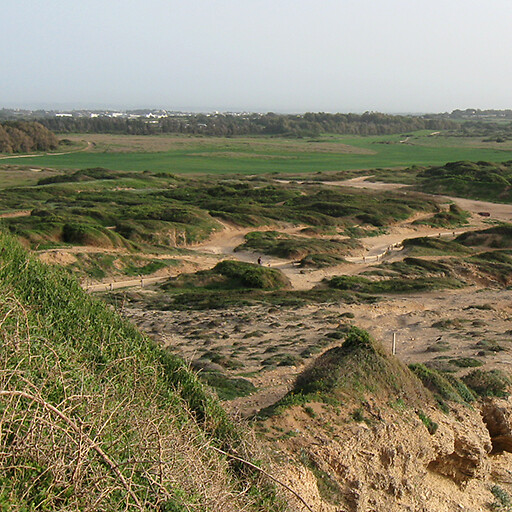
I struggled most with finding images to illustrate regions. Below, for example, is what I chose for the Sharon Plain; it shows that the region is coastal, flat, and agriculturally fertile, but depicting a whole region using a single image will necessarily be reductive.
All the data is available in a GitHub repository with a 7,000-word readme describing the (unfortunately complex) data structure. My hope is for you to do something interesting with it. It’s under a CC-BY license, though the images are under a variety of Wikimedia-approved free licenses (as noted in the metadata), and the OpenStreetMap data is under a CC-BY-SA-style ODbL license. GitHub isn’t ideal for data projects like this (though it does have an integrated GeoJSON viewer), but I wanted a stable, long-term host that doesn’t make you jump through hoops to get the data.
The dataset currently contains files for (the totals may change over time):
Ancient places (1,342 entries).
Modern locations (1,596 entries).
Geometry (6,621 GeoJSON and KML files) and metadata (588 entries for non-point data) for both ancient places and modern locations.
Images (1,650 jpegs) and image metadata (2,424 entries—there’s metadata for images considered but not included, as well as pointers to some copyrighted images, especially Google Street View).
Sources consulted (442 entries).
JSON Schemas to validate the rest of the data (5 schemas).
Beyond the 175 MB of images, you’ll find 100 MB of geometry data and 16 MB of core data.
The only data omitted from the repository is the raw vote data (“Anchor Yale Bible Dictionary found this particular identification to be ‘likely’”) because I want to supplement—not replace—my sources; if you want to find out how Anchor Yale Bible Dictionary identified a place, the data shows you where you can look it up in your own copy. This project transforms and interprets raw data, bringing together different perspectives and uniting different datasets, both in print and online. To save you time in your research, I want to point you to scholarly sources where you can learn more about the arguments for various identifications.
Limitations
This dataset has a number of limitations:
It builds on the work I did in 2007 to disambiguate places mentioned in the Bible. While I reworked many of the places (e.g., I didn’t realize in 2007 that there’s more than oneRabbah), I didn’t revisit the disambiguations from scratch.
The disambiguations also showcase a limitation to the data model. If two places in the Bible share a name, but my sources disagree about which one a certain verse is referring to, then I created a third place with identifications pointing to the other two. There aren’t really three possible places; the third one exists only because the data model requires it. For example, Ibzan’s hometown of Bethlehem 3 is likely Bethlehem 2 or possibly Bethlehem 1, not a third Bethlehem somwhere.
Similarly, some sources may consider a place the same as another one, while other sources may mention the modern location associated with the other place but not make the ancient connection explicit. I recorded the identification as described in the sources, but it leads to situations where the same modern location appears in multiple identifications, as part of both “another name for an ancient place” and “at this modern location” identifications. For example, Timnah 3 has Khirbet et Tabbaneh both as a possible identification for Timnah 2 and as a separate, modern identification.
While I’m confident that the spelling of biblical place names correctly reflects the text of the translations they appear in, spellings of modern locations are less validated. They could easily contain typos (where the typos exist in a source, I note it). They also reflect a variety of transliteration approaches from the nineteenth century to today. The primary modern name depends on whether it’s unique in the dataset, not whether it reflects the dominant name used in the sources. (For example, Bethsaida could be at at-Tell while Ai could be at et-Tell, names that reflect different transliteration approaches from Arabic into English of the same underlying name.) Additionally, I don’t know Hebrew or Arabic, so the transliterated diacritics I preserved could be wrong. I focused on simpler transliterations and thus didn’t usually preserve some more scholarly aspects of transliterations like breathing marks.
River geometry is always a single path, even if the river has branches. This limitation is most apparent on large rivers like the Nile, whose geometry doesn’t reflect the delta as it approaches the Mediterranean.
The identifications depend on my reading comprehension, interpretation, and conversion of freeform text into structured data, not to mention my limited sources and research abilities. The identifications don’t have the kinds of checks and balances a more-formal research project would entail. My goal was 90% accuracy.
Originally, I’d hoped to provide a wiki-style interface to the data, where people could contribute. But the data is so interrelated—it relies on a 45-step build process from raw spreadsheet to final form—that such functionality went beyond the scope of what I could accomplish. The identifiers also rely on static data snapshots and don’t incorporate improvements to, say, Wikidata that have appeared since I first pulled the data from there. The result is less dynamic than I’d originally hoped.
Advancements over the current state of the world
This project attempts to advance the state of the art along the following dimensions:
Number of identifications. With 23,000 votes for the locations of ancient places, this project reflects a broad (if heavily evangelical) survey of current thinking. And with 3,259 distinct identifications, it has around six times as many identifications as the typical Bible atlas. However, Bible atlases provide context and interpretation that this project lacks; I’m not trying to replace a Bible atlas, only to provide supporting data.
Precision of coordinates. With 87% of coordinates identified to within 250 m, the precision in this project outshines the best-case 1 km precision (often just a prose description) found in most Bible reference works.
Number of Bible translations. Ten Bible translations reflect a variety of spellings and translation approaches, reducing reliance on the ESV (compared to the 2007 version of this dataset). The NLT, for example, likes to use place names in verses where other translations instead might say something like “there.” In total, 5,616 verses contain at least one place name, with 87,988 total name instances tracked across all ten translations.
Integration with external resources. Linking to existing databases like Wikidata creates an outward focus and enables future work, with 6,536 ancient connections and 6,473 modern connections.
Images. Every modern location has a thumbnail image, with 1,014 of the 1,650 photos being an on-the-ground, close aerial, or artifact photo, and the remainder being a medium-resolution satellite image.
Transparency of data. With sources cited and data available, you should have what you need to trace my conclusions if you have the relevant sources available to you. (I tried to include links to online sources where possible.) I provide 1,251 comments providing more information in difficult cases.
Benefits to you
If a place is mentioned in the Protestant Bible, it should be in this dataset. You can look it up in the interface by passage reference or name and quickly get a sense of where modern scholars think it could be, as well as how confident they are in the identification. Often the possibilities cluster tightly (Penuel, for example, is probably on one of two neighboring hills, even though one is more likely than the other); if you only need to know an approximate location (which, unless you’re doing in-depth study, is almost certainly all you need), then you’re set. But if you want to know more about the possible locations and how confident my sources are in their identifications, that data is also available to you. I want to encourage you to purchase print or digital books that you find helpful to deepen your study of Bible geography; the dataset includes links to Amazon and other sites like Best Commentaries, sites whose stable urls also provide a further kind of Linked Data.
Interface
The data went live on this site in January 2021, and an interface that showcases it went live in September 2021. Looking at how people use the site has led to some data changes. For example, when I first launched, I didn’t provide proposed locations of the Garden of Eden, just calling it “unknown.” But after seeing how often people look it up, I treated it like any other place and provided potential identifications.
The 2007 version of the interface emphasized downloading Google Earth KMLs for individual books and chapters. For this update, I want to encourage exploration of the data even if you don’t have Google Earth. Therefore, I’ve changed the interface to let you interact with the data in five ways:
1. Book/chapter view
This view lets you see a bunch of places at once so that you can get a sense of how geography fits into the narrative. It includes:
A map of all the places mentioned in the book or chapter.
A way to drill down into a single chapter if you’re looking at a whole book.
A clickable list of all the places (including verse references and potential modern identifications) to explore on another view or on the map on the same page.
2. Ancient place view
This view presents data about ancient places mentioned in the Bible. It includes:
A map of possible identifications, with placemark pushpins varying in opacity depending on the confidence of the identification.
Any alternate names found in Bible translations.
Geo data (KML and GeoJSON) for the identifications.
All the identifications and their corresponding confidence levels.
Bible verses where the place appears.
Linked Data identifiers.
Sources supporting the identifications.
A graph of confidence trends over time.
Links to similarly named places (especially since the numbering system I use—“Aphek 1,” “Apkeh 2,” etc.—is fairly opaque).
A thumbnail image when the identification is noncontroversial.
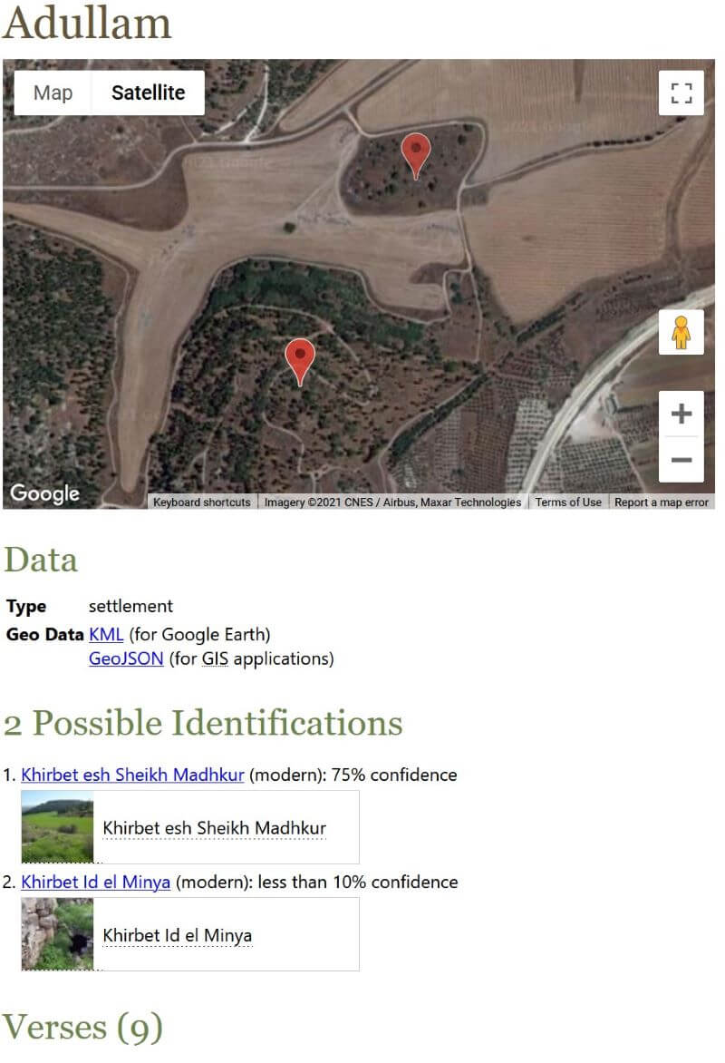
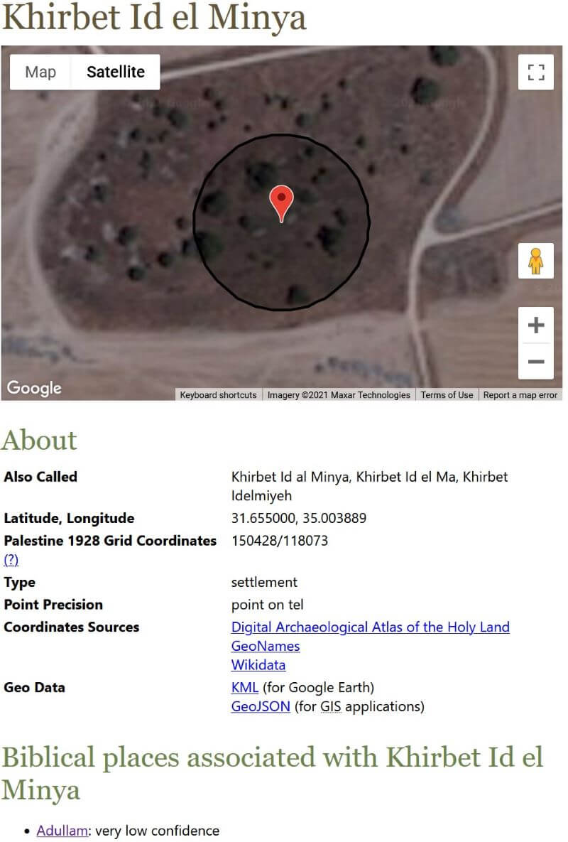
3. Modern location view
This view presents data about modern locations identified with ancient places. It includes:
A map showing geometry (point, path, polygon, or isobands), including polygon geometry of an archaeological site if it’s available (e.g., Colossae).
Alternate names (usually different transliterations but sometimes names in different languages, such as Hebrew or Arabic).
Latitude and longitude coordinates.
Palestine 1928 grid coordinates, where relevant; most Bible reference works use this coordinate system.
Coordinate precision (how close to the actual location the coordinates are).
Sources supporting the coordinates.
Accuracy and precision notes.
Biblical places associated with the location.
A thumbnail image.
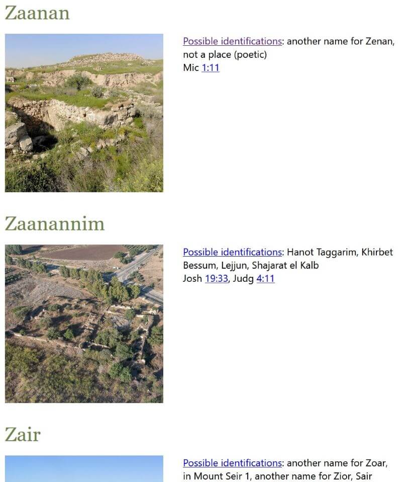
4. Atlas view
This view is an alphabetical list of all the ancient places. It includes:
A thumbnail image of the most-likely modern location.
A list of possible identifications.
Bible verses where the place appears.
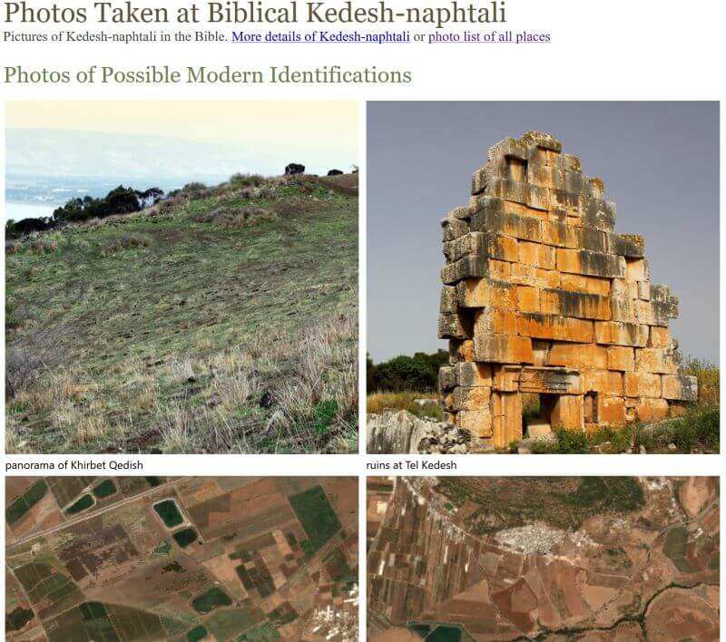
5. Photo view
This view is mostly for legacy compatibility. Previously, I used the Flickr and the now-defunct Panoramio APIs to pull in photos that are geographically near the coordinates, but the result was hit-or-miss. Now there’s a single photo for each modern location associated with an ancient place. I wouldn’t include this view except for historical reasons; I don’t consider it very useful.
Conclusion
It’s 2021. Bible reference works shouldn’t have to say that a ruin is, for example, “on the left side of the road from Salt to Amman, 1.5 hours [by horse] northwest of Amman.” And then you shouldn’t have to spend three hours figuring out exactly where that is, consulting the original 1822 travelogue that makes this claim, and then trying to determine exactly where the road ran in 1822 compared to modern roads. Instead, we should be able to say that that a ruin is at particular coordinates with a certain level of precision. And then we should be able to tie that ruin back to a biblical location with a quantifiable degree of confidence. This project lets us do that.
Environmental impact
Creating this data required about 800 kWh of electricity in computing power and local travel. All the electricity used was solar-generated; carbon emissions totaled about 40 kg. Book shipping generated an additional 103 kg of carbon emissions. The total carbon impact for this project is therefore approximately 143 kg; I don’t have tools at my disposal to be more precise than that. I include this statement just to note that data, even Bible data, has an environmental impact.
This year, the usual trio of Twitter, alcohol, and social networking led the list. But current events influenced the list this year more than most. Radio personality Rush Limbaugh‘s death on Ash Wednesday led many to comment that they were giving him up for Lent, landing him at #7. A major winter storm (#62, snow and #77, winter) in Texas (#34) knocked out electricity (#5), water (#35), and heat (#68) for millions of people. Finally, the global pandemic (#23, covid) elevated topics like going to the pub (#24) and suppressed others, like eating out (#75). Zoom (#63), a videoconferencing service, appeared for the first time. “Executive orders” (#53) refers to a satirical tweet about U.S. President Biden.
This year’s list draws from 24,312 tweets out of 557,560 total tweets mentioning Lent.
COVID-19
The global coronavirus pandemic led to jumps in several topics, most notably “going to the pub,” which was almost as popular as “COVID,” and was followed closely by food pickup and delivery.
Social Media
In the battle of the social networks, TikTok has almost overtaken Instagram, while Snapchat fell below Tinder. Facebook, not shown on this chart because it makes the chart harder to read, was once dominant and is now only just above Instagram.
Fast Food
Fast food is down across the board.
Top 103 Things Twitterers Gave Up for Lent in 2021
As I write this post, with about 593 tweets analyzed, perennial favorites “alcohol,” and “twitter,” and “social networking” lead the list. I expect to see tweets this year related to the global pandemic. And will TikTok make the top ten this year?
Look for the usual post-mortem on February 20, 2021.
Posted in Lent | Comments Off on Track in Real Time What People Are Giving Up for Lent in 2021
This year alcohol topped the list for the first time since 2017, followed by social networking and Twitter. New to the top 100 this year are “trolling” (#14) and “being toxic” (#94), following Pope Francis’s call to give up online insults. Also new are “TikTok” (#33), “simping,” or acting obsequiously on TikTok (#41), “coronavirus” (#73) (related: shaking hands), and “the streets” (#95).
This year’s list draws from 35,817 tweets out of 540,684 total tweets mentioning Lent.
Plastic
Plastic has been appearing near the top of the list for the past two years as some churches, especially in the UK, have encouraged people to give it up for Lent. This year, mentions of plastic fell precipitously, suggesting that either giving it up has become less fashionable or that people inclined to give it up already did so over the past two years. In particular, “straws” received no mentions.
Social Media
As noted above, TikTok is the big winner here.
Fast Food
Chick-fil-A continues its march upward, while McDonald’s continues its decline.
Top 100 Things Twitterers Gave Up for Lent in 2020


.")


