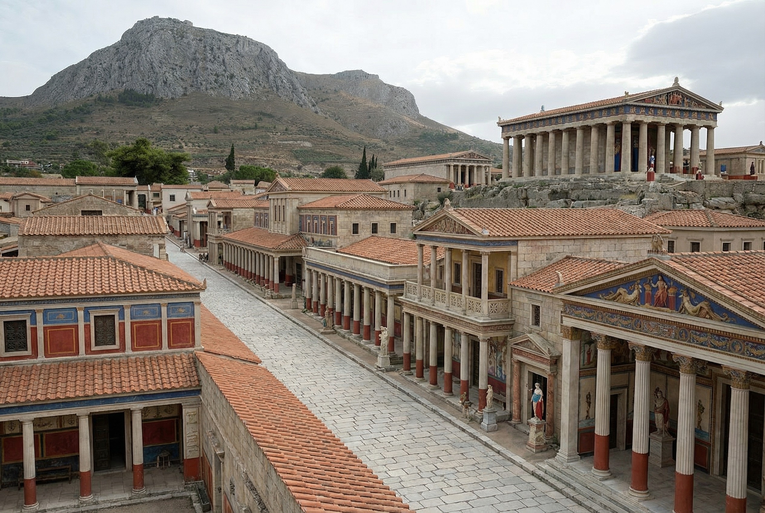
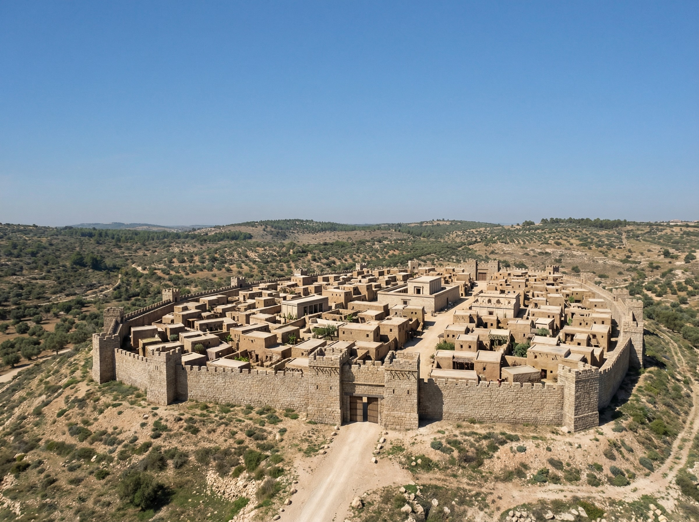
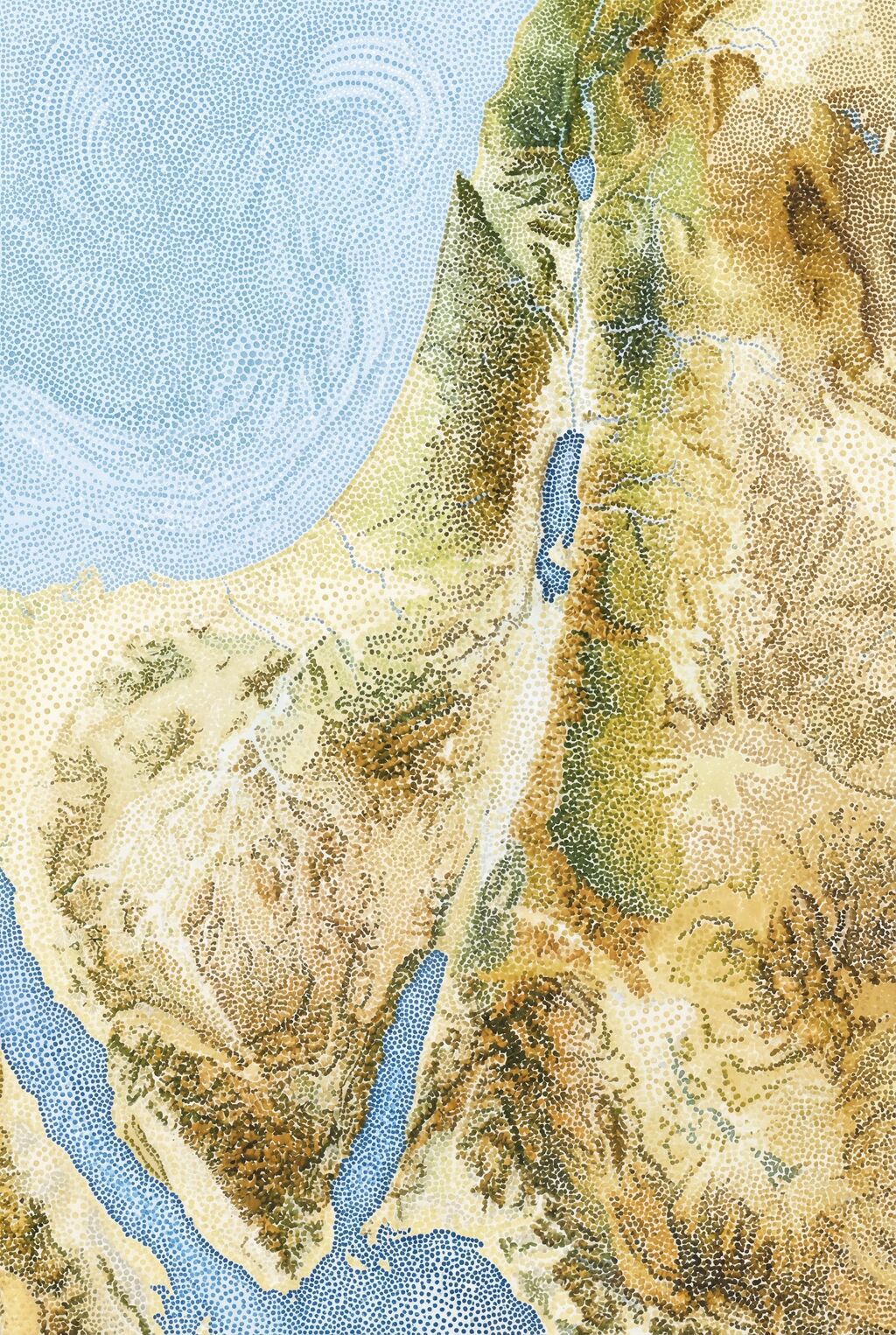
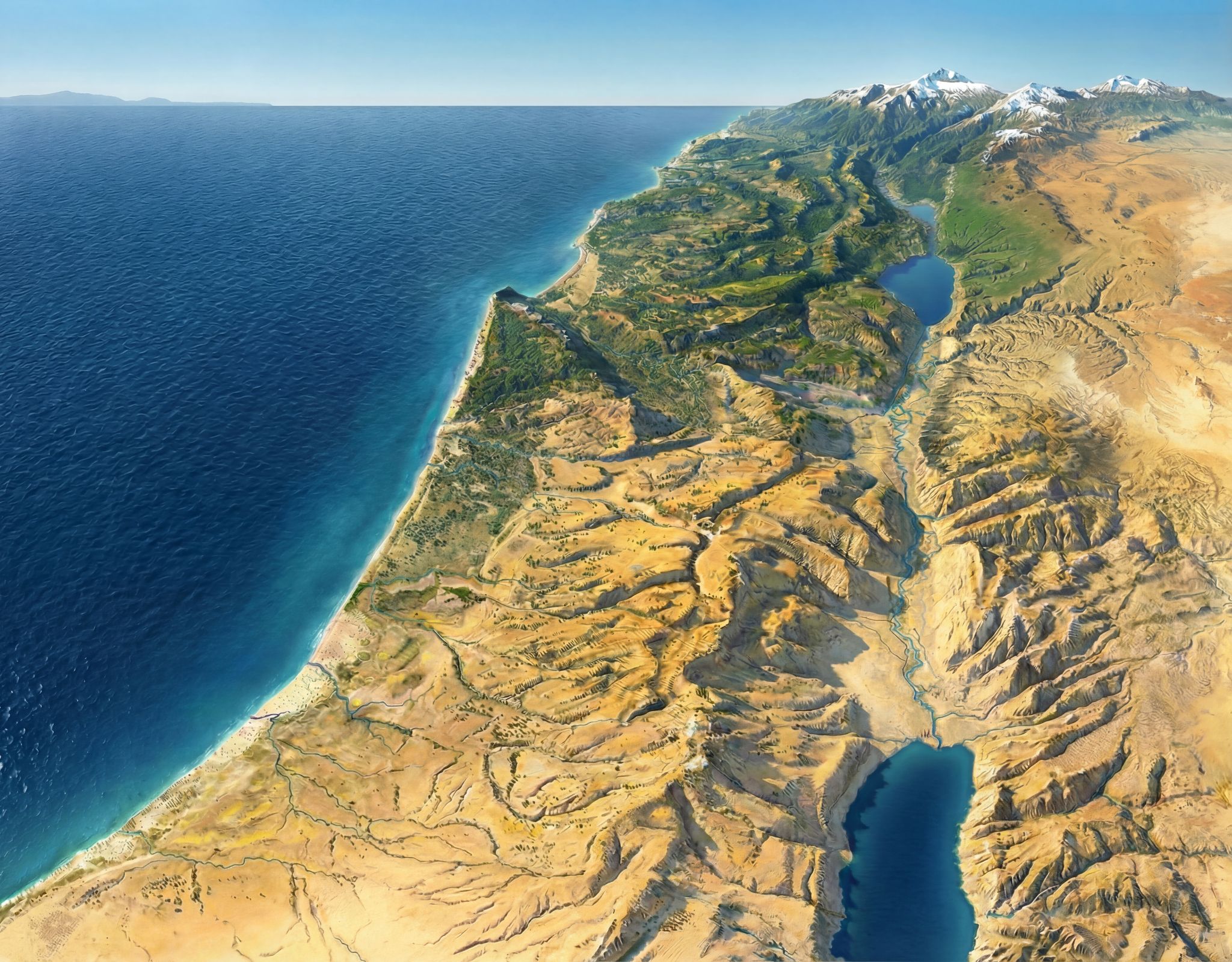
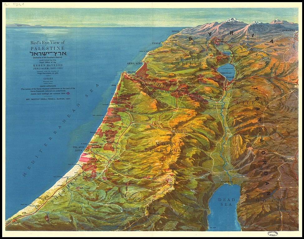
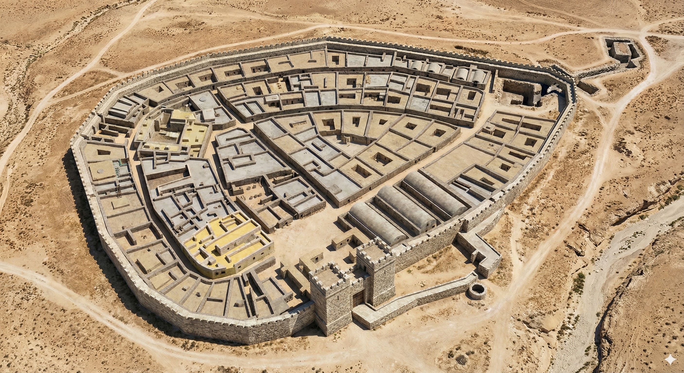
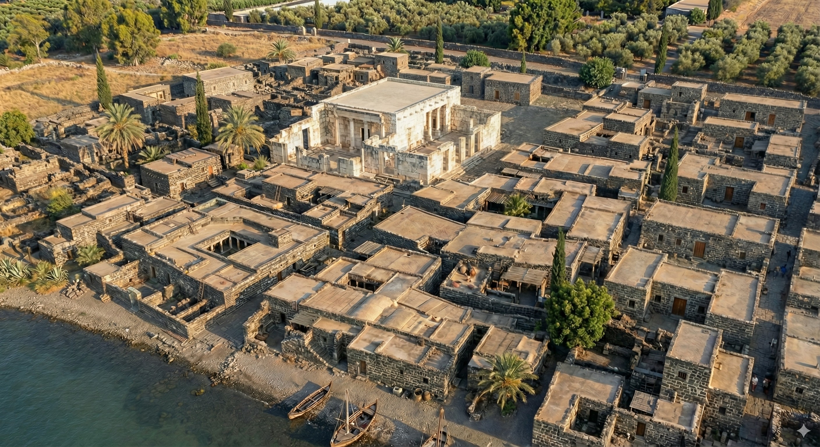
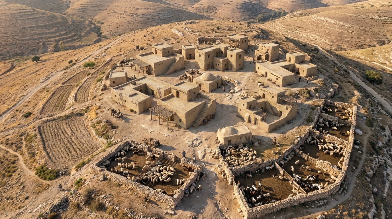
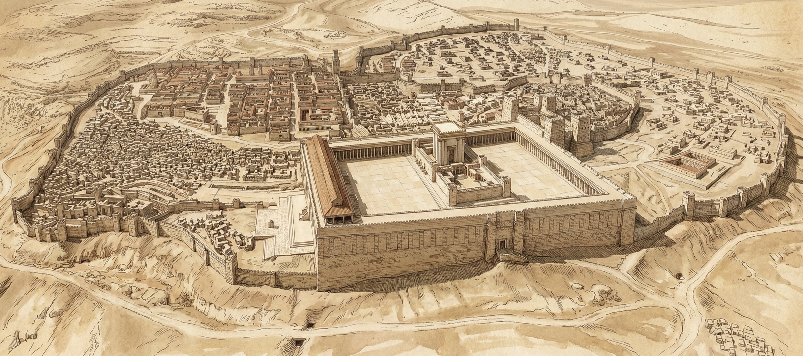
In addition to reconstructing archaeological sites from photos, Nano Banana Pro can do the opposite: it can rewild them—removing modern features to give a sense of what the natural place might have looked like in ancient times. Where reconstruction involves plausible additions to existing photos, rewilding involves plausible subtractions from them. In both cases, the AI is producing “plausible” output, not a historical reality.
Mount of Olives
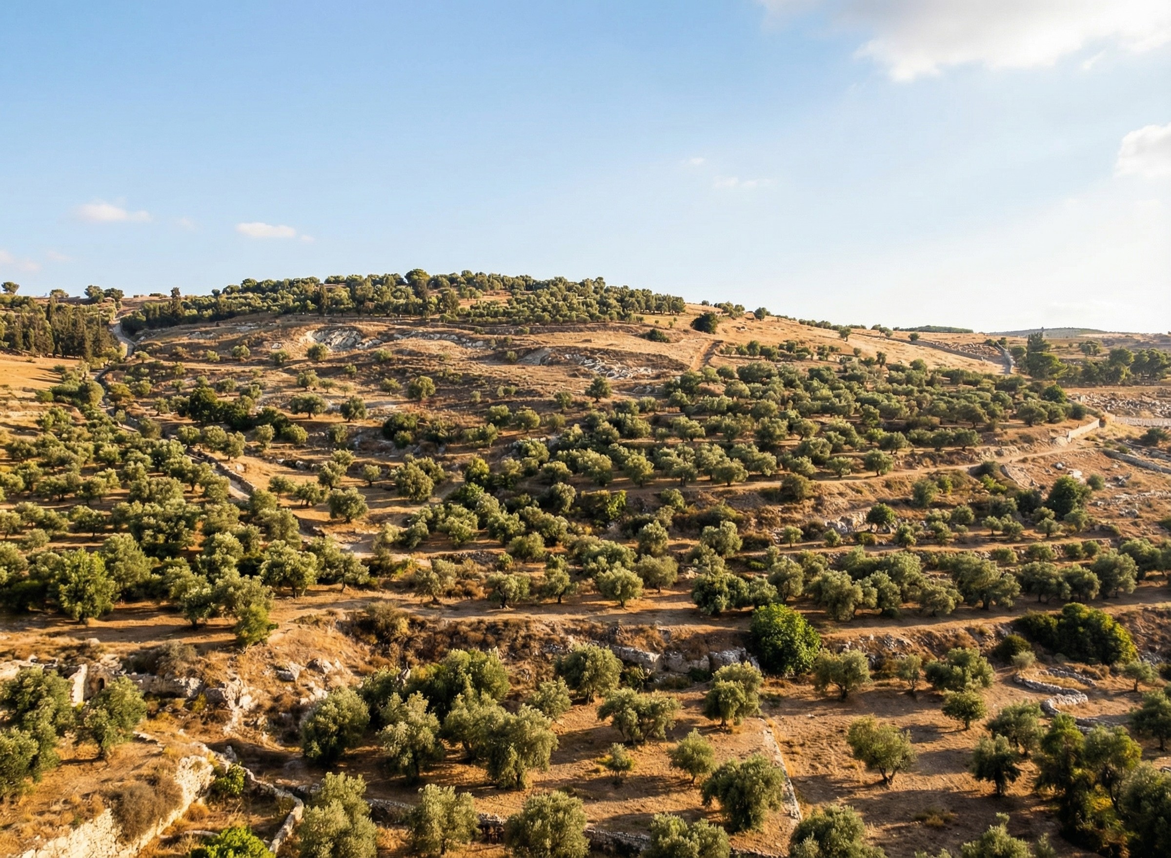
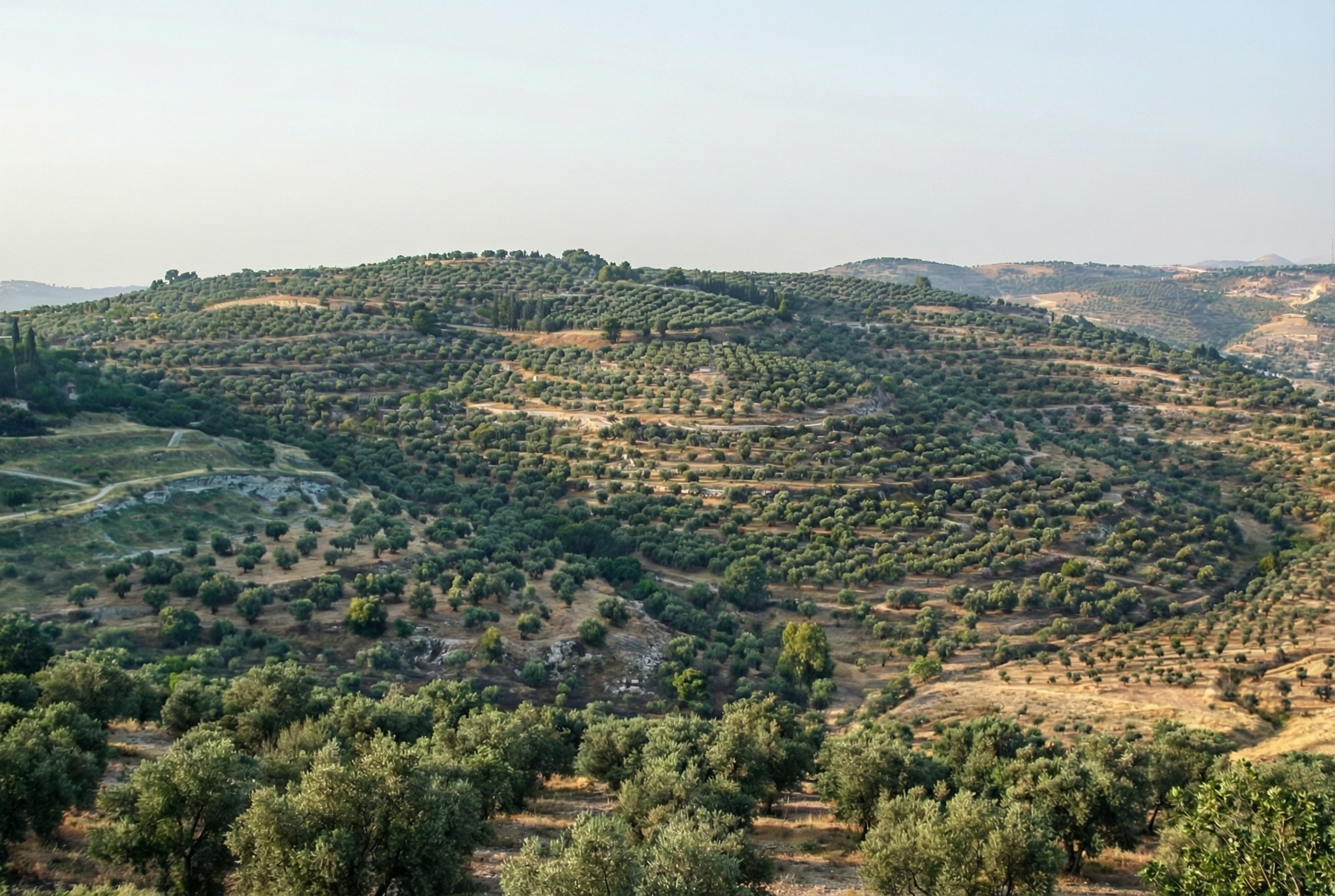
For example, the modern Mount of Olives has many human-created developments on it (roads, structures, walls, etc.). My first reaction to seeing it in person was that there were a lot fewer olive trees than I was expecting, and I wondered what it would’ve looked like 2,000 years ago.
Nano Banana Pro can edit images of the Mount of Olives to show how Jesus might have seen it, giving viewers an “artificially authentic” experience. It’s “authentic” by providing a view that removes accreted history, getting closer to how the scene may have appeared thousands of years ago. It’s “artificial” because these AI images depict a reality that never existed, combined with a level of realism that far outshines traditional illustrations. Without proper context, rewilded AI images could potentially mislead viewers into thinking that they’re “objective” photographs rather than subjective interpretations.
Rewilded Mount of Olives
The first image below is derived from a monochrome 1800s drawing of the Mount of Olives, which allowed Nano Banana Pro to add an intensely modern color grading (as though post-processed with a modern phone). The second is derived from a recent photo taken from a different vantage point.
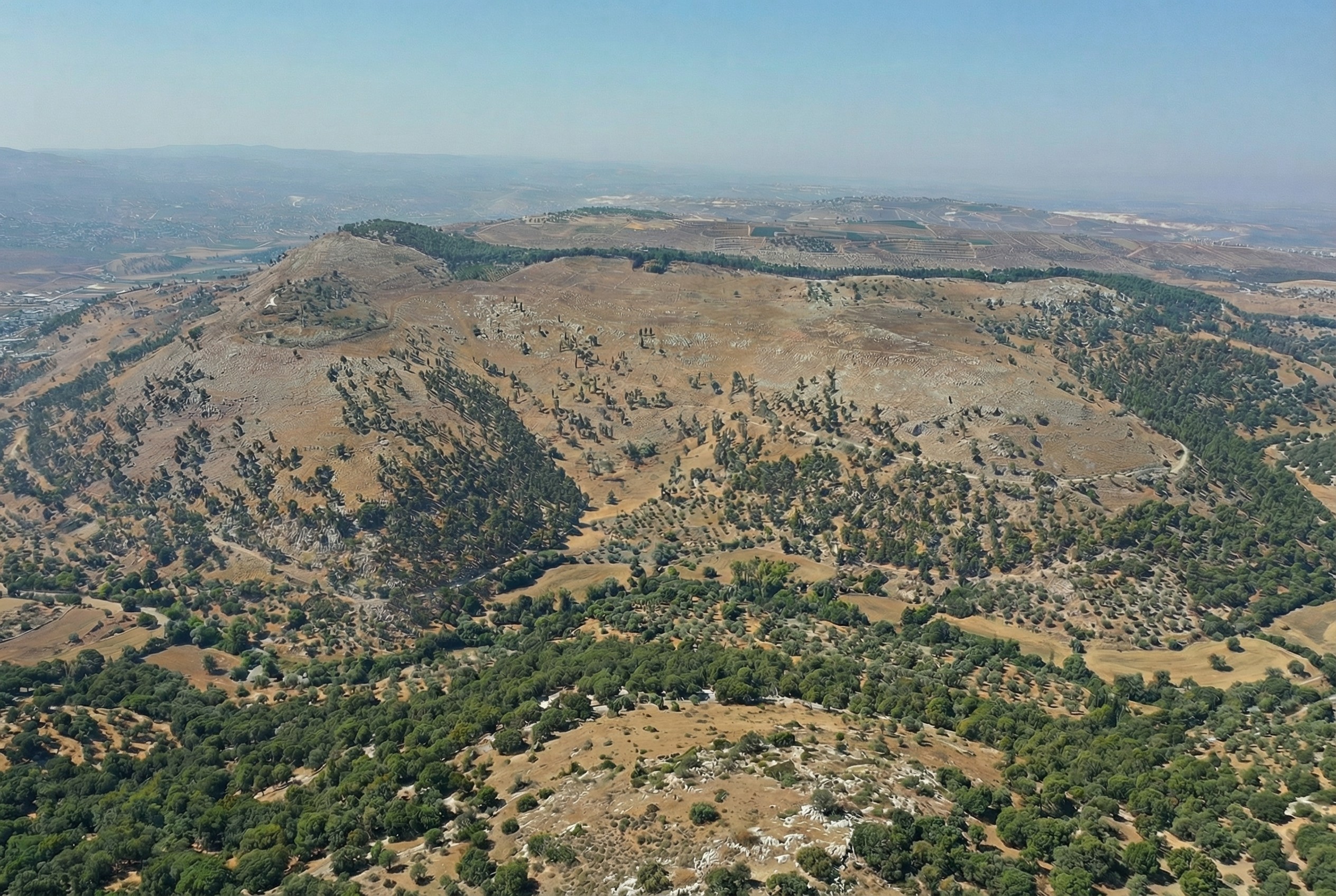
Rewilded Mount Gerizim
Similarly, here’s Mount Gerizim, minus the modern city of Nablus. Nano Banana Pro didn’t completely remove everything modern, but it got close. If I were turning it into a finished piece, I’d edit the remaining modern features using Photoshop’s AI tools (at least until Google allows Nano Banana Pro to edit partial images).
Conclusion
This process only works if existing illustrations or photos accurately depict a location. If I owned rights to a library of photos of Bible places, I’d explore how AI could enhance some of them (with appropriate labeling), either through reconstruction or rewilding. A before/after slider interface could help viewers understand the difference between the original photos and the AI derivatives, letting them choose the view they want.
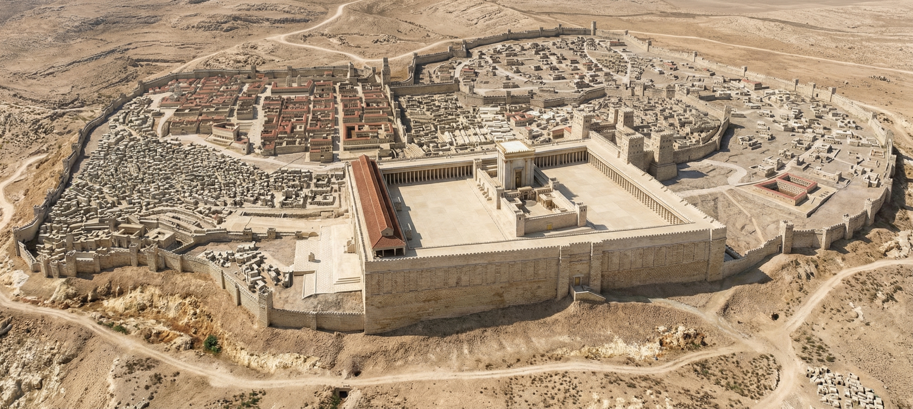
Restoration (using original or equivalent materials to restore portions of the original site) is another archaeological approach that AI could contribute to, but the methods there would be radically different.
Nano Banana Pro did its best job at converting the Mount of Olives illustration, in my opinion. I wonder if doing multiple conversions (going from a photo to an illustration and then back to a photo) could yield consistently strong results.


.jpg)
.jpg)